Behind the Pretty Face
Fashion designers are notoriously picky about their branding, so it makes sense that they’d tuck away a few "Easter eggs" for the most observant fans to find. From nods to ancient mythology to secret family tributes, these visual marks often carry more weight than just looking good on a t-shirt. With that in mind, here are 20 secrets hidden in popular logos.

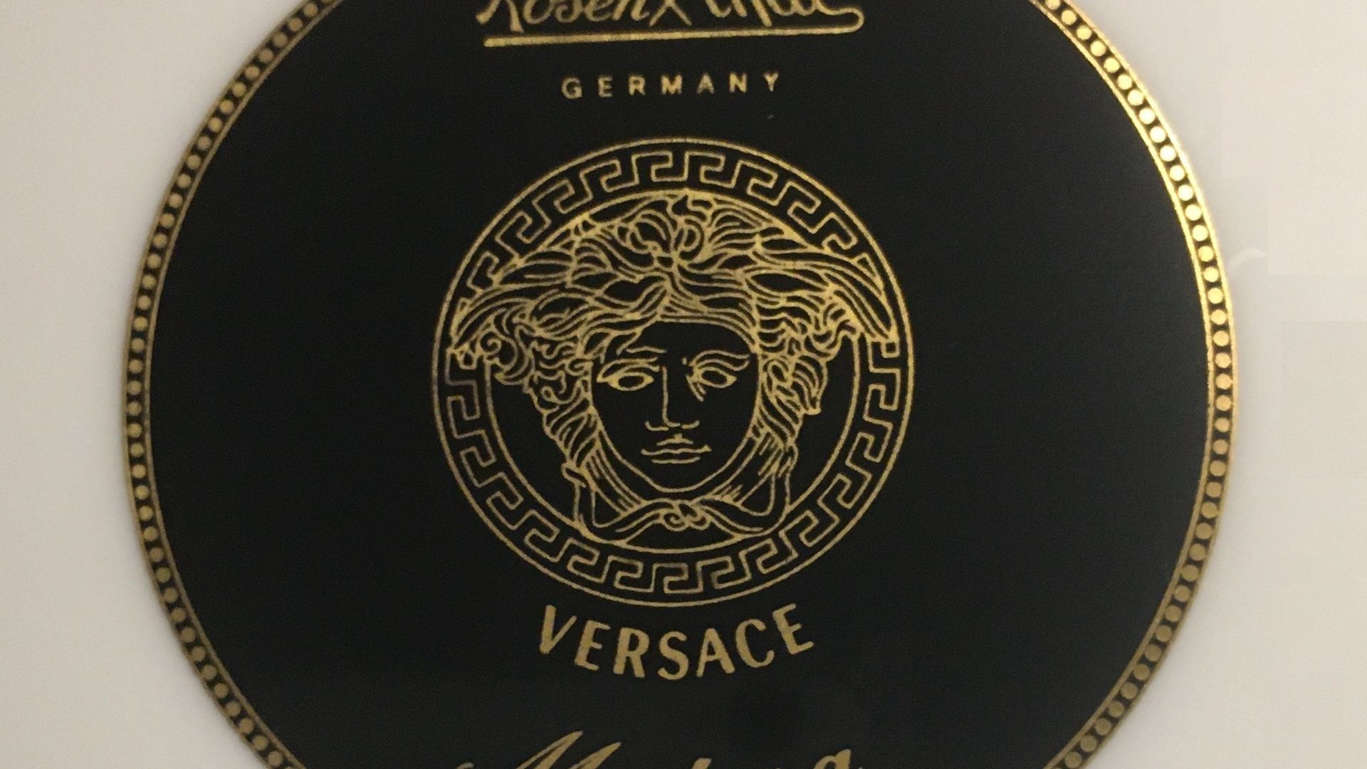
1. Versace and the Gorgon's Gaze
Gianni Versace based his brand around the head of Medusa because he wanted his customers to fall madly in love with fashion, just like sailors lust over Medusa before they are turned to stone. Study the circular frame around Medusa’s face. You’ll notice the Greek key motif, which symbolizes infinity.
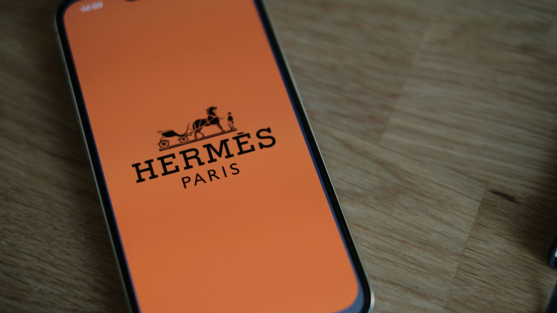
2. Hermès and the Empty Carriage
Take a second look at the orange logo. You’ll notice a horse-drawn Duc carriage with a classy gent standing boldly in front of it, and yet there’s no one behind the wheel. Hermès symbolically left the driver out of the picture to imply that the customer is in control and provides their own horsepower.
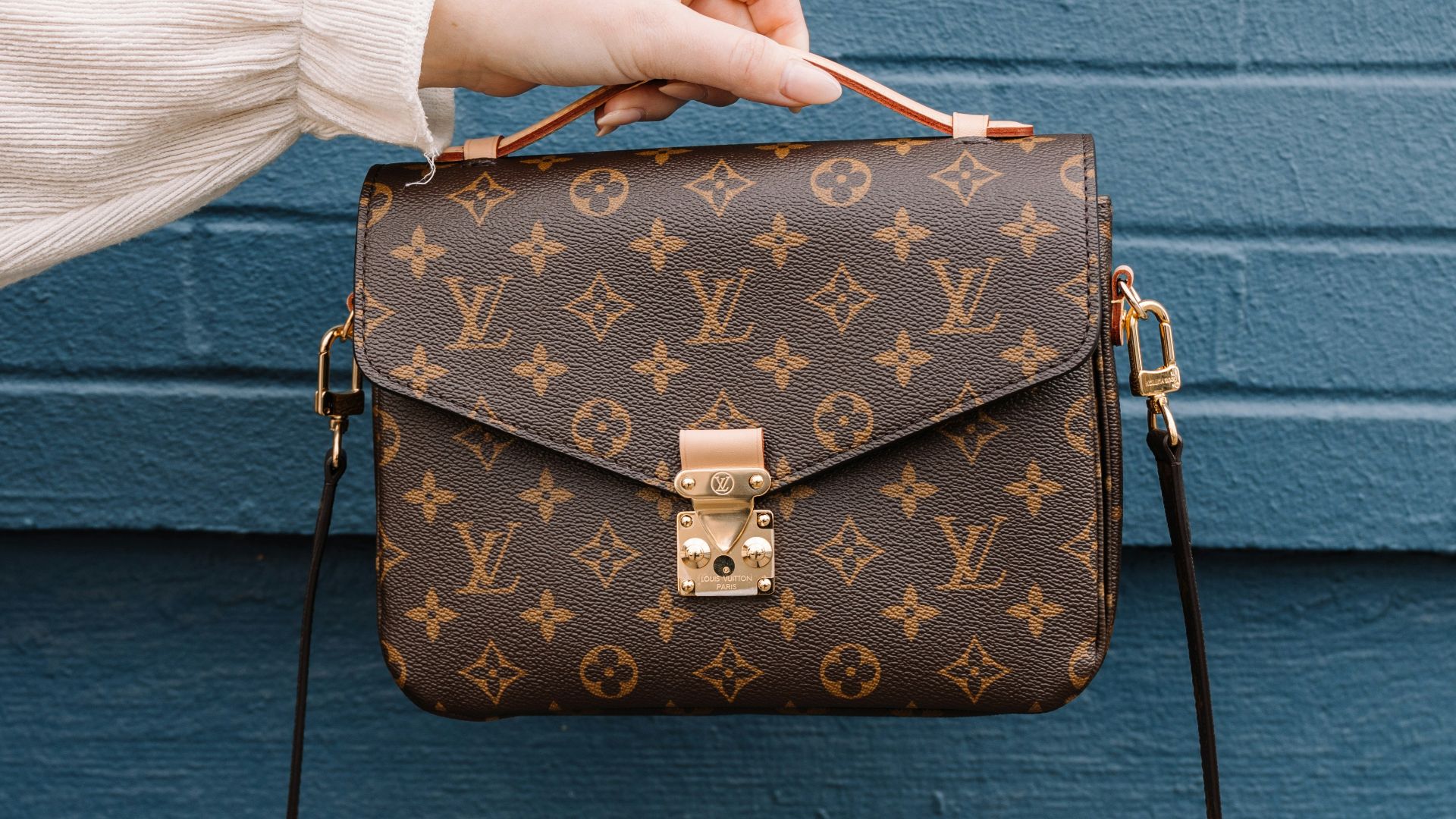
3. Louis Vuitton’s Floral Tribute
Pay close attention to the four-petal flowers tucked inside the symbols. They were inspired by oriental designs that were wildly popular in France during the Victorian era. By superimposing LV’s signature font, Georges made the logo difficult for counterfeiters of that time period to reproduce.
 Jonathan J. Castellon on Unsplash
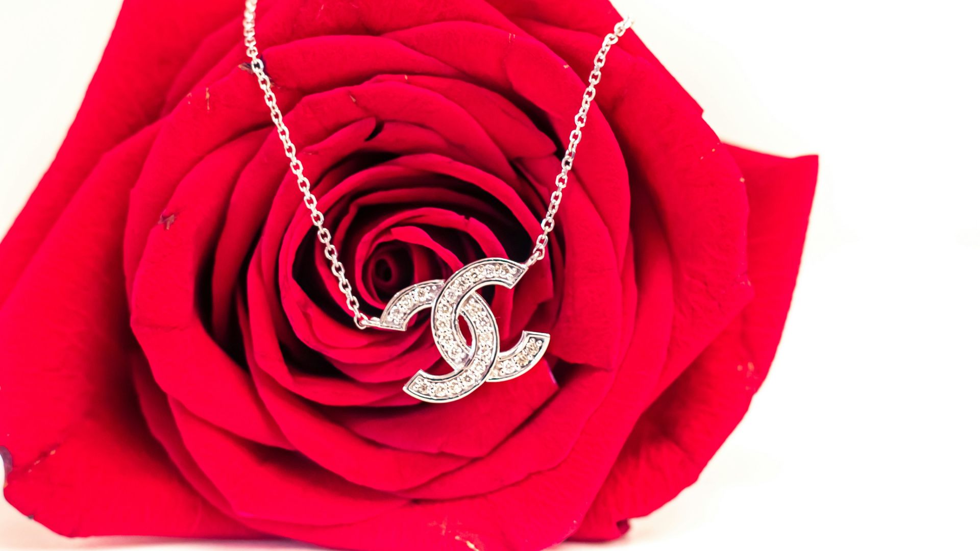
4. Chanel’s Interlocking Connection
Legend has it that Coco Chanel created her double-barreled logo after being inspired by the Notre Dame stained glass windows at the orphanage where she grew up. Sure, it may simply stand for Coco Chanel. But others believe it pays tribute to her relationships with life partners and her past.
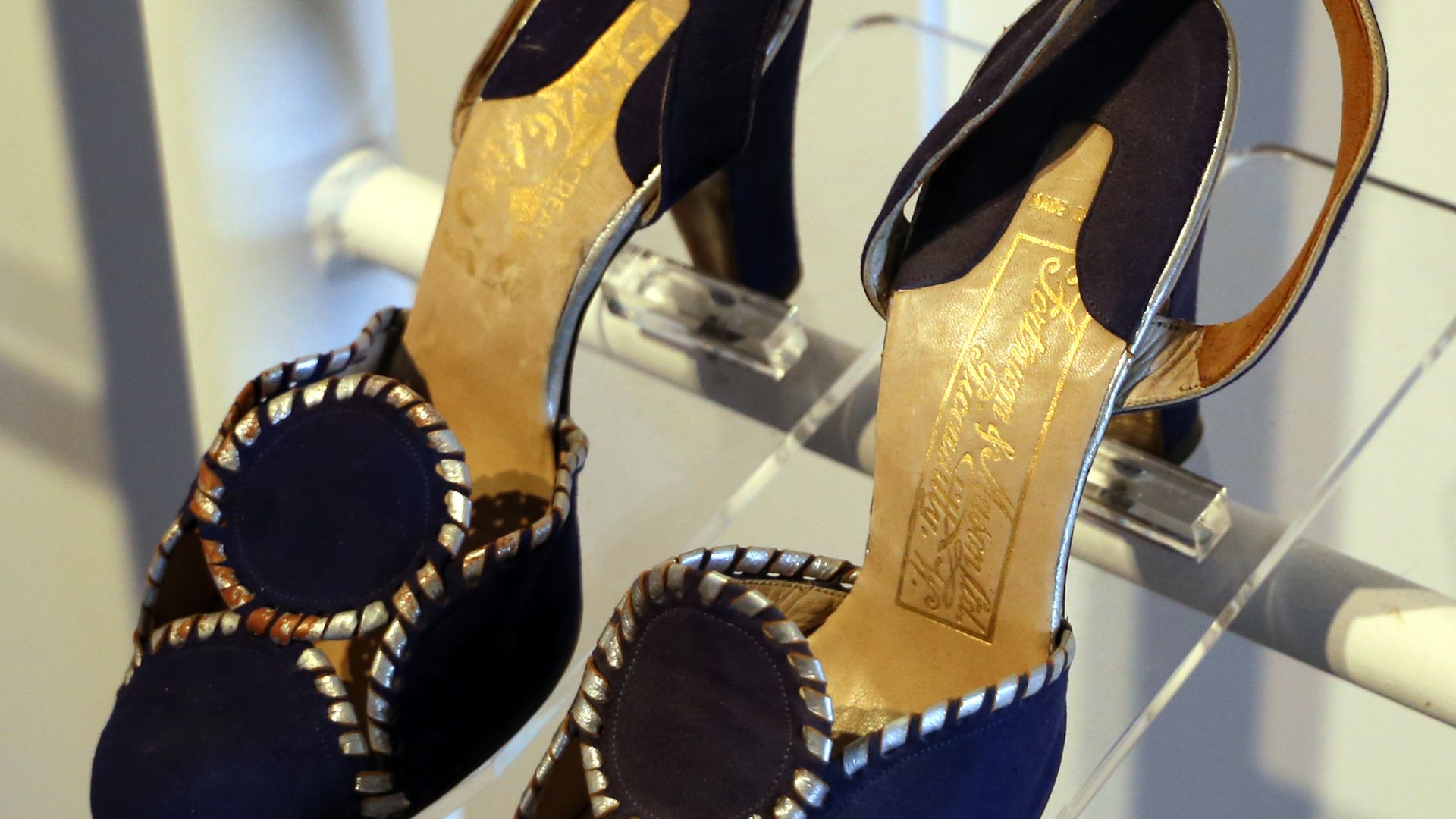
5. Ferragamo and the Arch of Support
Nicknamed the “shoemaker to the stars,” Salvatore Ferragamo incorporated his signature into his logo as a tribute to his groundbreaking shoe research. Look at the lowercase “f” inside the logo and notice how it resembles the arch of a high-heeled shoe. Anyone familiar with Salvatore knows he was obsessed with the anatomy of the foot.
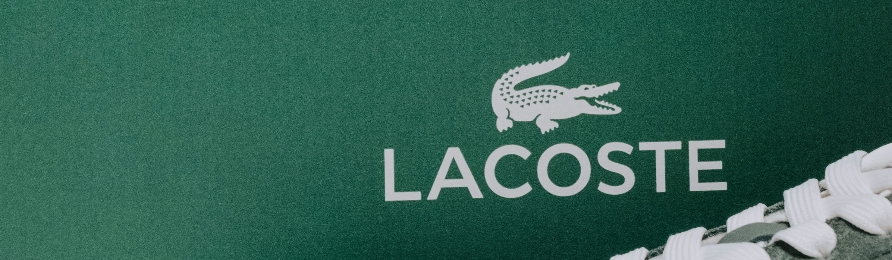
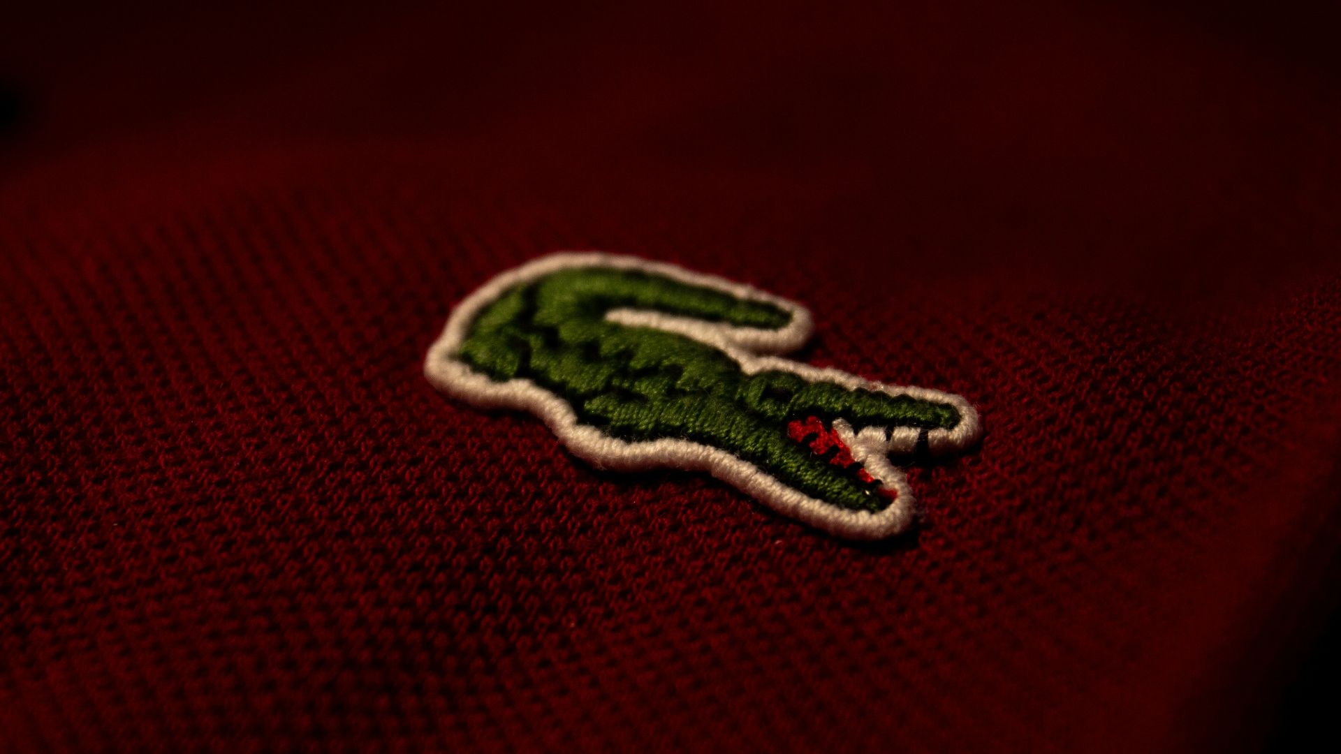
6. The Lacoste Crocodile Bet
If it weren’t for his sartorial sense and a lucky chance meeting with a journalist, René Lacoste would have never trademarked a reptile as the face of his tennis shirts. He had actually made a friendly bet with his team captain over a suitcase stuffed with crocodile skin. Reporters got hold of the story and began playfully referring to him as “The Crocodile” during matches.
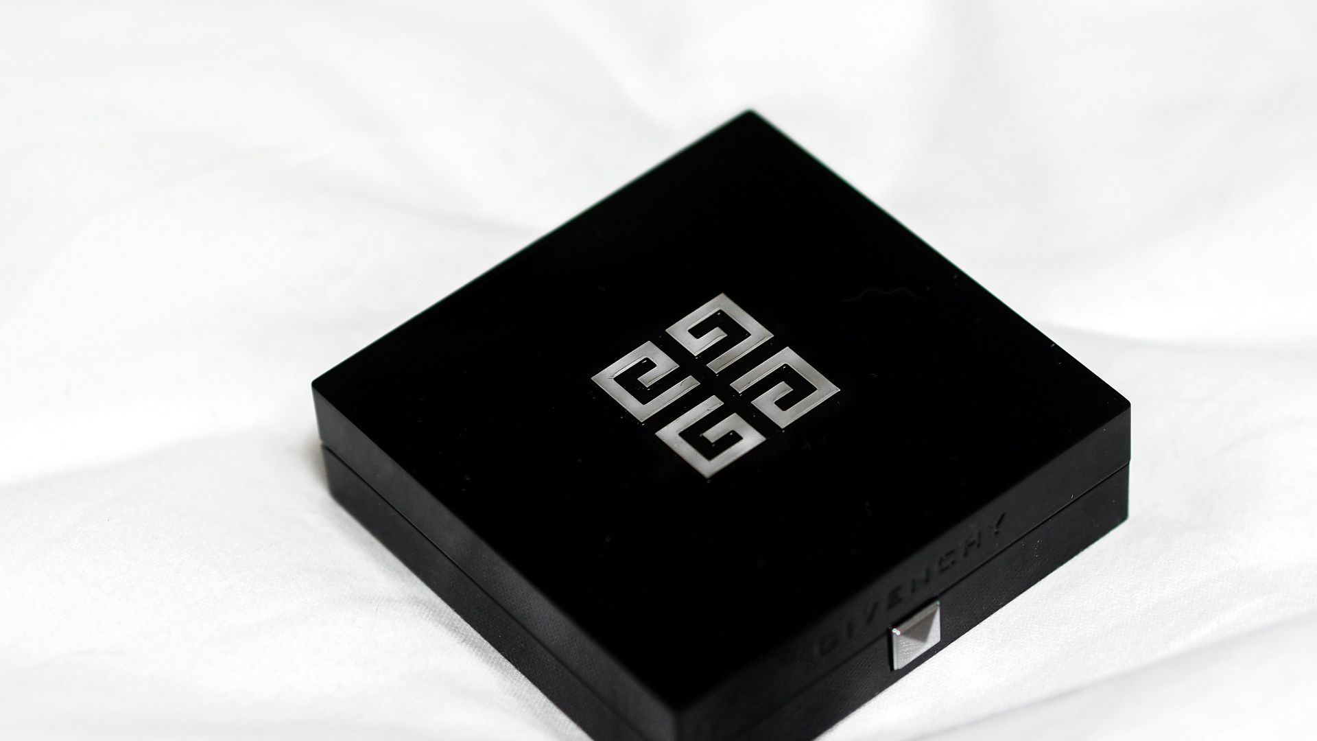
7. Givenchy’s Celtic Symmetry
This logo is comprised of four capital letter G’s fused to form what looks surprisingly like a Celtic knot. Ingelsetter created the logo to showcase perfect symmetry while giving off timeless “Gallic” charm. Hidden inside is a perfectly centered micro cross, crafted by intertwining the letters without any intersections.
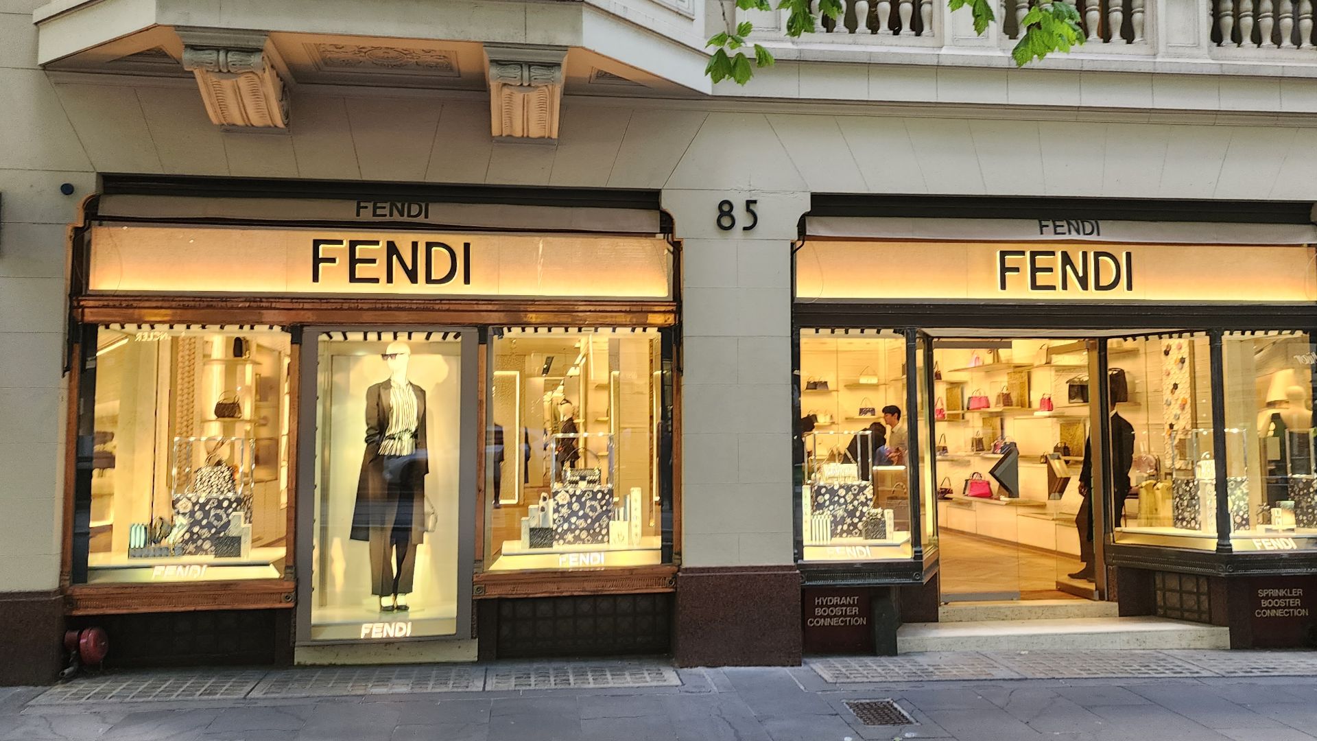
8. Fendi’s Zucca Puzzle
Fun fact: Karl Lagerfeld only took five seconds to sketch the now-iconic double F logo. Upon request by the Fendi sisters, he wanted to come up with a simple logo that would stand for “Fun Fur.” Lagerfeld wanted to dissociate from traditional heavy coats and make fur fun and trendy for women.
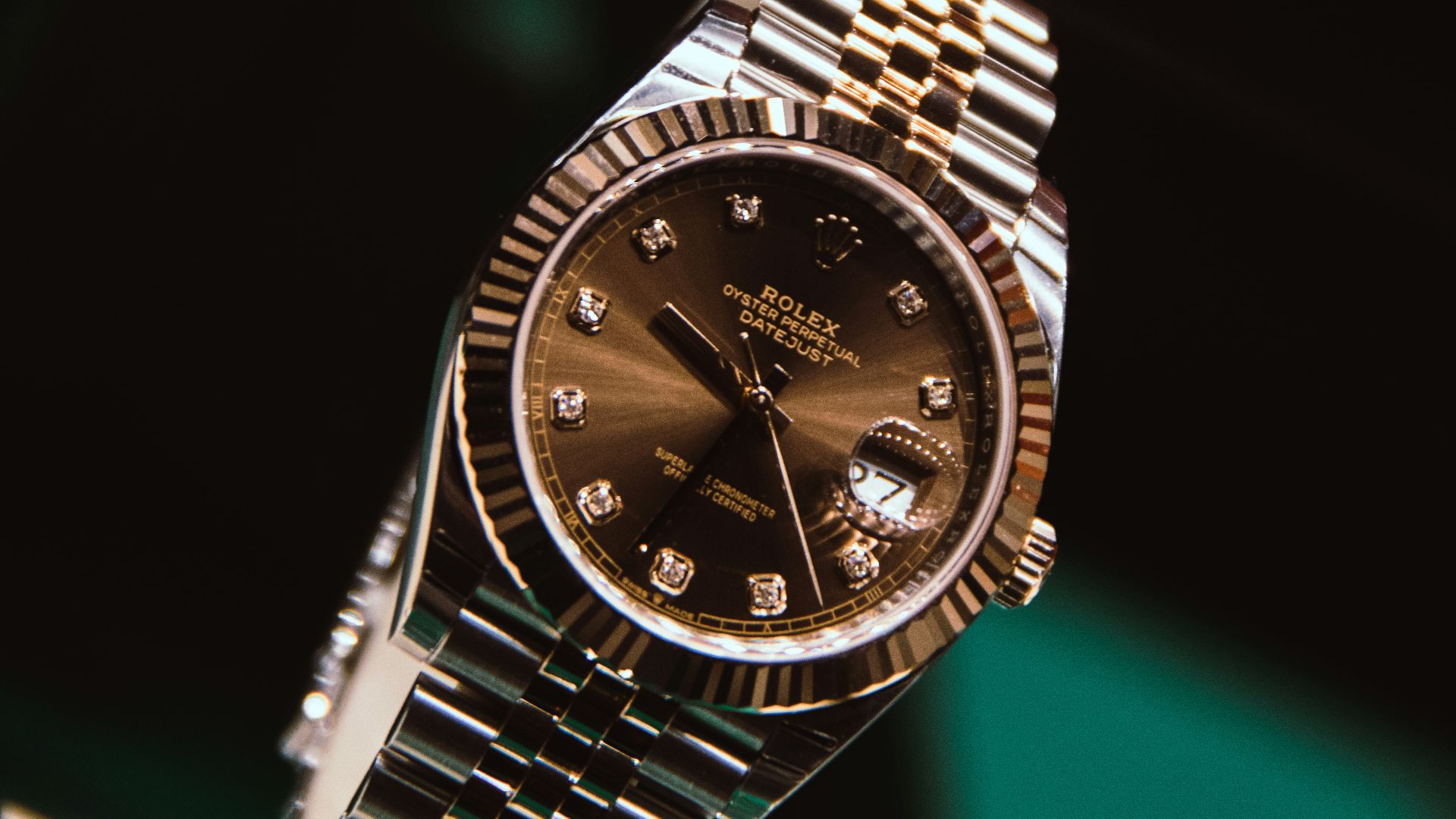
9. Rolex and the Crown of Achievement
Officially referred to as the “coronet,” the five-pointed crown above every Rolex tells a story of its own. Each spike on the crown represents one finger on a human hand, signifying how much manual labor crafts every timepiece. Wearing a Rolex also acts as a status symbol, showing everyone that the wearer is the king of the watch game.
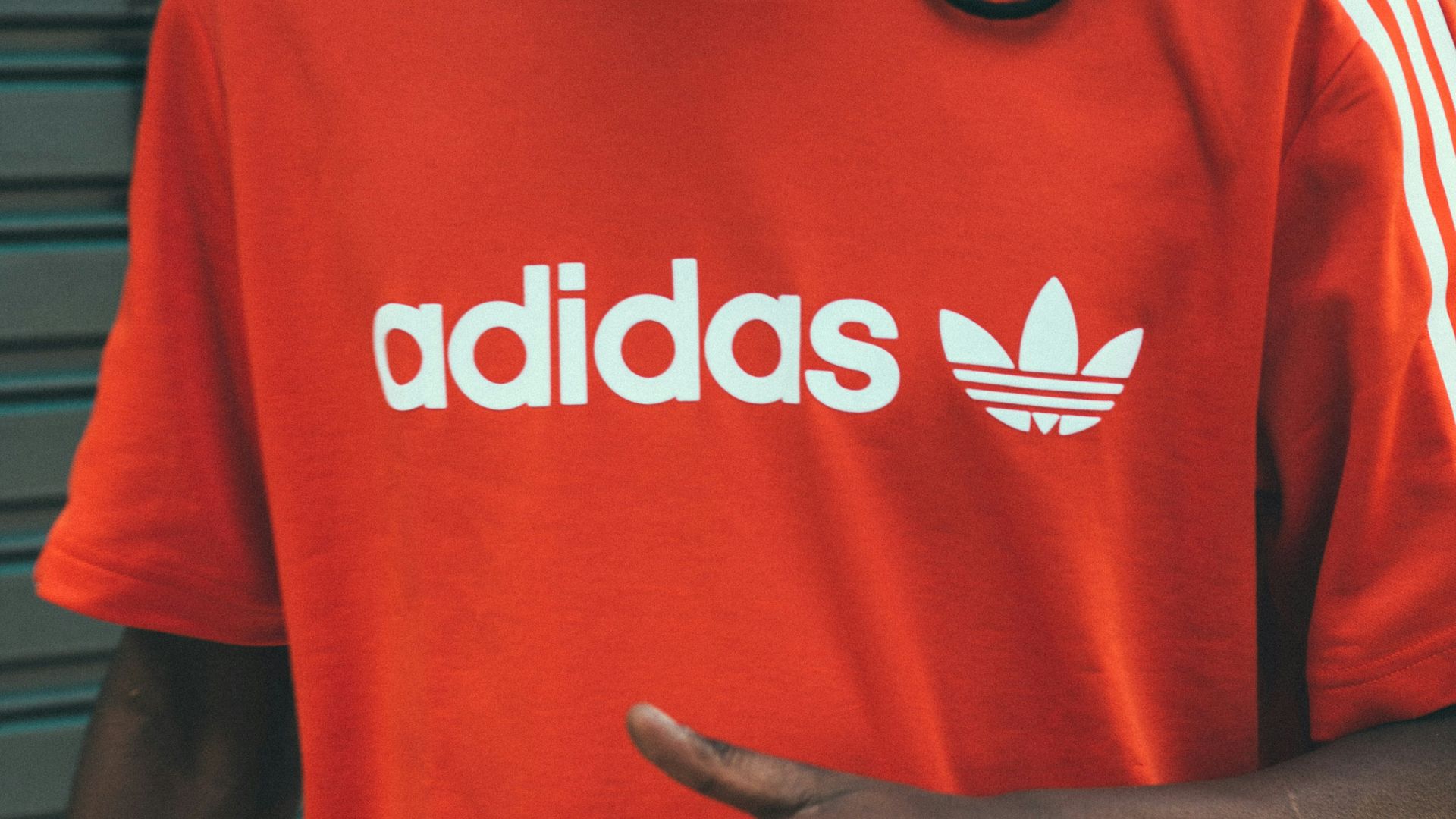
10. Adidas and the Mountain Challenge
Everyone knows about the three stripes, but did you know the logo was designed to portray a mountain? The logo is arranged so that each color symbolizes an athlete overcoming obstacles to reach the top of their game. It’s clever motivational imagery that tells the customer the brand will be there every step of the way toward the peak.
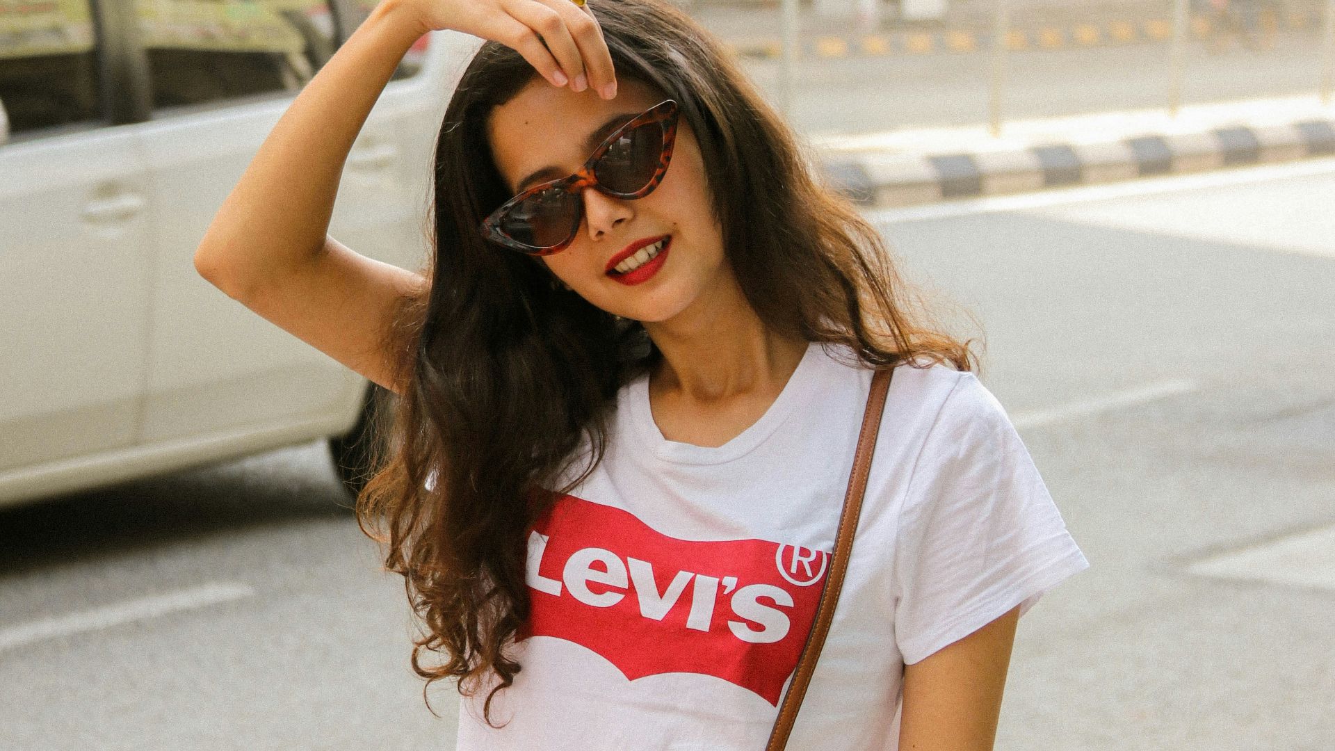
11. Levi’s and the Batwing Shape
Take a closer look at the back tab on a pair of Levi’s, and you’ll notice the signature batwing shape. The iconic shape is actually modeled after the arcuate stitch that runs along the back pockets of the famous 501 jeans. Its placement ensures the brand is visible even if the telltale stitches are missed.
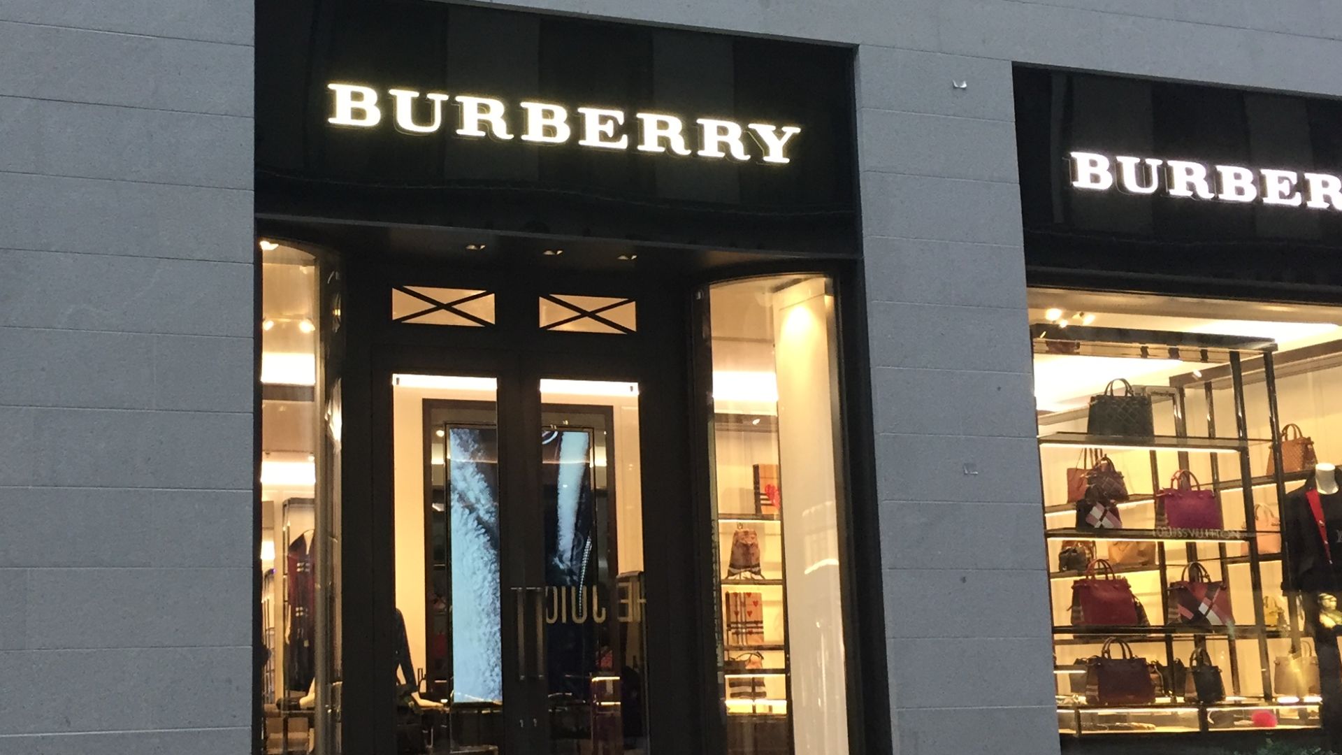
12. Burberry’s Equestrian Knight
Watch closely as Sir Burberry charges on his steed, wielding his uppercase letter B-engraved shield. The knight represents the brand’s motto: “Prorsum,” which translates to “forwards” in Latin. Prorsum implies that Burberry is always moving forward with innovations in outerwear.
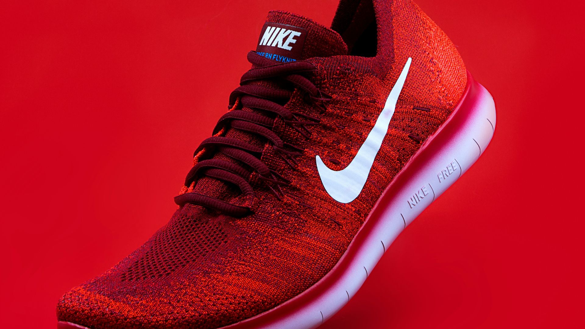
13. Nike’s Winged Victory
Officially called a “swoosh,” the Nike logo was intended to resemble Nike’s winged foot. Nike is the Greek goddess of victory, and designer Carolyn Davidson wanted a logo that depicted motion and speed. The sweeping curves are so fluid that they resemble the sound of a body rushing past.
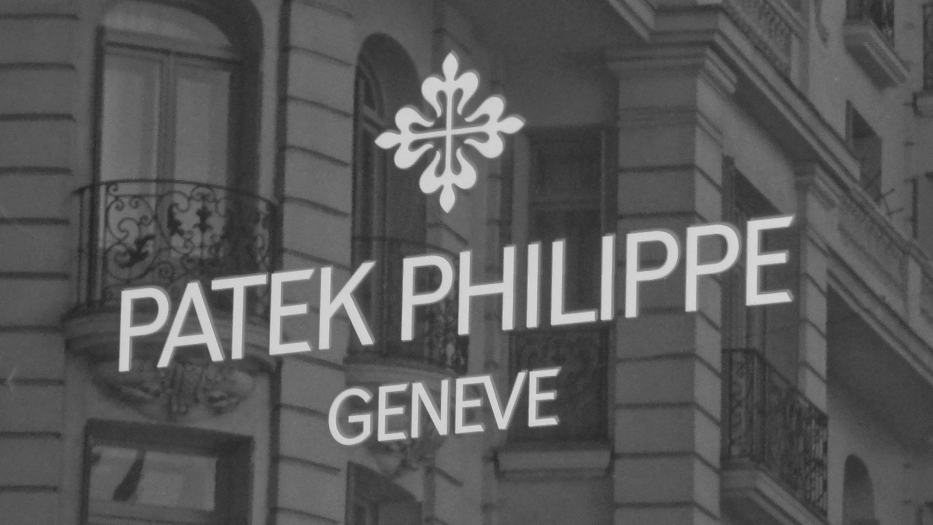
14. Patek Philippe’s Calatrava Cross
The cross that Patek Philippe owners proudly wear around their wrists is called the Calatrava cross. As the emblem of a Spanish knight’s order in the 12th century, it was adopted by the company to symbolize bravery and timeless brotherhood. Wearing a Patek isn’t just about showing wealth.
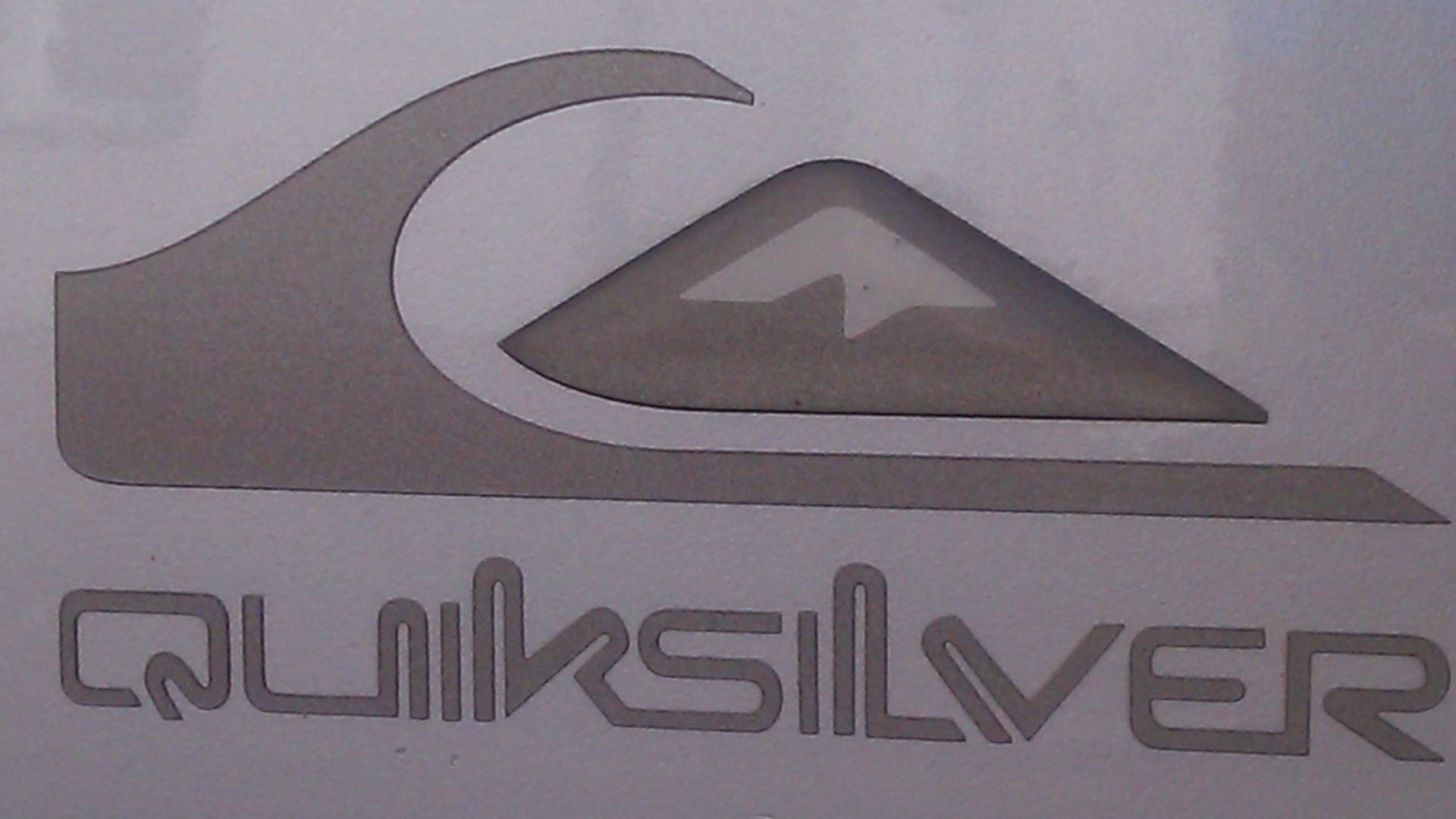
15. Quiksilver and the Great Wave
The original scribble logo was inspired by one of the world’s most famous Japanese woodblock prints. The diagram accurately depicts a wave breaking in front of Mount Fuji, alluding to the brand’s involvement with both surfing and mountain activities like snowboarding.
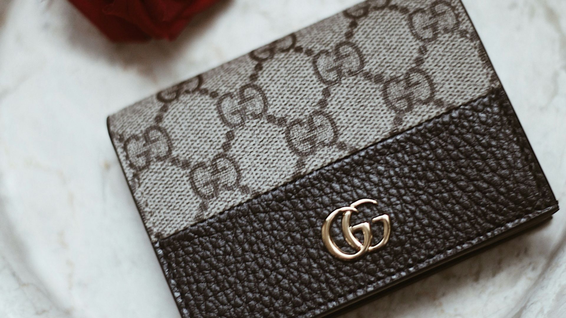
16. Gucci’s Stirrup Origins
Gucci favors the GG monogram, but there are other subtle equestrian designs woven into the brand’s logo. Guccio Gucci developed an obsession with all things horses while working for an English hotel company early in his career.
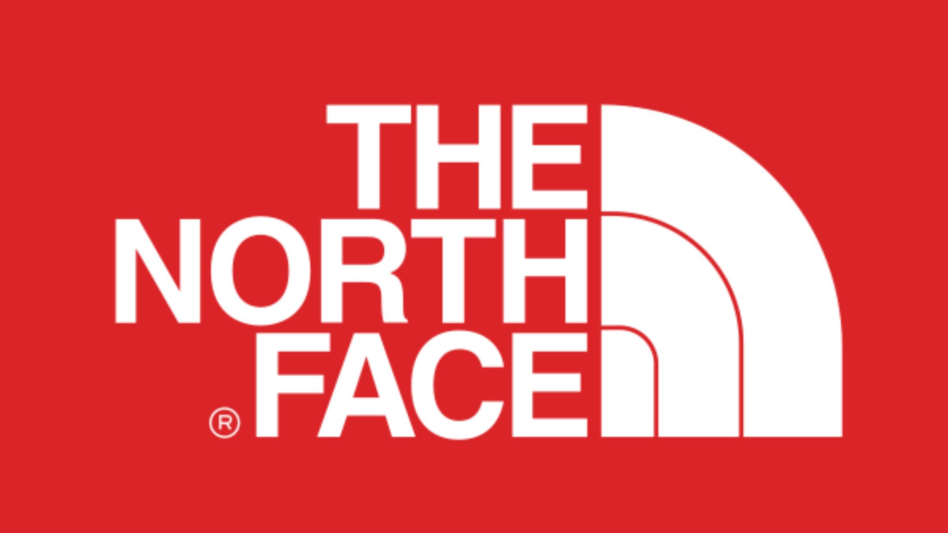
17. The North Face Half Dome
Those three curved lines symbolize a prominent rock formation. According to official reports, they replicate the shape of Half Dome in Yosemite National Park from the perspective of the north face. Logo lovers and rock climbers alike revere this symbol as it represents the hike required to complete the climb.
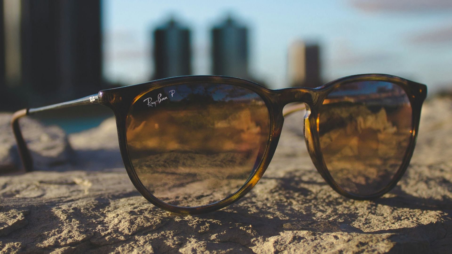
18. Ray-Ban’s Scripted Authenticity
Take note of the strategic placement of Ray-Ban’s logo. The font is purposely slanted to mimic a signature. Back in the early 1900s, when faux logos weren’t common, companies placed their signature on each pair of glasses to signify authenticity.
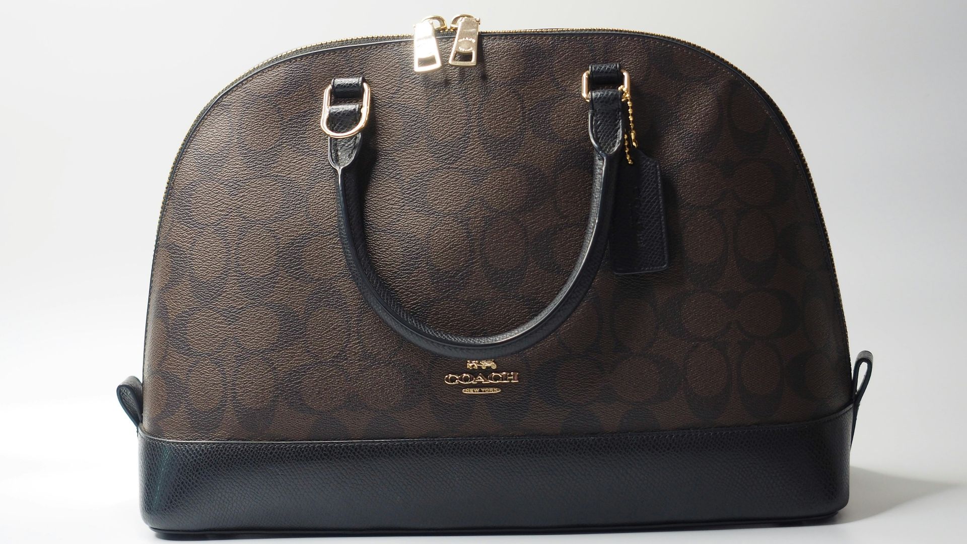
19. Coach’s Stagecoach Journey
The Coach brand centers around high-quality leather goods, so it makes sense that the logo would pay homage to early leather craftsmanship in America. When founded in 1941, Coach incorporated pictorial illustrations of a horse and carriage to symbolize the coaches that transported travelers throughout Manhattan.
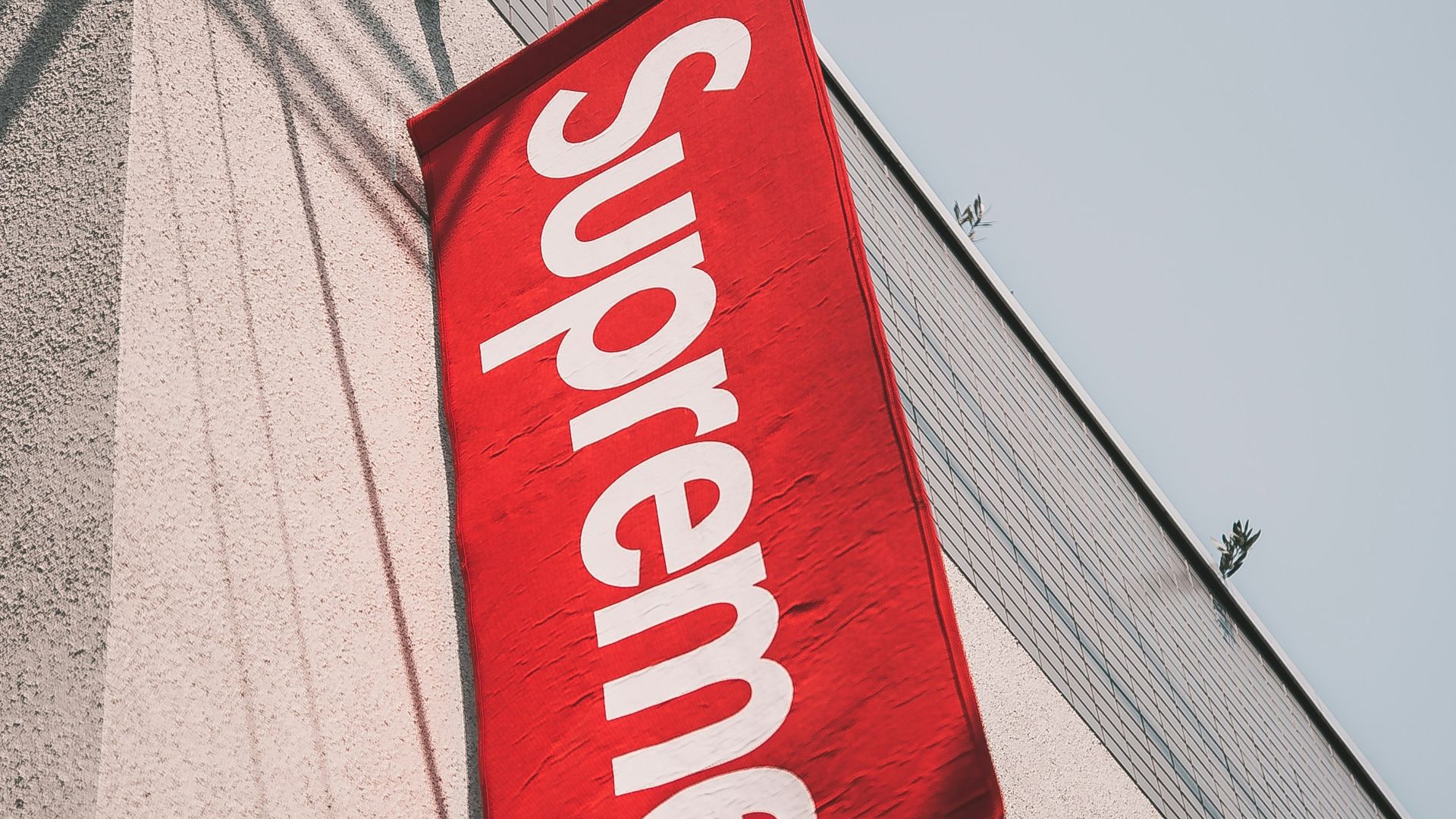
20. Supreme’s Artistic Theft
Supreme created its iconic red-and-white box logo based on another artist’s design. Influenced by feminist artist Barbara Kruger, they borrowed her signature white futuristic font on a red background and applied it to their own purposes. This is ironic for a brand that started a culture of “hype” consumption by appropriating others’ creativity.