Stylish Pairings That Always Feel Put Together
Some color combinations immediately make outfits, rooms, and designs look more refined without requiring complicated styling. A polished look usually comes from balance, contrast, and tones that naturally complement each other rather than compete for attention. While trends change over time, certain pairings consistently remain popular because they feel clean, versatile, and visually balanced in almost any setting. Here are 20 color combinations that instantly look polished.
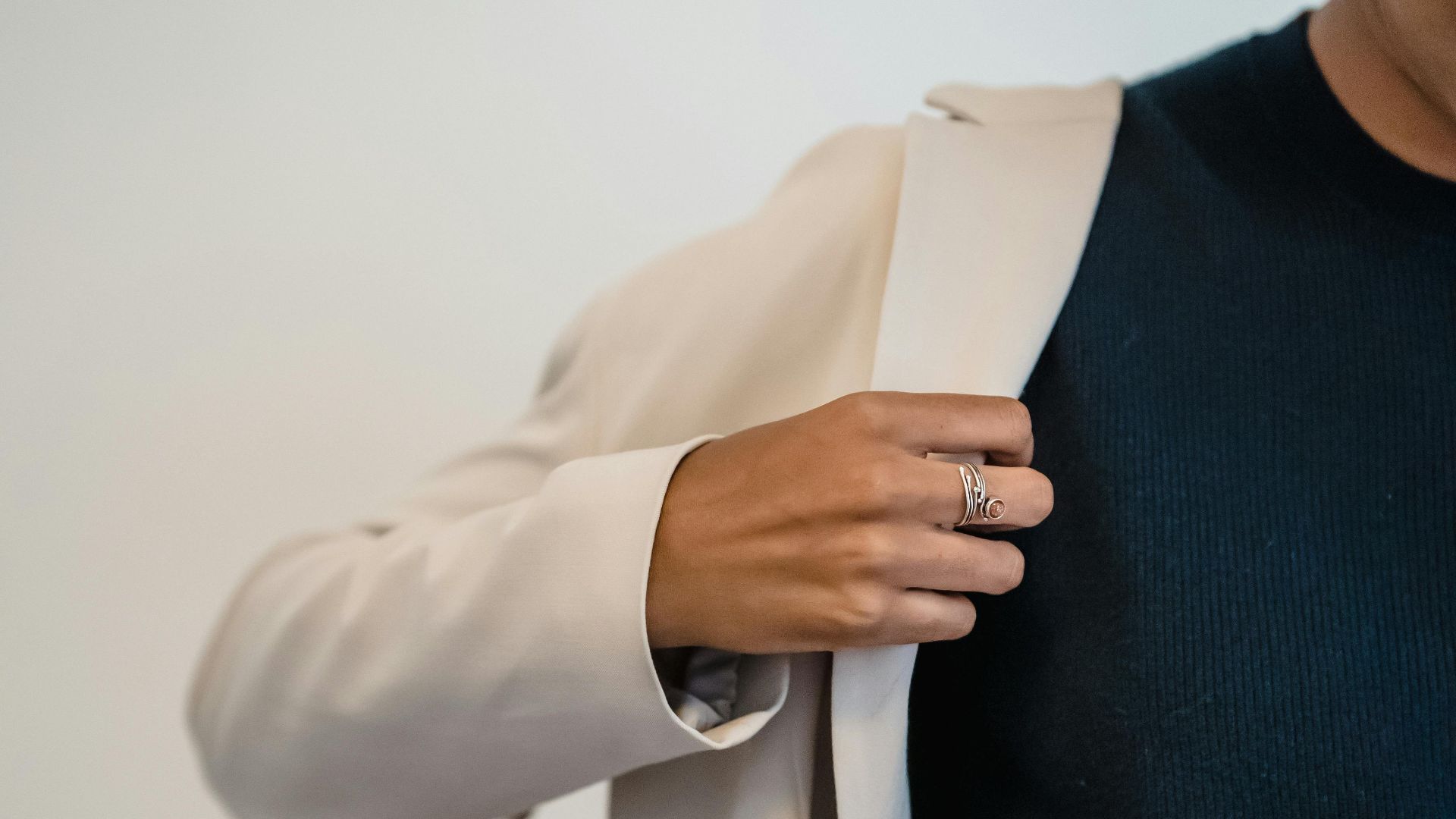
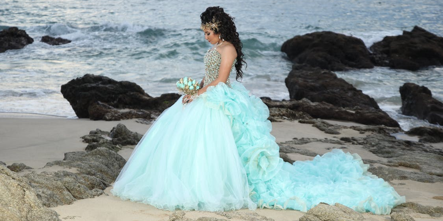
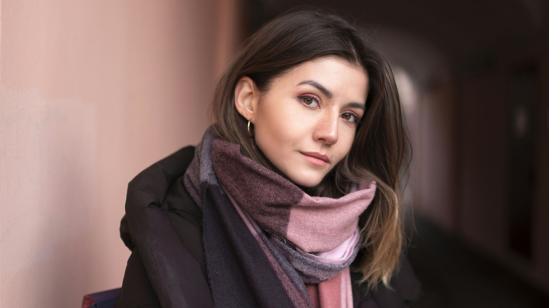
 Abdul Raheem Kannath on Unsplash
1. Navy and White
Navy and white create a crisp combination that feels timeless in fashion and interior design. The contrast looks clean without appearing overly harsh, which helps the pairing stay elegant and versatile. Whether you're styling clothing or decorating a room, this combination usually looks organized and intentional.
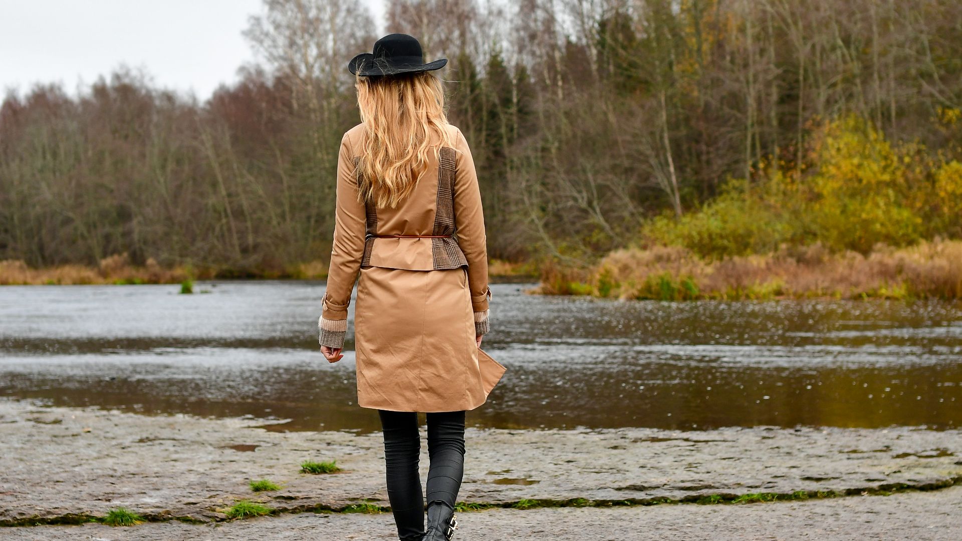
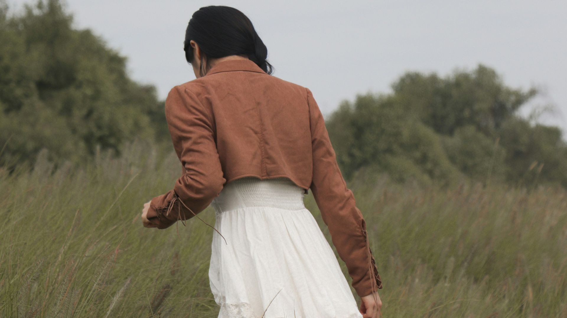
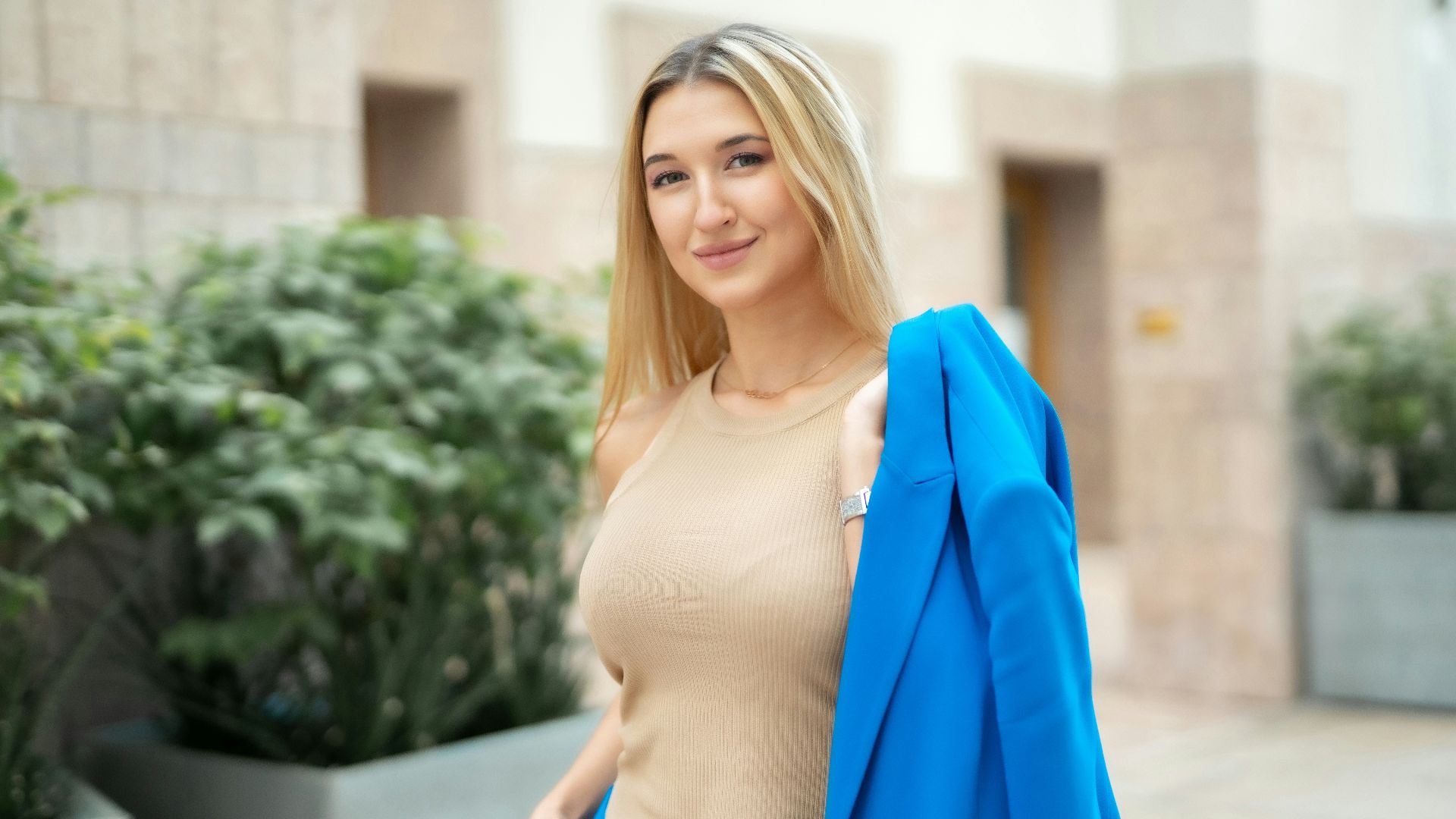
2. Black and Camel
Black and camel work well together because the warmth of camel softens the sharpness of black. The pairing often appears expensive and understated without needing bold patterns or accessories. Many designers rely on these colors because they transition easily between casual and formal settings.
3. Gray and Soft Blue
Gray and soft blue create a calm, balanced appearance that feels polished without looking cold. The muted tones blend naturally and work especially well in professional environments. This pairing is often used in modern interiors and tailored fashion because it feels clean and sophisticated.
4. Cream and Olive Green
Cream brightens olive green while allowing the earthy tone to remain grounded and elegant. Together, the colors feel relaxed but still refined enough for upscale styling. The combination works particularly well during fall and winter without looking overly seasonal.
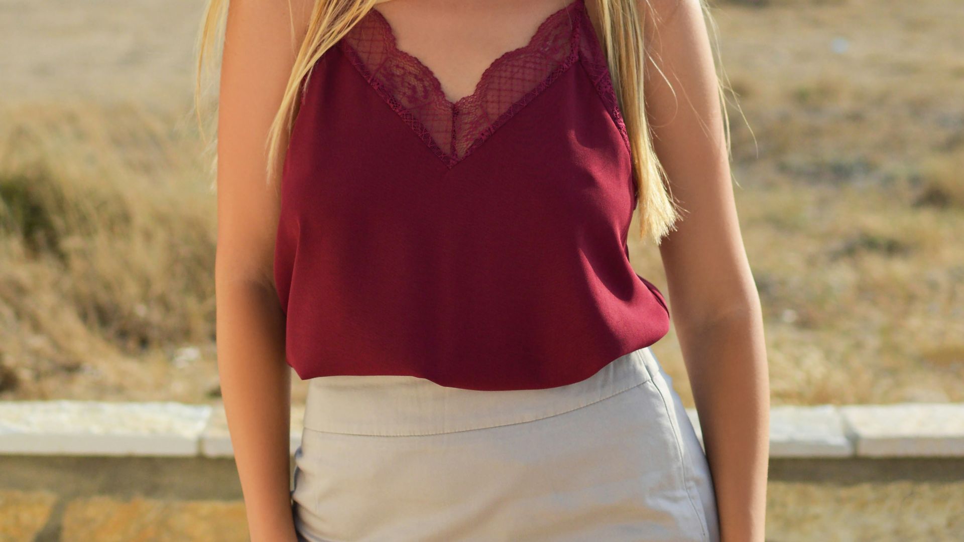
5. Burgundy and Beige
Burgundy adds richness while beige keeps the overall look balanced and approachable. The contrast feels softer than black and red, which helps the combination appear more polished. These colors are often used together in fashion because they create depth without overwhelming the eye.
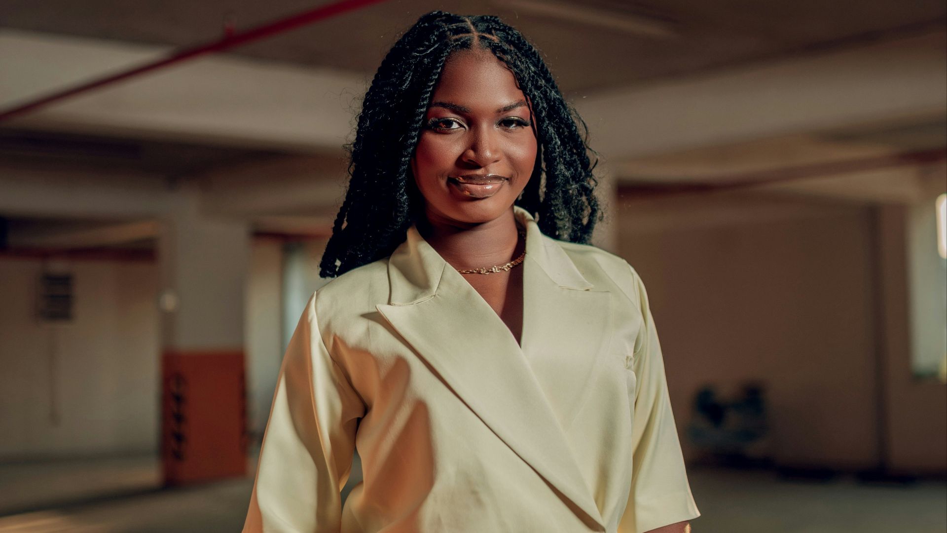
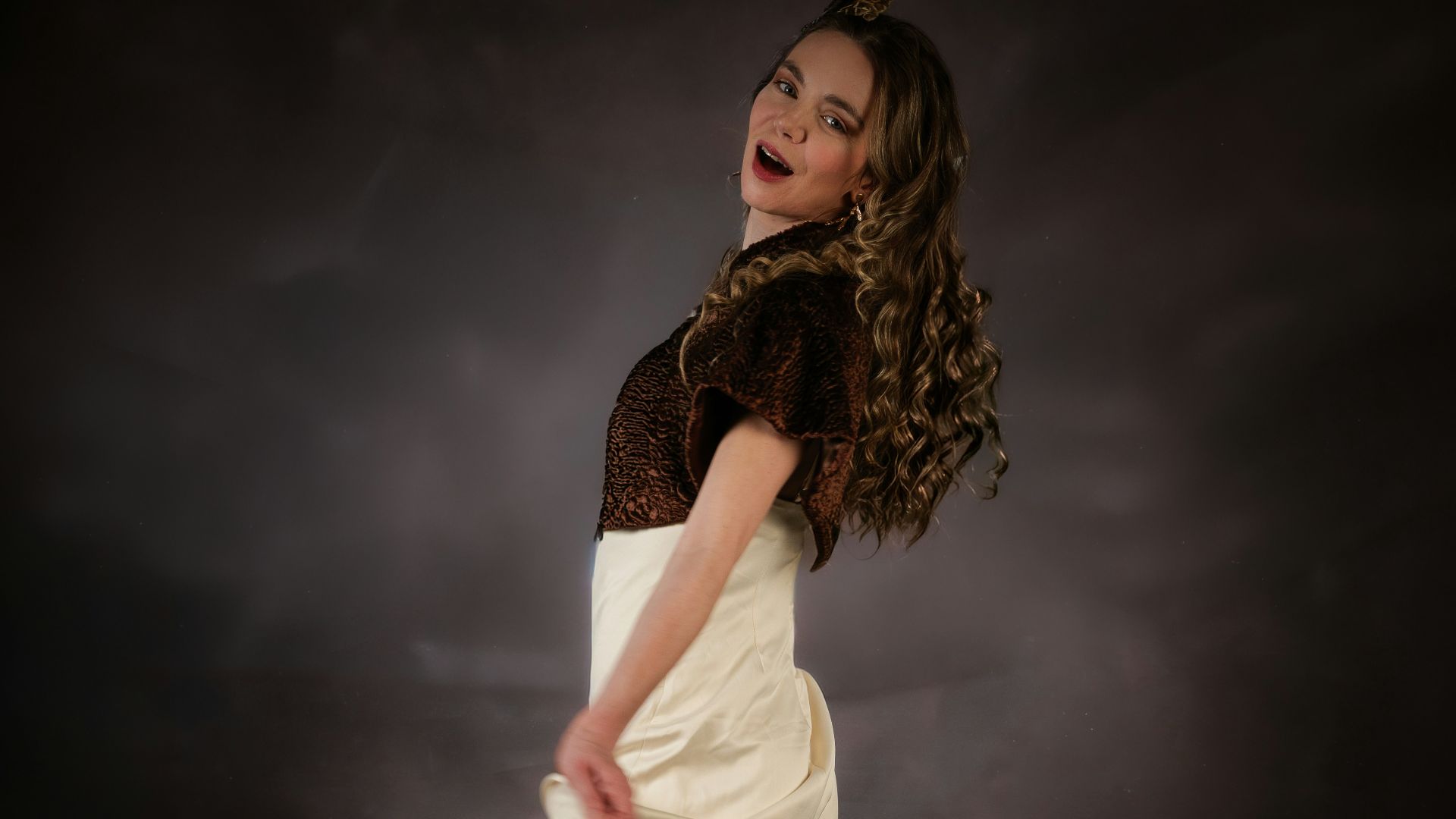
6. Chocolate Brown and Ivory
Chocolate brown and ivory create warmth and contrast at the same time. The darker tone gives structure, while ivory lightens the overall appearance subtly.
7. Sage Green and White
Sage green offers a muted natural tone that pairs cleanly with bright white. The result feels fresh, organized, and visually calming without looking too plain. Many people use this combination because it works well in both minimalist and traditional styles.
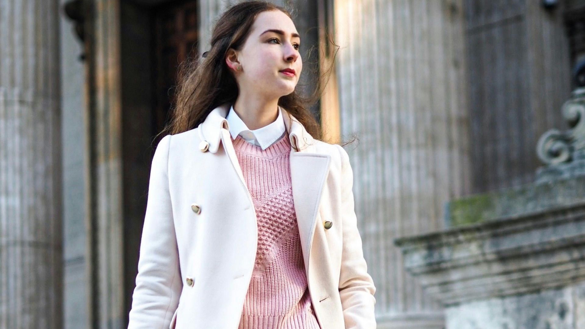
8. Charcoal and Dusty Pink
Charcoal gives depth to dusty pink and prevents it from looking overly sweet or decorative. The muted pink softens the darker shade while still maintaining a mature appearance.
9. Denim Blue and Tan
Denim blue and tan create an effortless combination that still looks thoughtfully styled. The earthy warmth of tan balances the casual coolness of blue very naturally. This pairing remains popular because it works equally well in relaxed and semi-formal settings.
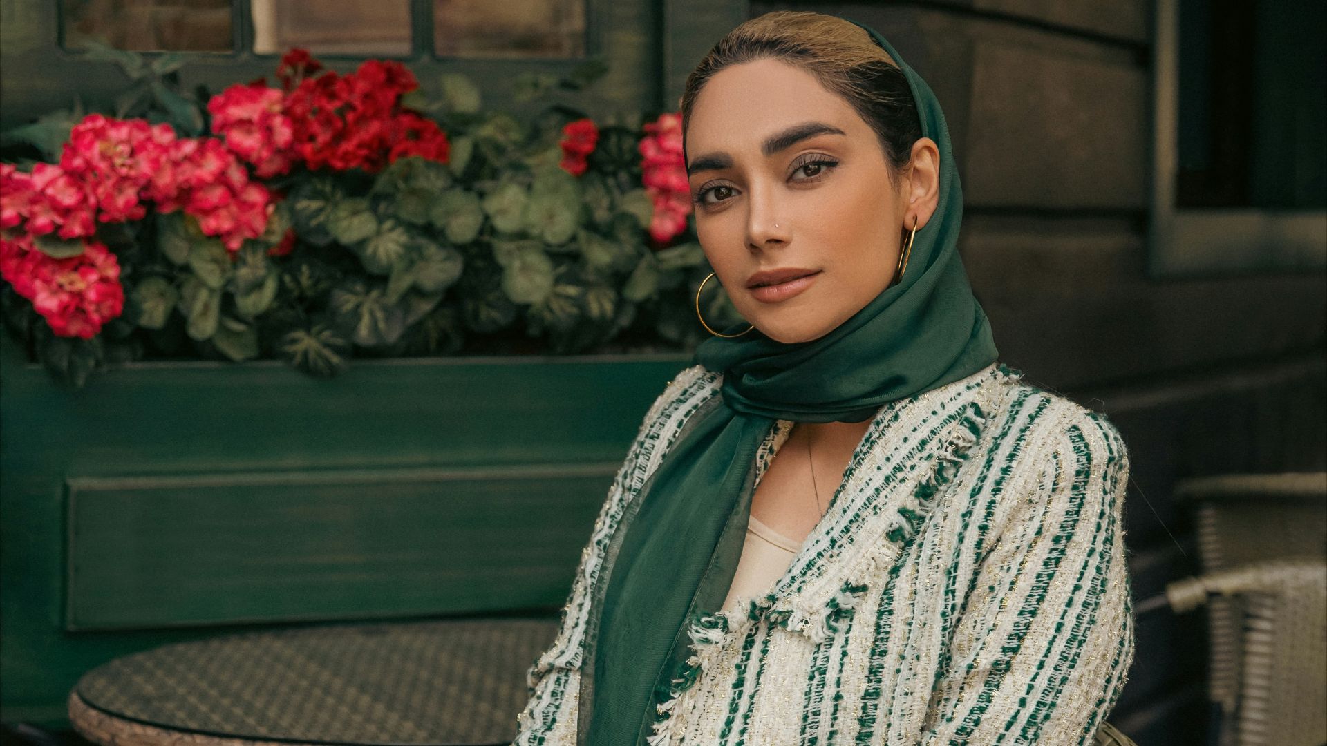
10. Forest Green and Gold
Forest green and gold create a rich appearance often associated with luxury and traditional elegance. The deep green keeps the metallic tone from looking flashy or overpowering. Used carefully, this combination can make both fashion and interiors feel more upscale.
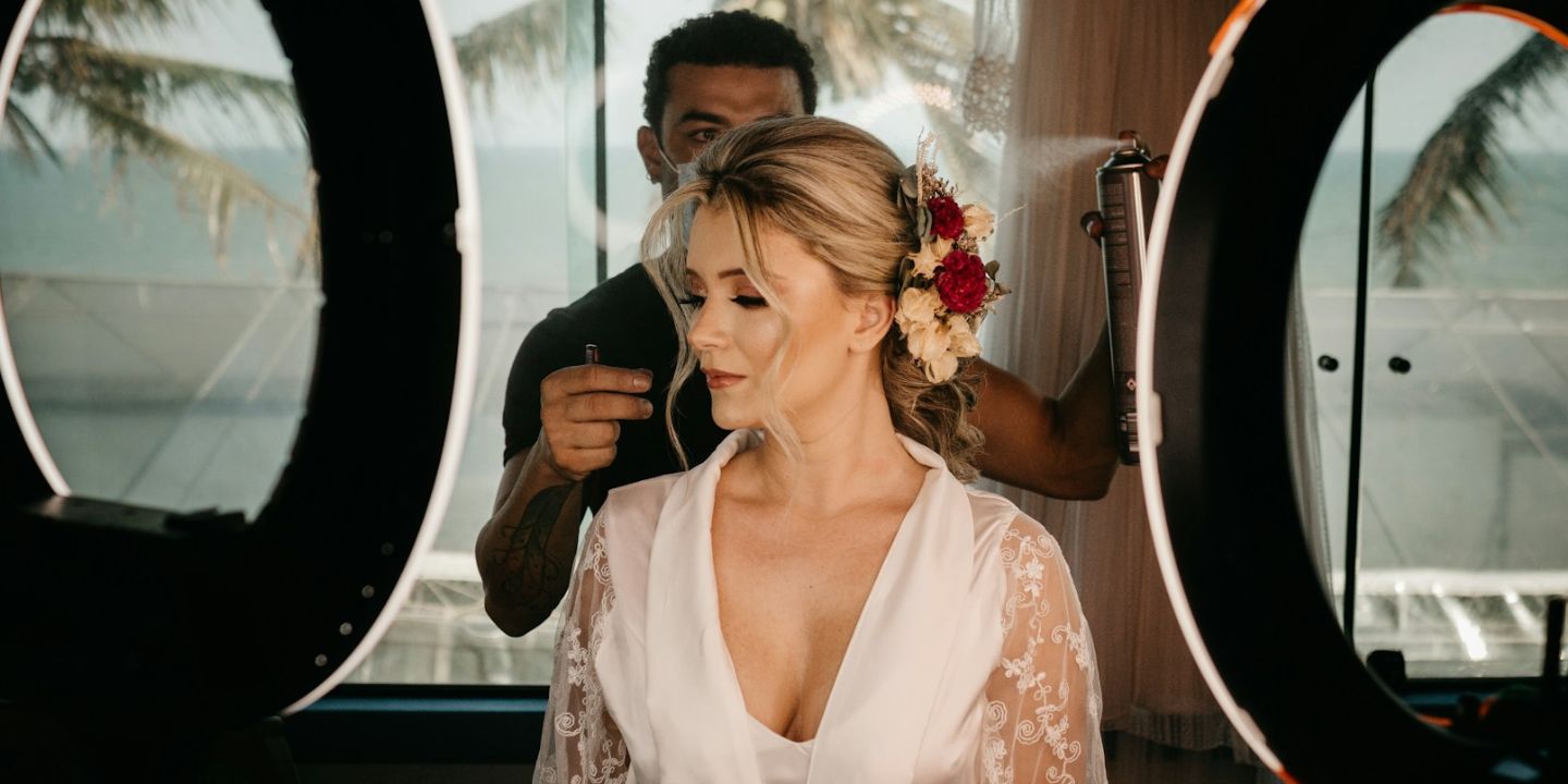
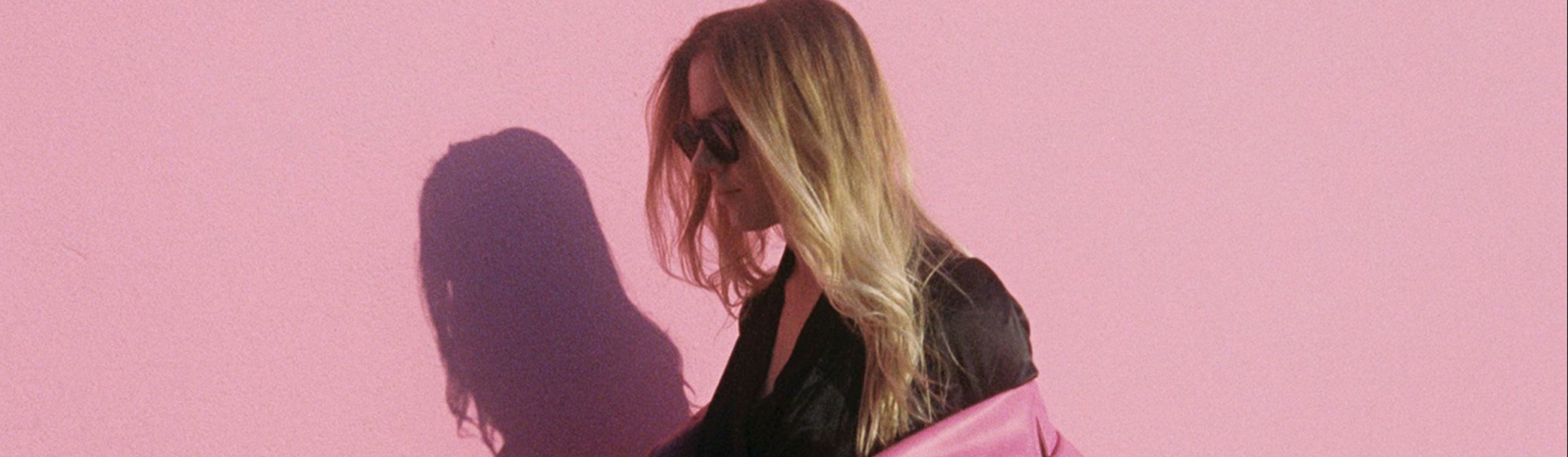
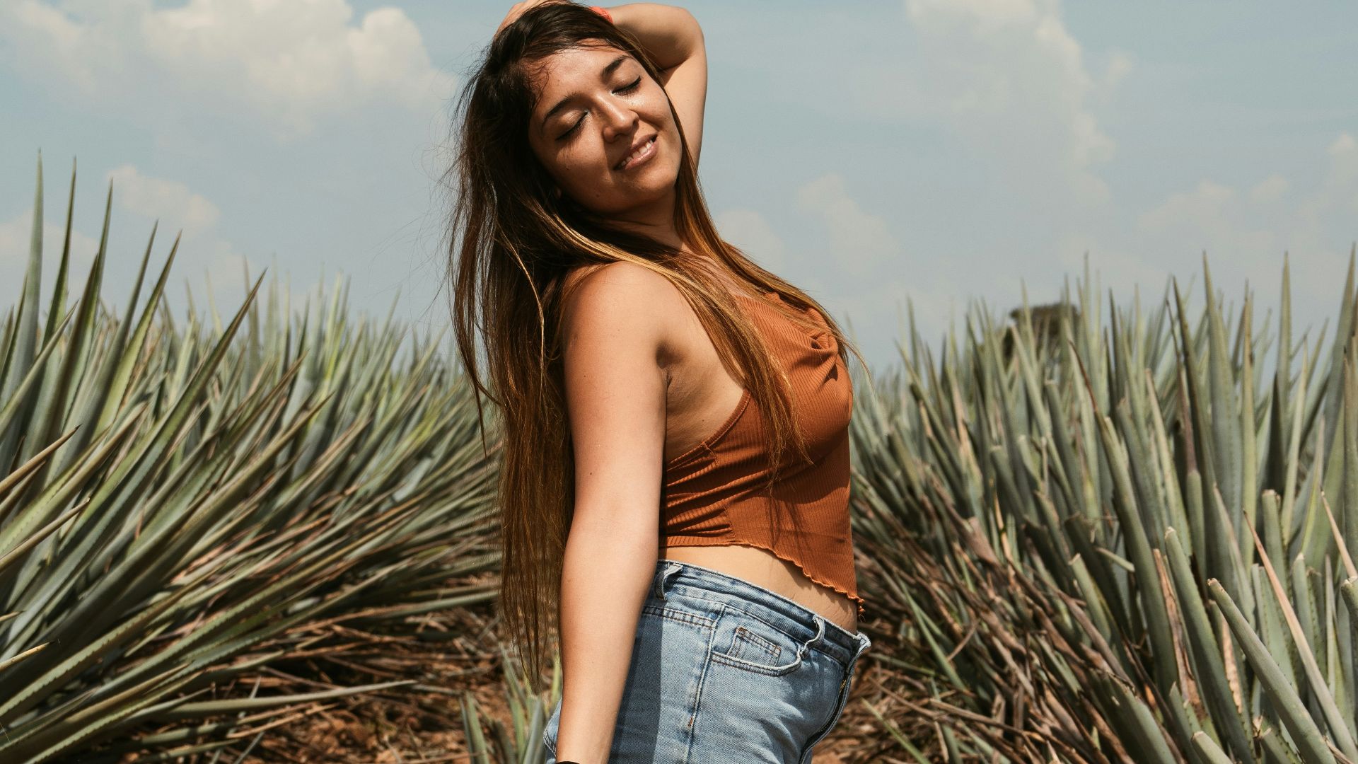
 Benjamin Wedemeyer on Unsplash
11. White and Light Gray
White and light gray create a clean layered appearance that feels modern and polished. The subtle contrast prevents the look from feeling sterile while still maintaining simplicity. This combination is commonly used in minimalist spaces because it creates brightness without harshness.
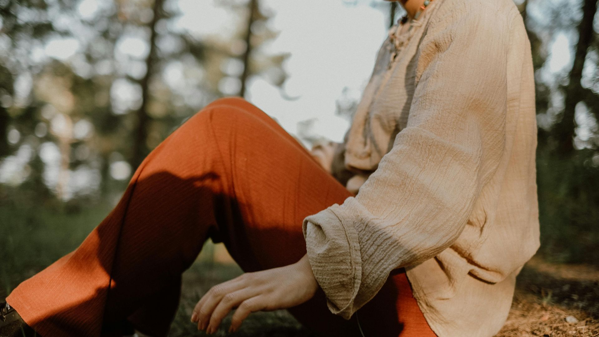
12. Rust and Cream
Rust brings warmth and personality while cream keeps the pairing soft and balanced. The colors complement each other naturally without creating excessive contrast. Together, they often create a cozy but refined appearance in both clothing and décor.
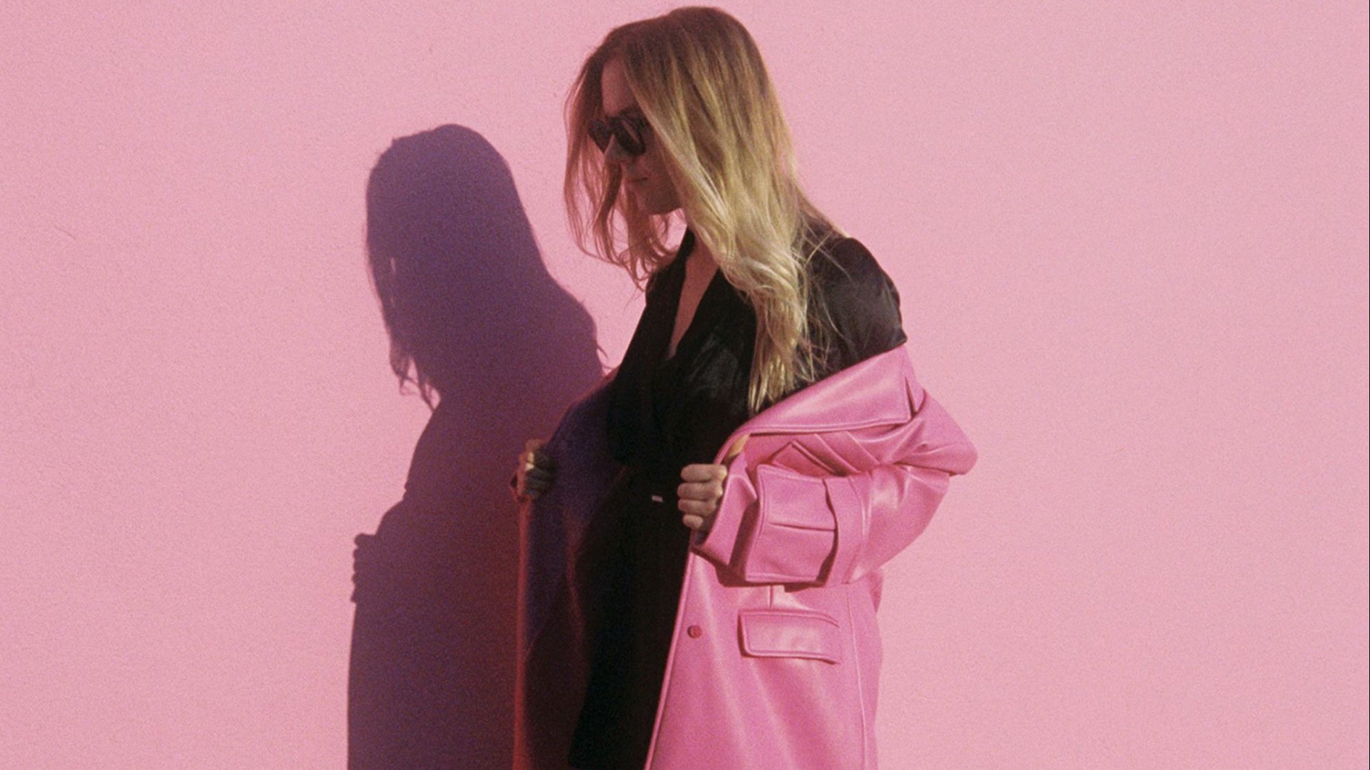
13. Black and Soft Pink
Black gives structure to soft pink and helps the lighter color appear more sophisticated. The contrast feels polished because the softness of pink balances the intensity of black. This pairing works especially well when the pink shade remains muted rather than bright.
14. Taupe and White
Taupe and white create a soft neutral palette that feels calm and elegant. The understated tones work well together because neither color dominates the overall look.
15. Emerald Green and Cream
Emerald green adds richness while cream softens the intensity of the jewel tone. The pairing feels polished because it combines bold color with a lighter neutral balance. This combination often appears in formal fashion and upscale interior styling.
16. Light Blue and Sand
Light blue and sand tones create a relaxed appearance inspired by coastal color palettes. The warmth of the sand prevents the blue from feeling too cool or distant. Together, they create a fresh and polished look without seeming overly styled.
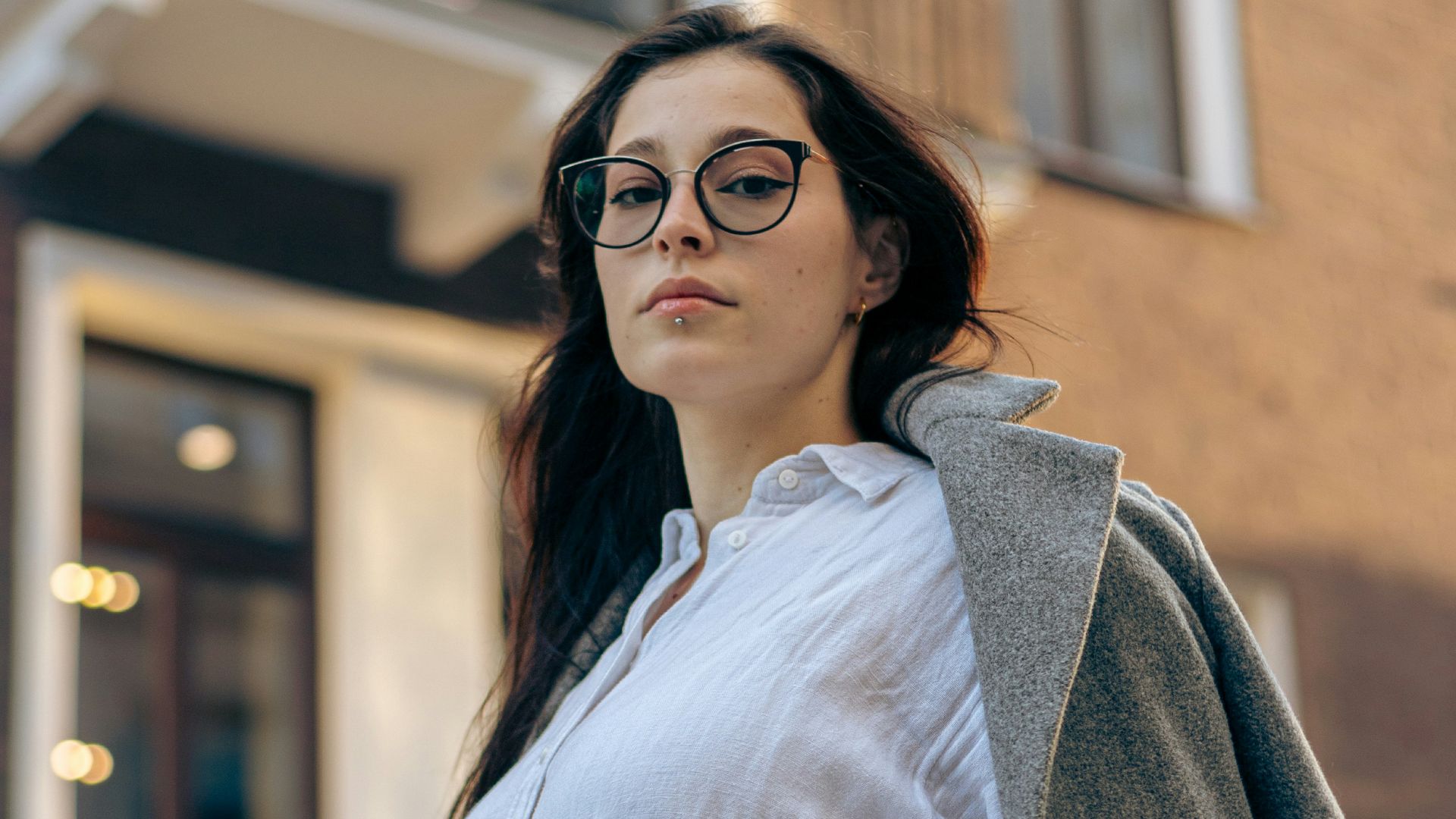
 Abdul Raheem Kannath on Unsplash
17. Plum and Gray
Plum introduces depth and richness, while gray keeps the combination balanced and mature. The muted neutral helps the darker purple appear refined rather than dramatic. This pairing is often used when people want color without overwhelming brightness.

18. Black and White
Black and white remain one of the most polished combinations because of the strong contrast and simplicity. The pairing works across nearly every design style, from modern to classic.

19. Terracotta and Beige
Terracotta brings warmth and personality, while beige keeps the palette grounded and soft. The combination feels natural and polished because the earthy tones complement each other easily. These colors are especially popular in modern interiors and relaxed fashion styling.
20. Navy and Blush
Navy gives structure and depth, while blush softens the overall appearance. The contrast feels elegant because the darker shade balances the lighter tone without overpowering it. This combination works well in fashion, weddings, and home décor because it feels refined but approachable.