Your Ultimate Color Confidence
The color you're wearing right now is reflecting your entire silhouette. While we obsess over cuts and fits, the color of our clothing works quietly yet powerfully to create optical illusions that either enhance or undermine our appearance. Some sculpt and streamline with effortless elegance, while others inadvertently add visual weight we never intended. Let's discover which ones work their magic first.
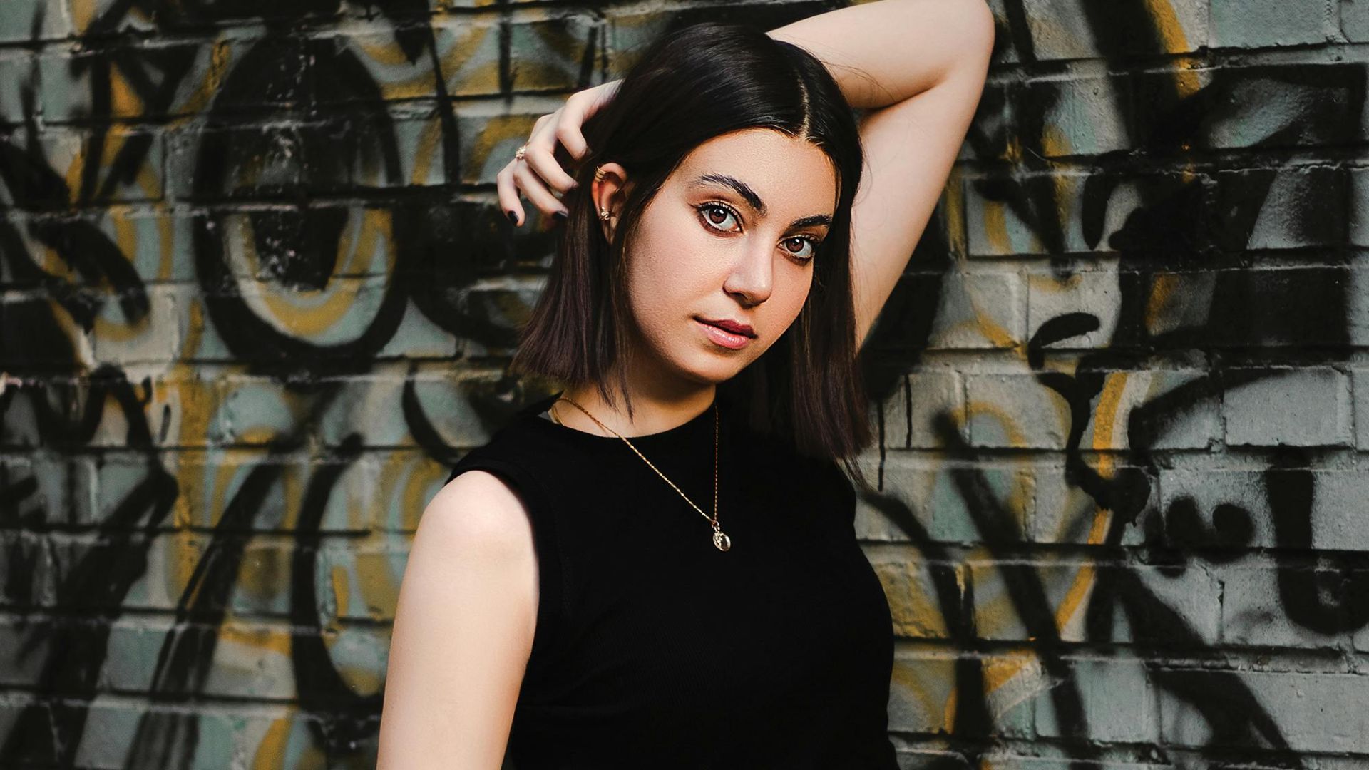
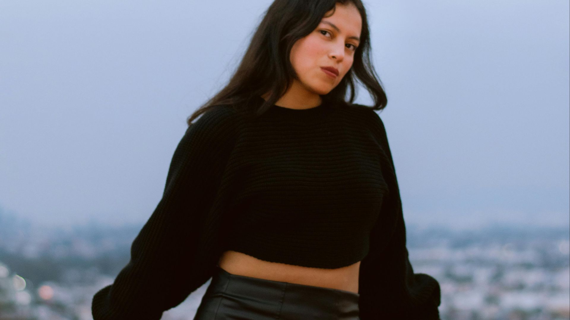
1. Black
Designers rely on black for a reason. Black absorbs light instead of reflecting it, which smooths visual breaks across the body. That seamless effect elongates everything—exactly why black remains fashion’s most trusted slimming shortcut.
2. Navy Blue
Think of navy as black’s softer cousin. Its cool depth pulls the eye inward to reduce width without feeling severe. Because it supports uninterrupted vertical lines, the navy quietly lengthens the frame, especially when worn in matte fabrics.
3. Charcoal Gray
This color merges shadows gently, avoiding the sharp contrast that highlights curves. Its softer recession makes the body appear longer and leaner, which is why charcoal works so well in tailoring and everyday wear alike.
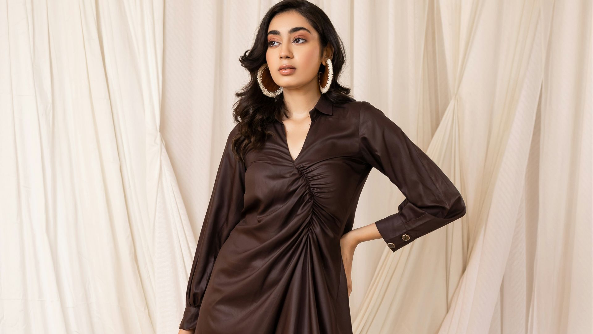
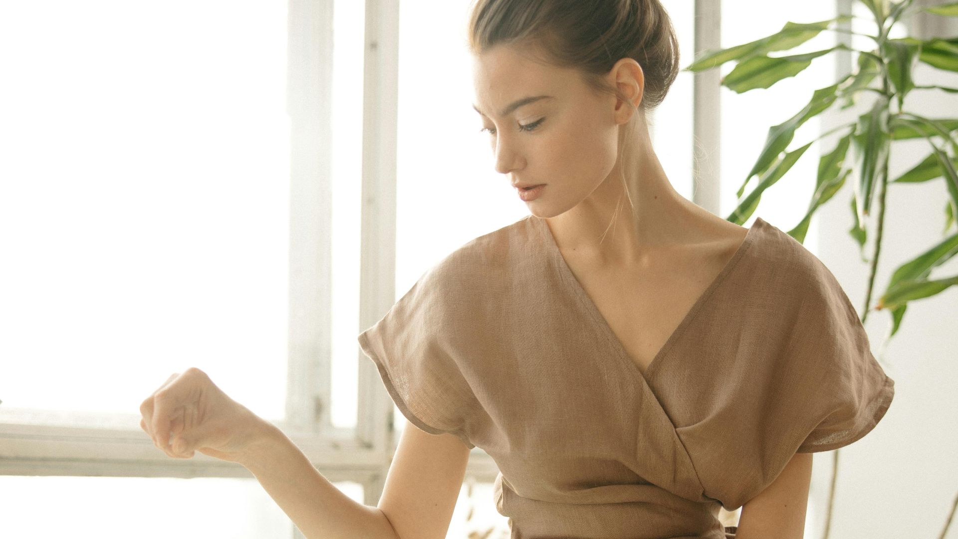
4. Chocolate Brown
Warm doesn’t have to mean widening. Chocolate brown absorbs light through richness rather than darkness, which disguises volume naturally. When styled head-to-toe, it creates subtle shadow lines that slim the silhouette while keeping the look elegant.
 GLOBALDSIO IT SOLUTION on Unsplash
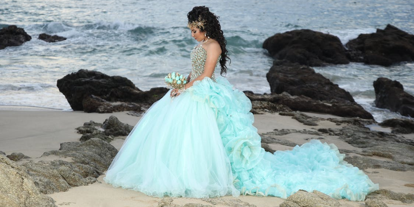
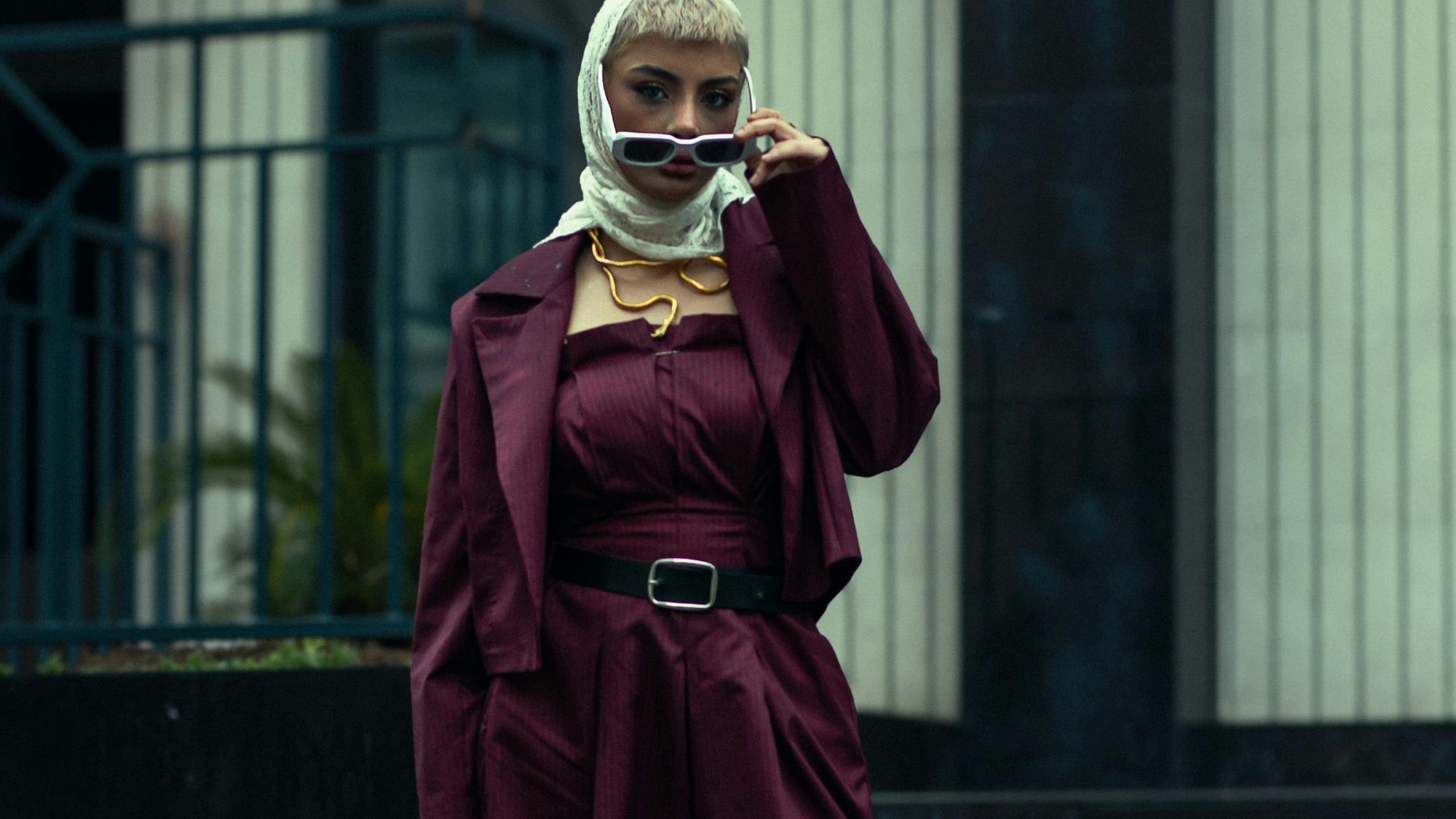
5. Deep Burgundy
There’s a reason burgundy shows up in eveningwear so often. Its jewel-like depth minimizes surface reflection and hides inconsistencies. The payoff is a streamlined effect that feels luxurious without visually expanding the body.
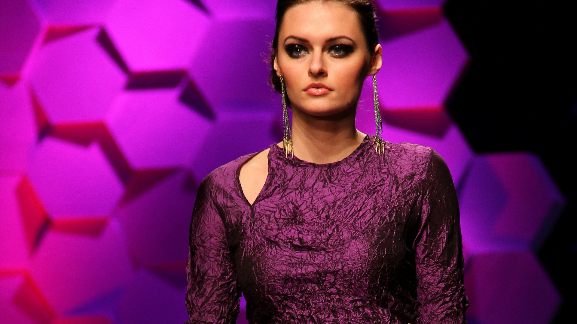
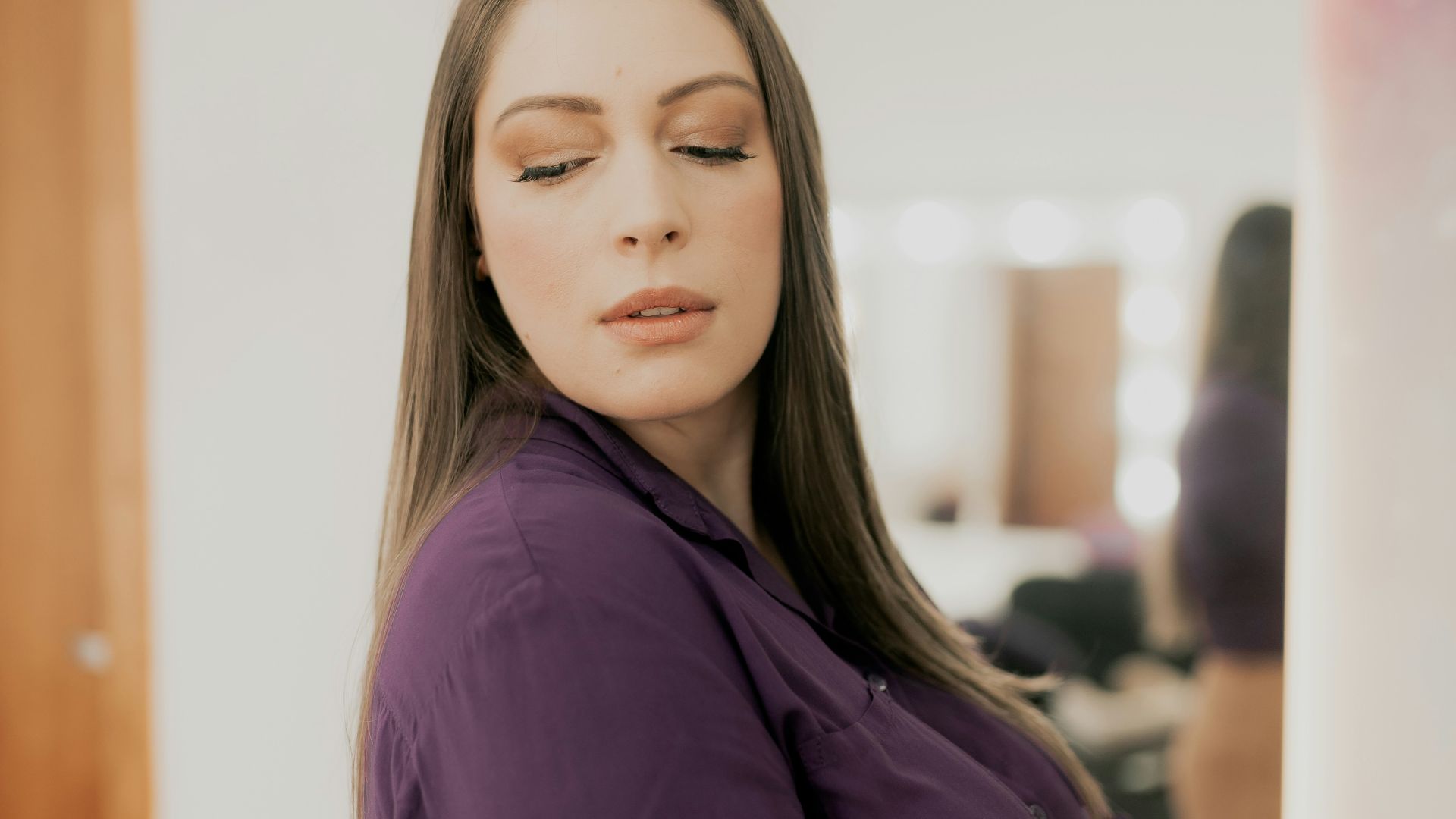
6. Eggplant Purple
Eggplant works by creating depth, not contrast. The hue’s cool undertones push the color backward visually, which helps curves recede instead of standing out. Its result feels dramatic yet controlled—a bold shade that slims without relying on black.
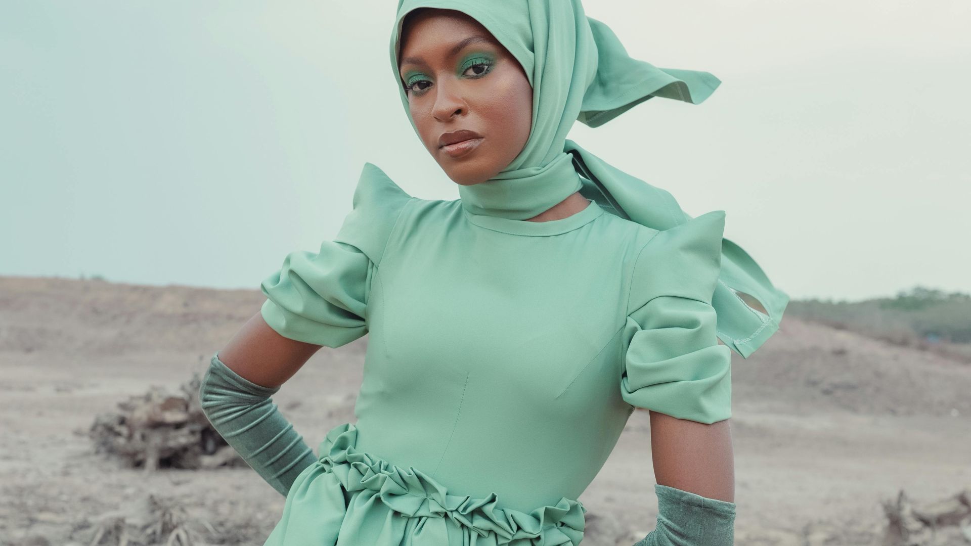
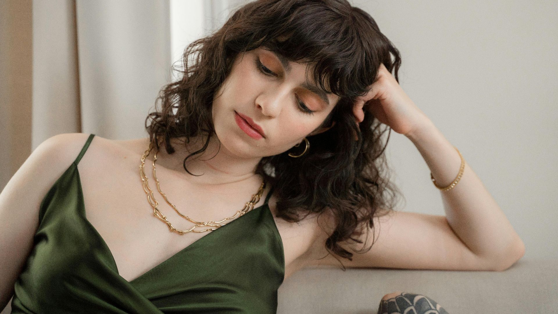
7. Forest Green
This shade doesn’t rely on drama to slim the body. Instead, its muted depth absorbs light gently to prevent curves from standing out. Because the color sits visually closer to the frame, outfits feel calmer and more naturally balanced by the end.
8. Indigo
Long before color theory had a name, indigo was already doing the work. The shade naturally minimizes width with soft shadow lines. Instead of drawing attention outward, it keeps the eye moving vertically, which delivers an effortless slimming effect.
9. Deep Olive Green
There’s something grounding about deep olive. Its darker, dusted finish pulls the eye inward, softening outlines without adding heaviness. This color reads streamlined rather than bulky, which explains why it’s often favored for relaxed yet slimming silhouettes.
10. Dark Teal
Dark teal plays a visual balancing act. The blue element cools and recedes, while green softens the effect. Together, they absorb light smoothly by helping the silhouette appear elongated rather than wide, especially in structured or matte fabrics.
Even with all the right shades working in your favor, color can just as easily do the opposite, which brings us to the hues that tend to draw the eye in all the wrong ways.
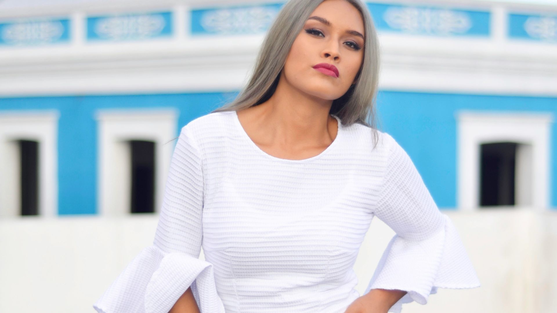
1. White
Brightness is white’s biggest drawback. Its reflective nature breaks up the body visually by interrupting elongation and making areas appear larger. Unless balanced with texture or darker elements, white often emphasizes volume rather than minimizing it.
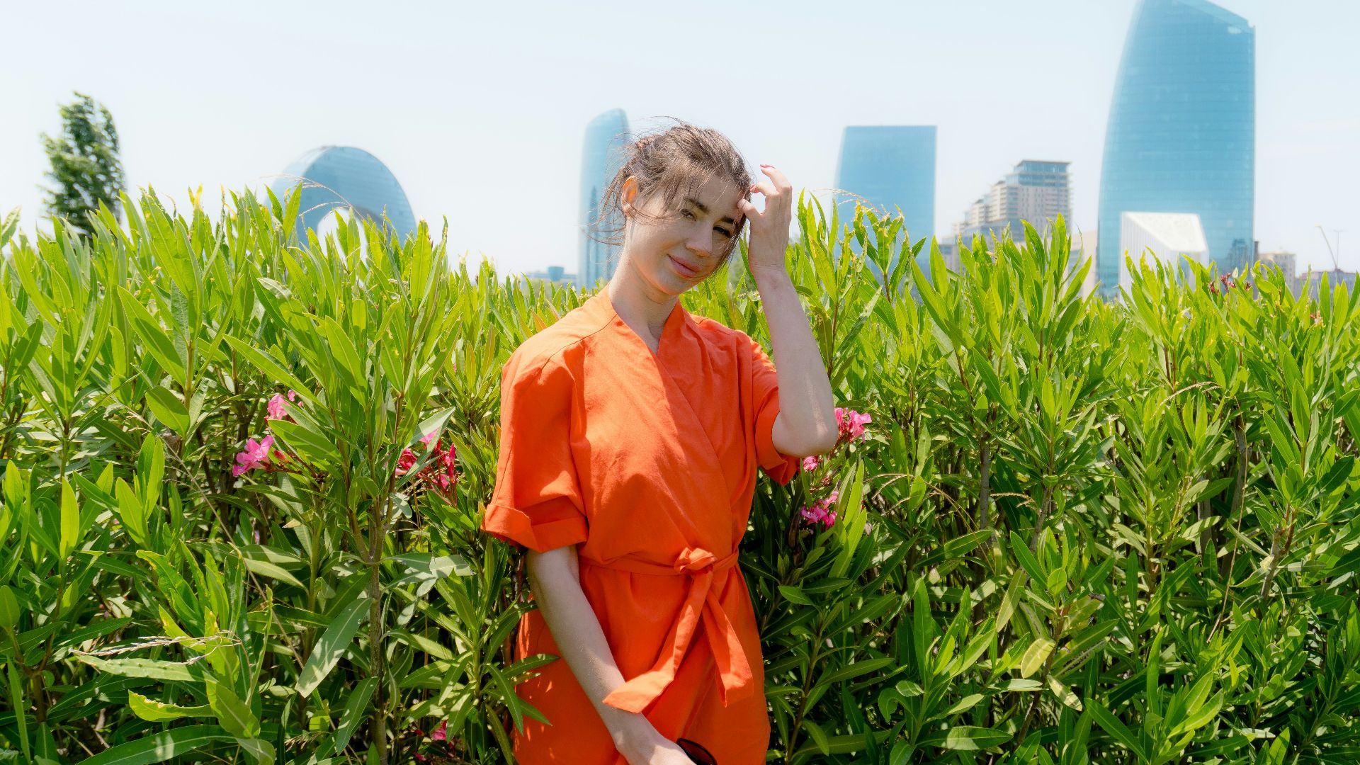
2. Orange
The moment orange enters an outfit, it commands attention. Bright and warm, it advances toward the eye, widening how the body is perceived. That outward reflection of light emphasizes volume, which makes streamlined shapes feel fuller than intended.
3. Pearl
What makes pearl tricky is its glow. This pale, luminous tone reflects light evenly, reducing shadow and adding fullness. Without movement or texture, the color expands visually, which explains why it can feel less forgiving on the silhouette.
4. Lilac
The challenge with lilac lies in its lightness. Warm undertones mixed into the pastel push the color outward to reduce visual depth. That forward movement interrupts elongation. It causes the frame to appear wider rather than streamlined.
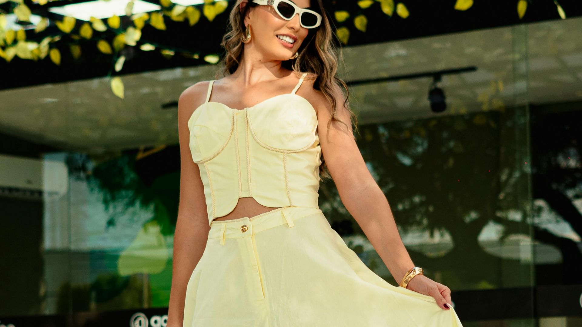
5. Light Yellow
Light yellow reads as cheerful rather than subtle. High brightness reflects light straight back onto the body, and this highlights contours and surface texture. That added emphasis draws the eye to every detail, which explains why deeper yellow tones usually appear more flattering.
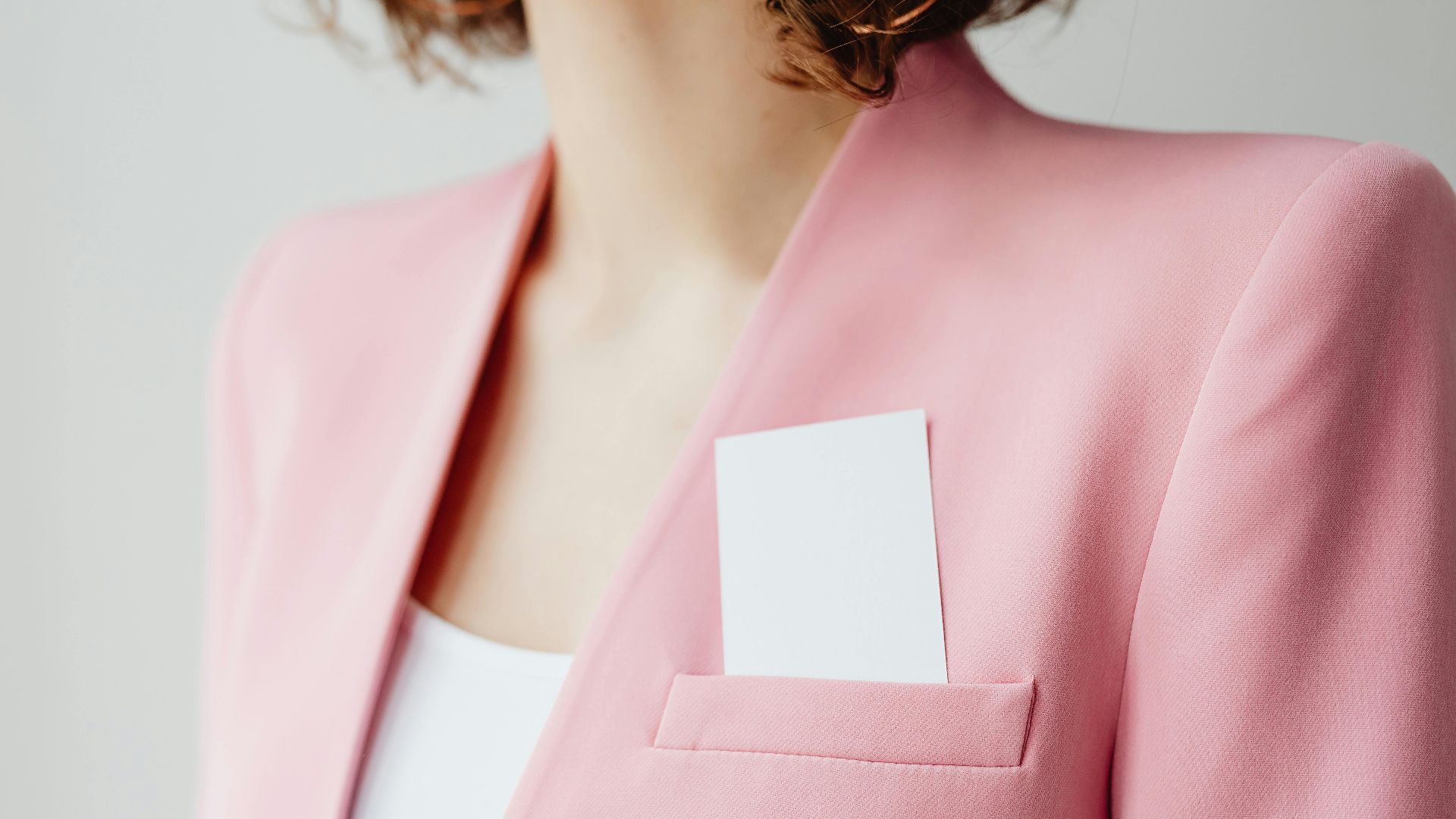
6. Pastel Pink
Pastel pink looks soft, but the effect can mislead. Strong lightness pushes the color forward visually, making curves stand out more. Clean lines lose definition rather than stretch the body, creating a rounder overall impression.
7. Beige
At first, beige seems harmless. In practice, the pale warmth reflects light evenly, reducing shadow where it’s needed most. That lack of depth makes shapes appear fuller, especially when the outfit relies on smooth, uninterrupted fabrics.
8. Cream
Cream feels gentle, but the color visually advances. Bright, light tones spread illumination across the body and reduce natural shadowing. With fewer shadows to create depth, shapes appear more pronounced rather than smoothly streamlined.
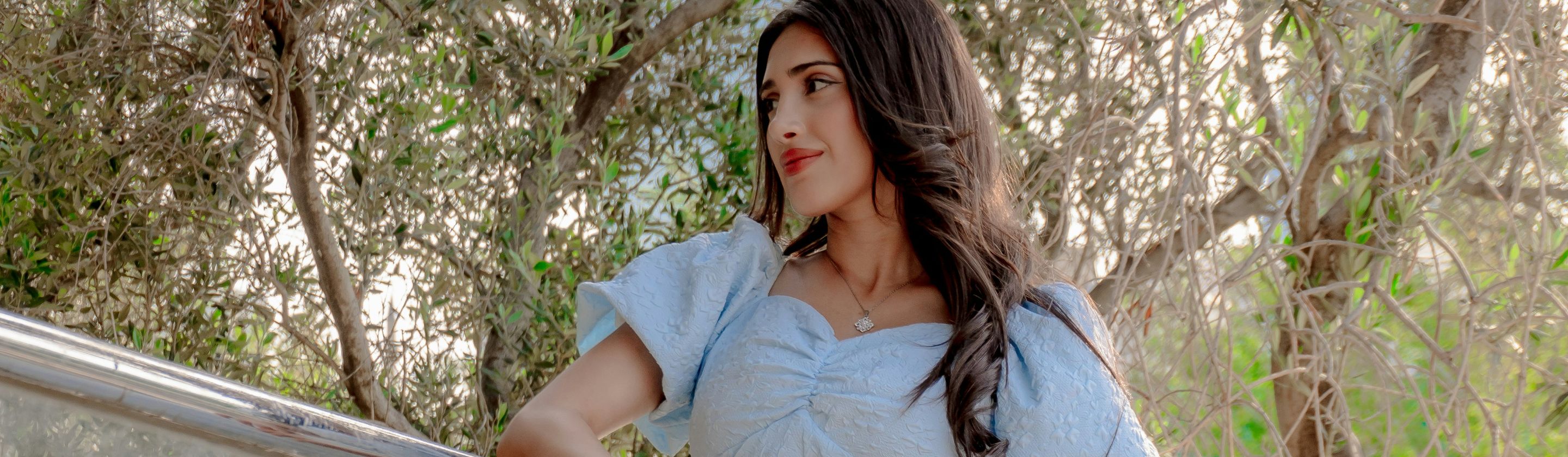
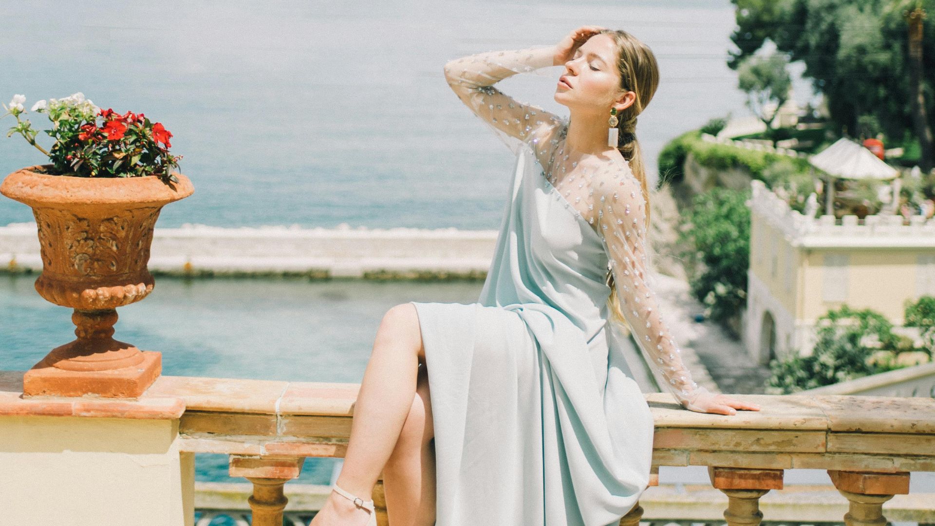
9. Light Blue
This beautiful shade looks calm and breezy, yet visually it appears expansive, just like the sky. Light blue reflects light to flatten depth and highlight contours. Without a darker contrast, the body appears slightly wider, especially in smooth, uninterrupted outfits.
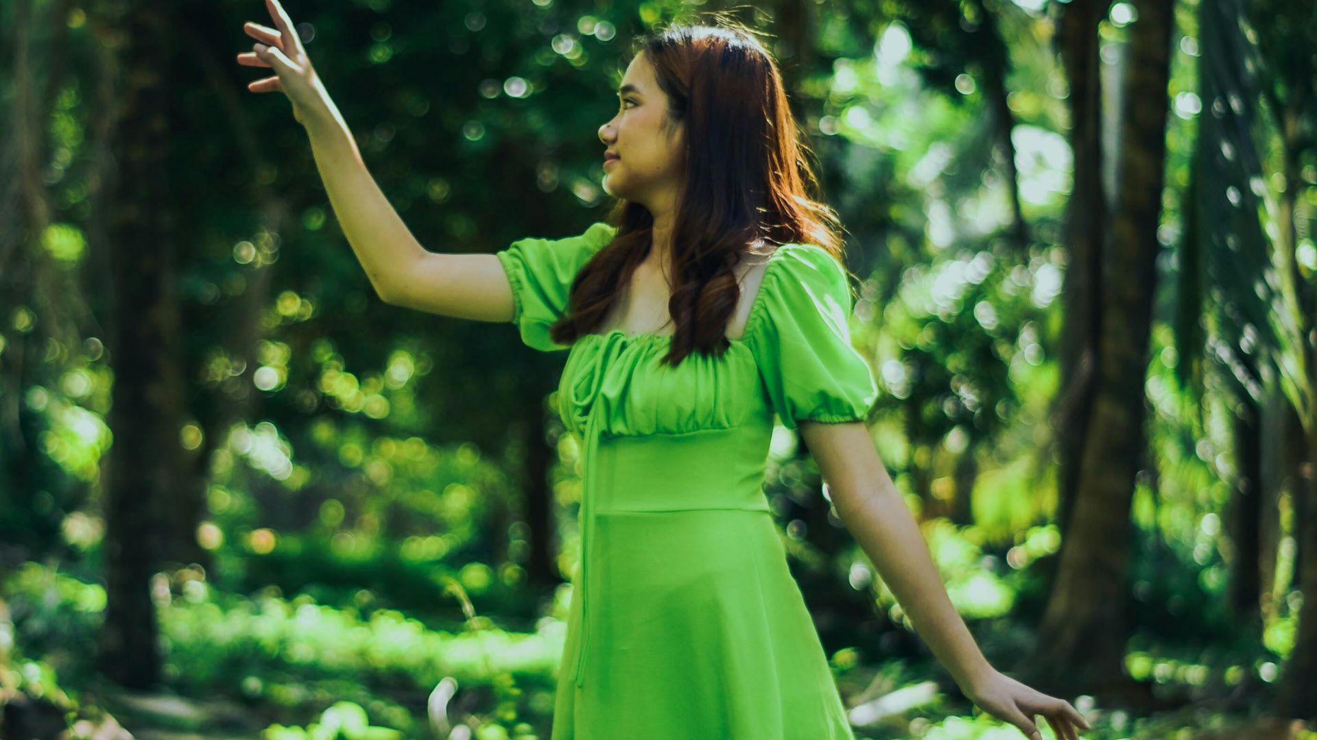
10. Pastel Green
Pastel green brings freshness. Its light saturation advances toward the eye, which breaks clean vertical lines. With little shadow to pull the color back, the silhouette loses structure by making the body appear softer and broader than intended.