Colors That Define Winter
Every winter, something feels off about certain outfits—and it’s often the color, not the cut. Cold weather changes how shades show up, making some feel elevated and others strangely tired. Right now, that contrast is sharper than ever! If your winter wardrobe feels stuck, the reason might be simpler than you think.
1. Bitter Chocolate
Plant and bark-based dyes laid the foundation for chocolate-brown shades centuries ago. Bitter chocolate, inspired by dark cocoa, absorbs light with ease, and that grounding quality explains its long-standing presence in winter leather and outerwear.
 Ion Ceban @ionelceban on Pexels
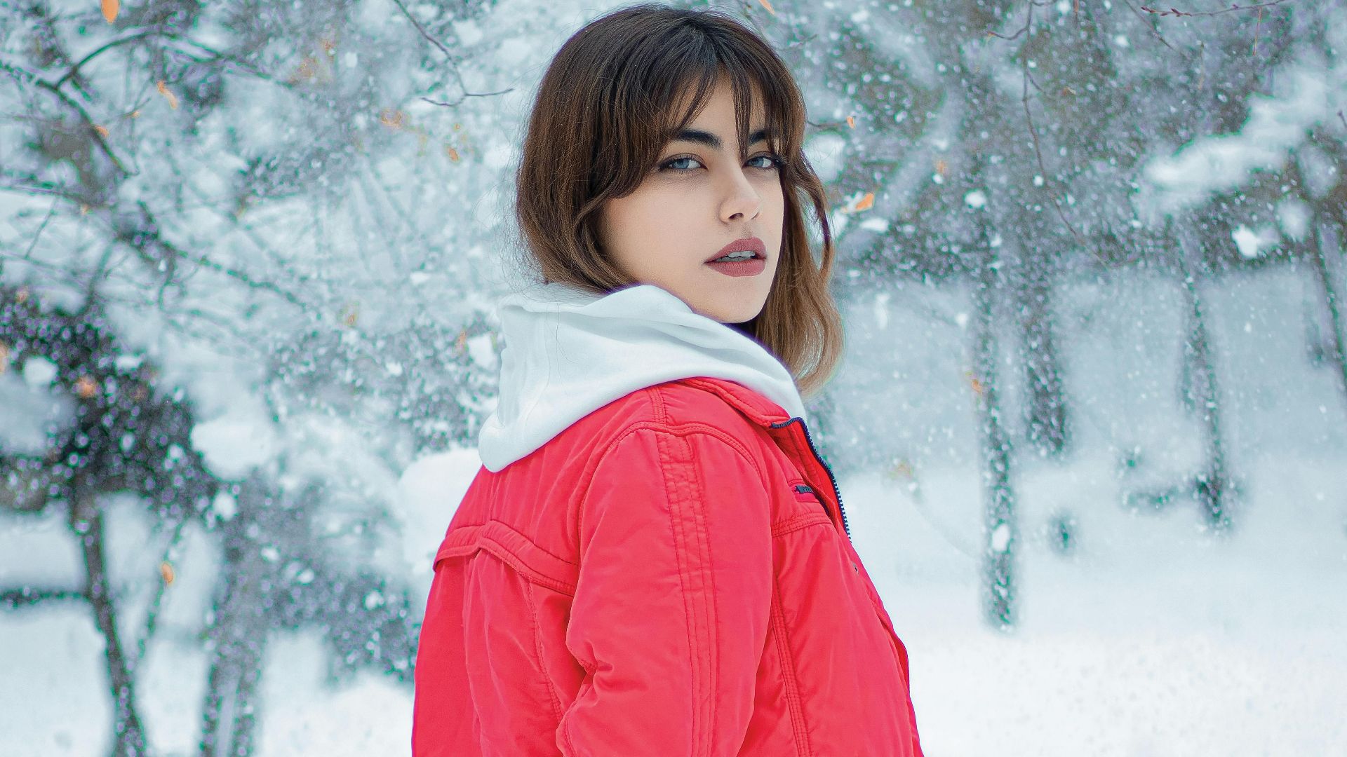
2. Scarlet Red
Bright red with subtle orange undertones radiates warmth and vitality across cultures. Scarlet pigments also came from cochineal insects, which made each garment a vibrant statement of purpose and passion—something we could all use in the winter.
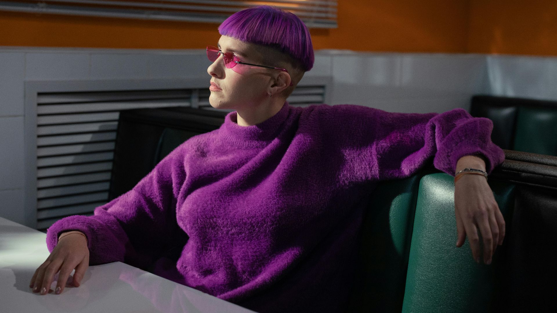
3. Aubergine
It may be hard to pronounce, but it's not hard to wear! Aubergine offers an alternative to black that still feels serious. The dark purple shade borrows its name from the eggplant and once signaled status through rare dyes. Combined with dark tones, it creates the exact winter richness your wardrobe needs.
4. Lavender Haze
Soft and pale, lavender haze takes its name from natural lavender flowers. It has long represented calm and relaxation in a number of products, but it brings the same serenity to your clothes. Light purples also effectively soften dark winter palettes to offer a breath of calmness and color block.
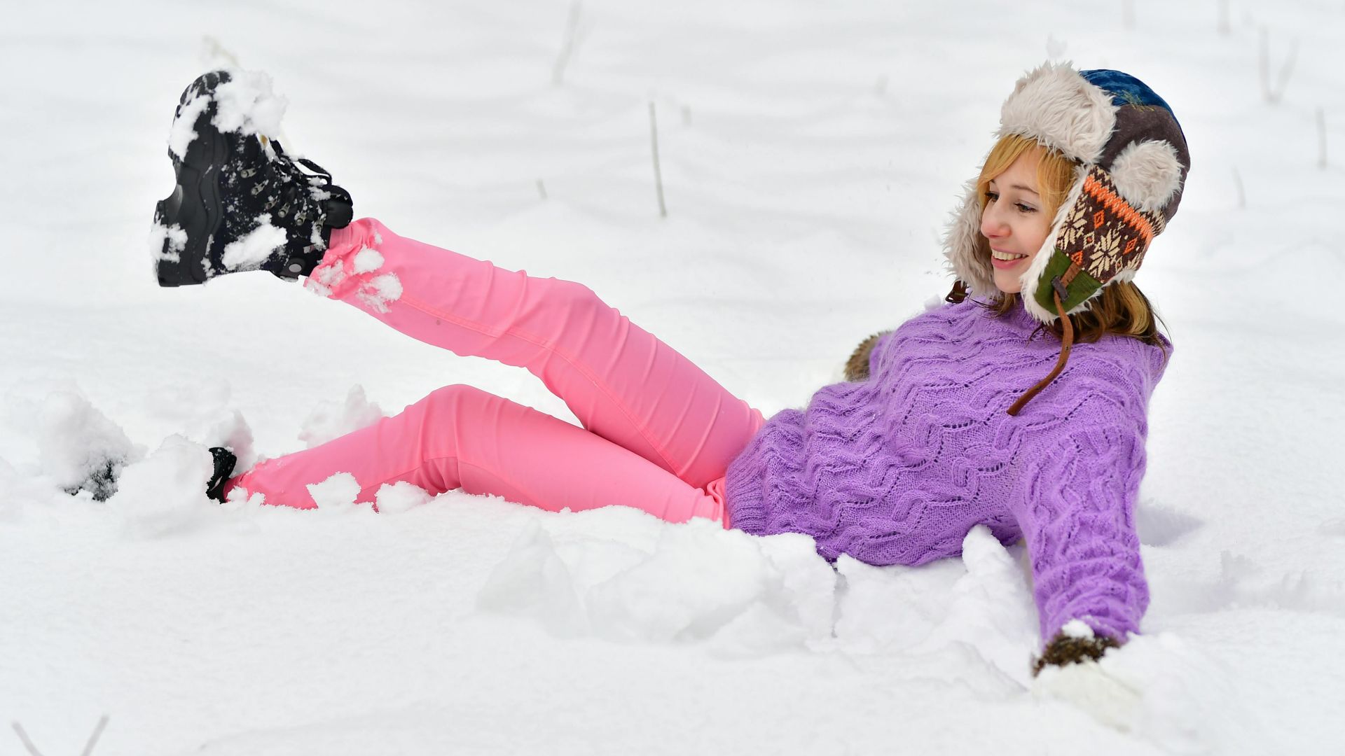
5. Powder Pink
Mid-century fashion widely embraced powder pink's understated elegance, so there's no reason you shouldn't either! The muted tone gives subtle contrast against wool's heavier texture, adding dimension to winter outfits. It's also a shade just about anyone can rock with confidence.
6. Yves Klein Blue
Artist Yves Klein trademarked this intense ultramarine blue during the 1960s by believing it captured infinity's essence. Of course, we'd have to agree! The shade's remarkable pigment saturation forms visual depth unlike any other, and its bold intensity makes it a striking choice for contemporary winter fashion statements.

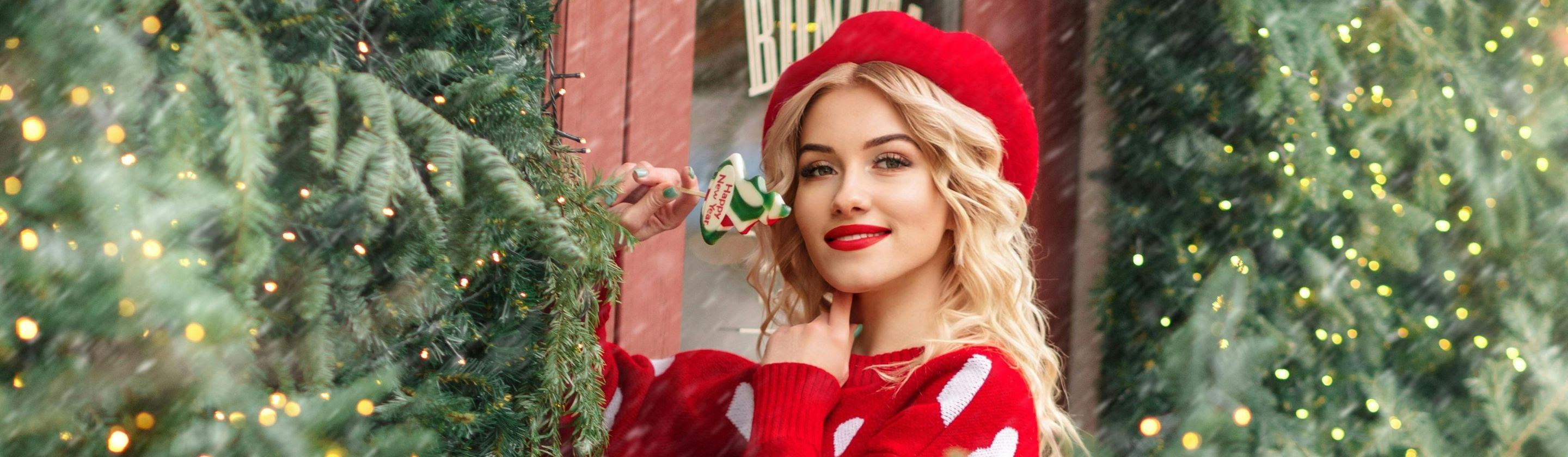
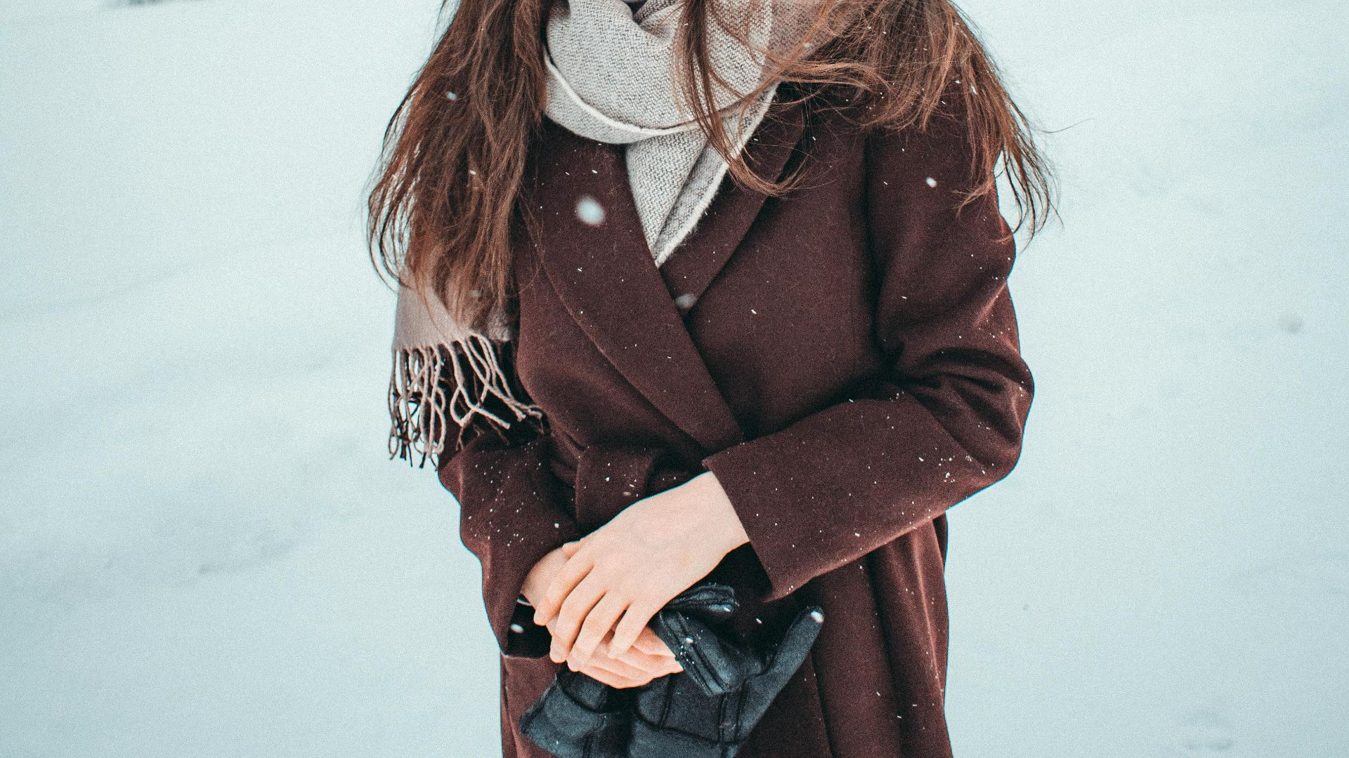
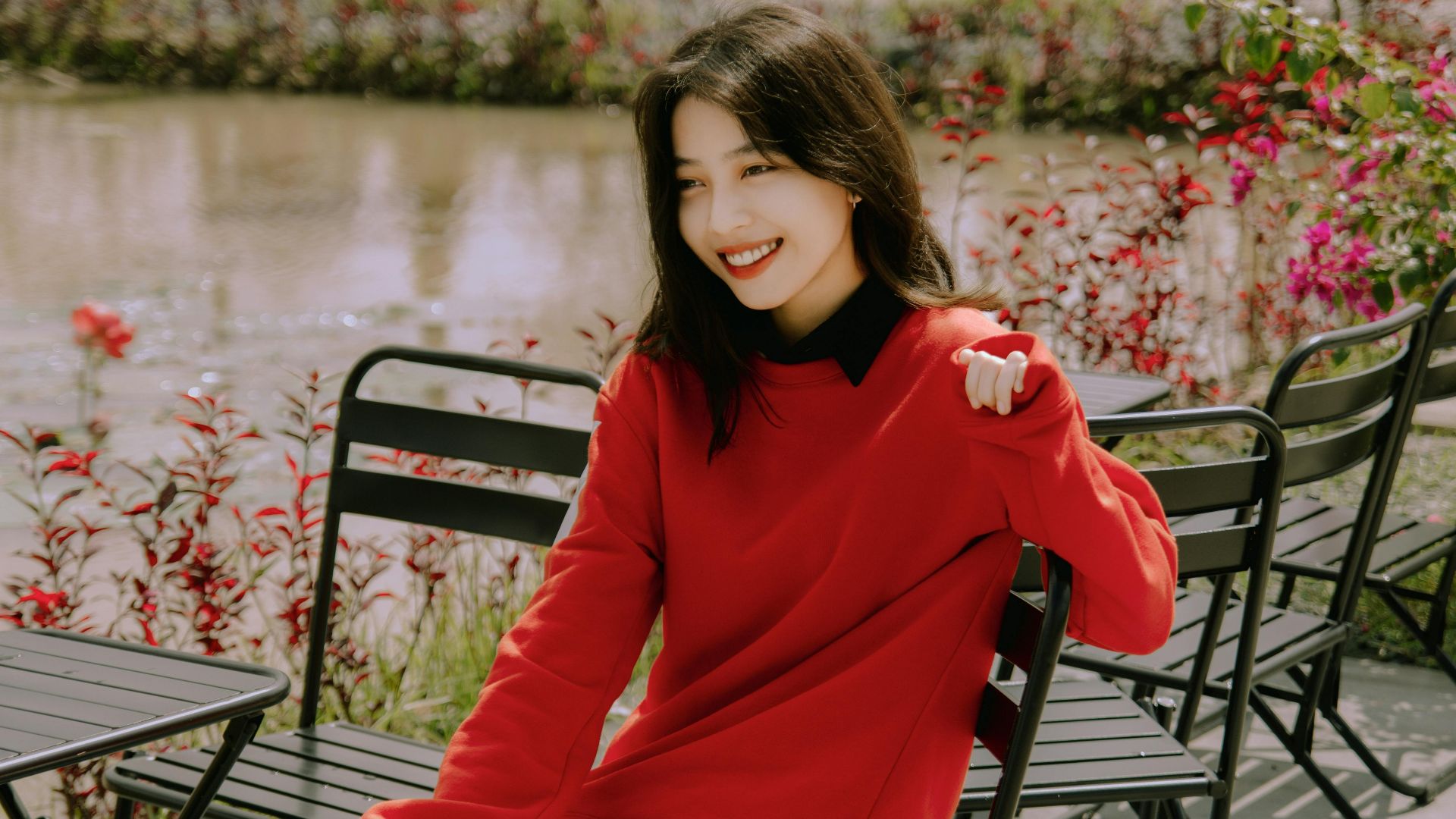
7. Burgundy
For centuries, cold-weather wardrobes have relied on burgundy. The dark red shade, marked by soft purple undertones, takes its name from France’s famous wine region. Don't worry, though—you won't look like someone spilled a fine red down your sweater!

8. Pumpkin Spice
No, this shade isn't just for spooky season. Orange-brown hue adds essential warmth to winter styling through its spice-inspired richness. It also bridges seasonal transitions beautifully to carry autumn's comfort into colder months with effortless appeal.
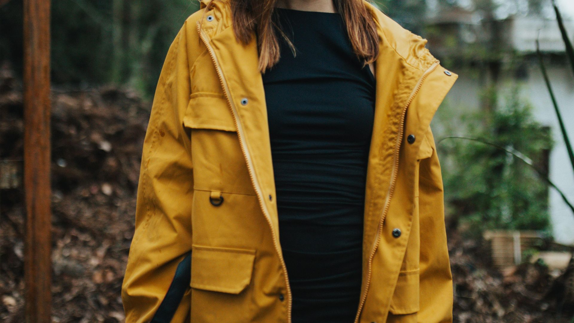
9. Marigold
Named for the flower itself, the rich yellow-orange brings brightness to cold-weather styling. Its warmth cuts through winter's darkness and offers an energizing alternative to traditionally muted seasonal palettes. Don't be afraid to rock it on larger garments, too, like a sweater or a jacket.

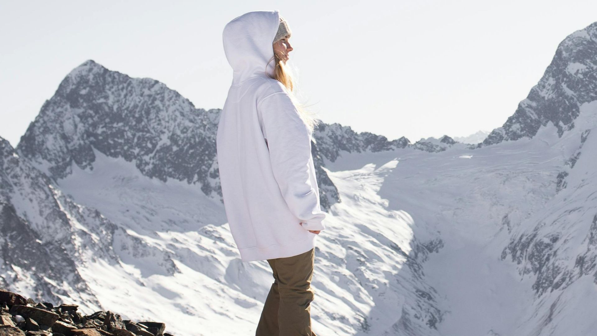
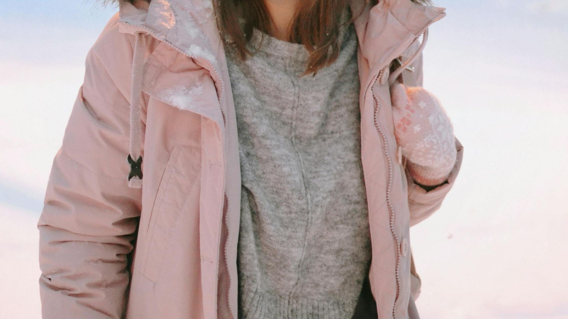
10. Cream
Winter light flatters off-white tones far better than stark, pure white options. This dominates knitwear and outerwear collections to provide timeless appeal! Whether it's in simple accessories or a full-blown knee-length coat, this hue never disappoints.

While these shades feel right for now, others are starting to feel stuck in the past. Let's explore which ones you should probably leave out this season.
1. Classic Black
Once a symbol of restraint and refinement, black has ruled winter fashion for decades. Its strong ties to formalwear and minimalism made it an easy default, but reliance on this classic now feels more habitual than intentional.
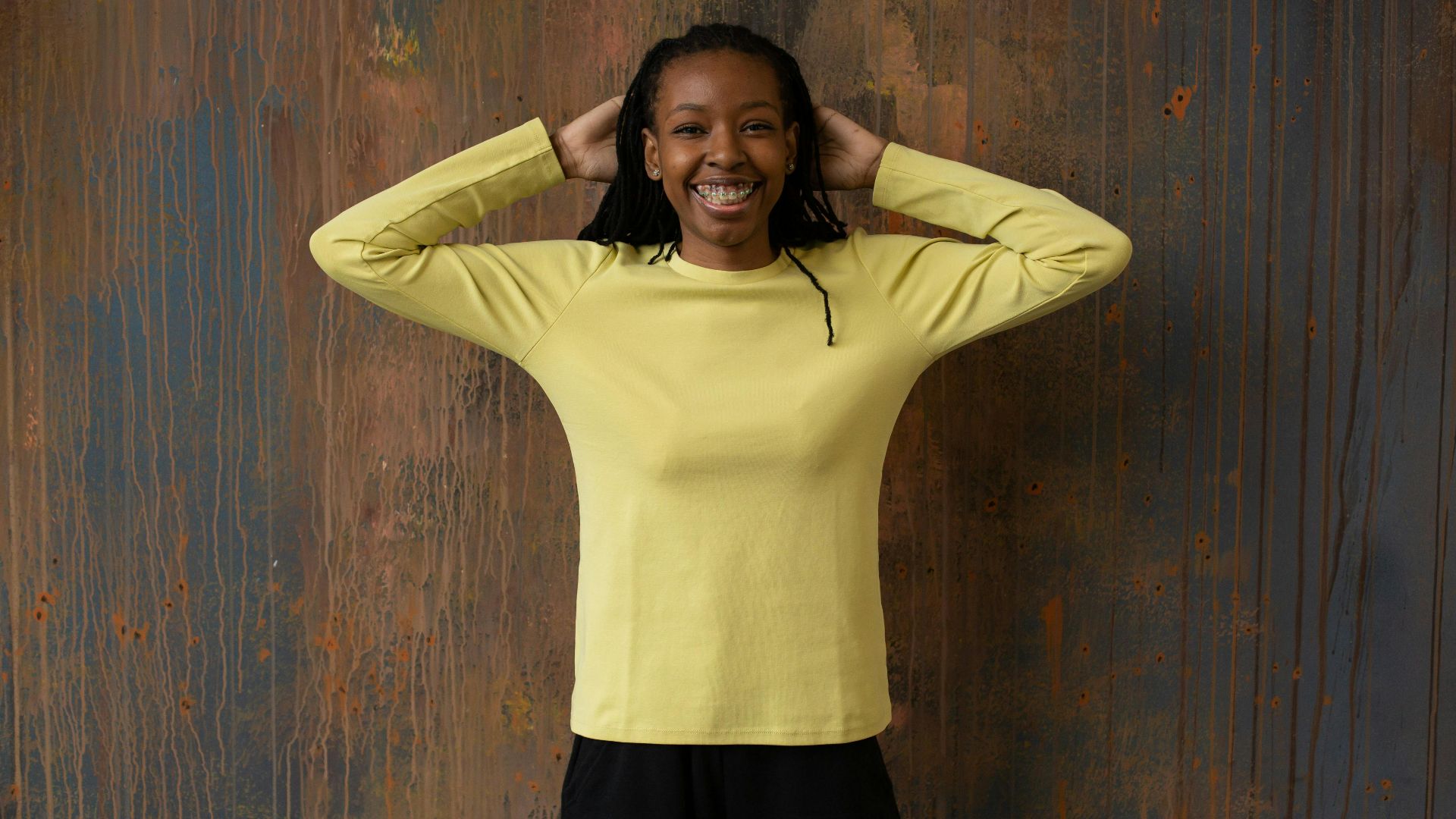
2. Butter Yellow
The best way to describe the color is pale yellow with warm undertones. As you can imagine, it's not great for winter! Butter yellow typically suits spring collections better, and winter conditions demand darker tones that can look warm.
3. Hot Pink
Hot pink was built for attention, not subtlety. Rising to fame through late 20th-century pop culture, it clashes sharply with muted winter palettes. Call us crazy, but this one should take a backseat. Sure, the impact remains loud, but that's exactly why it overwhelms.
4. Neon Green
This color has no business mingling with winter’s natural mood. Surrounded by muted skies and heavy fabrics, the fluorescent tone feels jarring rather than fresh, leaving outfits disconnected from the season instead of thoughtfully styled.
5. Camel Beige
This feels overfamiliar in winter wardrobes. Used for generations in coats and outerwear, the warm neutral now reads predictable and unpolished, often blending into the background without adding any real visual interest or seasonal freshness.

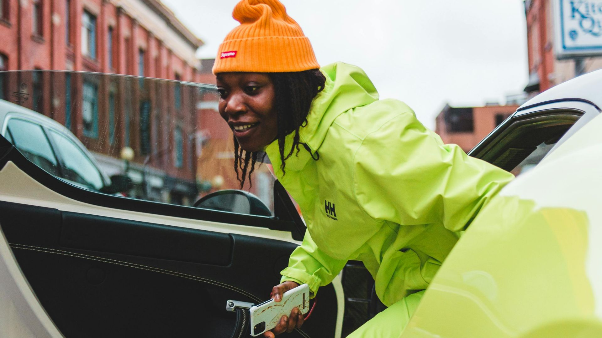
6. Bright Orange
Designed to grab attention, a neon orange only clashes with muted palettes and heavy layers. It's also more sporty or safety-coded than seasonal, so you might want to leave this shade hanging in the closet until the sun comes out.

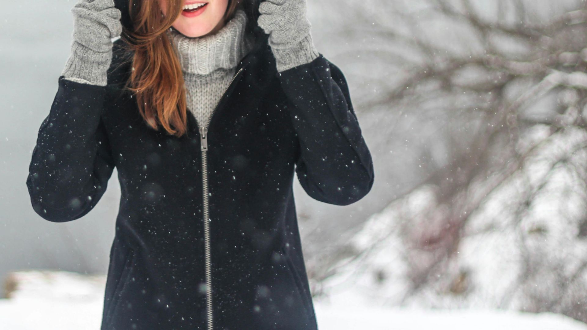
7. Charcoal Gray
The color feels too close to black to feel intentional anymore. Long tied to workwear and winter suits, it often reads more corporate than anything else. Its practicality still holds, but visually, the shade now lacks freshness and personality.
8. Navy Blue
Navy blue may be a beloved classic, but it also feels too safe in winter. Though steady, it rarely excites, reducing ensembles to functional statements lacking expressive confidence. Don't be afraid to go bolder this season!

9. Mustard Yellow
A flashback to 1970s fashion, mustard yellow carries brown undertones inspired by the condiment itself. And it shows. While once trend-forward, the shade now feels era-specific.
10. Crisp White
Crisp white looks striking at first glance, but winter quickly exposes its flaws. The pure, bright shade shows dirt and stains easily in cold, wet weather. Unless you want to blend into the blinding snow drifts around you, it's probably time to reach for something that truly pops.