
The Color That Tricks Everyone
Black carries a kind of fashion magic that feels instantly persuasive. One moment, it sharpens a look and pulls everything together to create that effortless confidence people chase. Another moment, it flattens the vibe or hides details you wanted to show. That swing keeps black fascinating, unpredictable, and worth exploring with fresh eyes. Keep reading to understand how this color wins big or slips quietly. Let’s begin with the reasons black looks good with everything.
1. Neutral Base
There’s something reassuring about a color that never argues with anything you pair it with. Every shade settles beside it without clashing in outfits or décor. Because it creates such a calm foundation, designers trust it whenever they need a background that behaves.
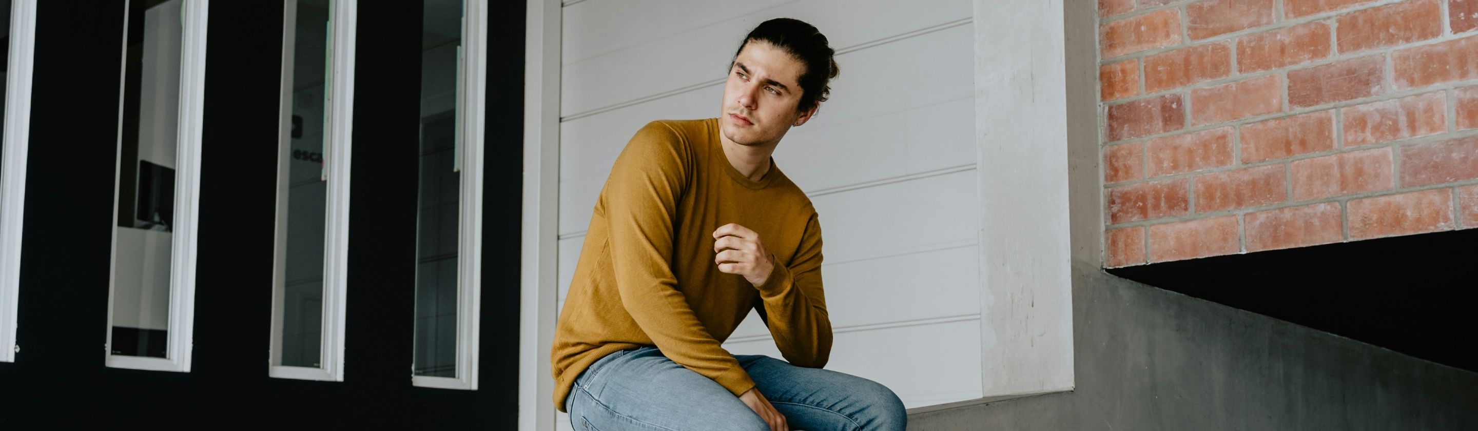
2. Slimming Effect
Plenty of people notice how their outline shifts when this shade enters an outfit. Shapes appear smaller, and many body types benefit from that effect. Formal wear depends on it for a cleaner silhouette, giving the whole look a more intentional feel without much effort.
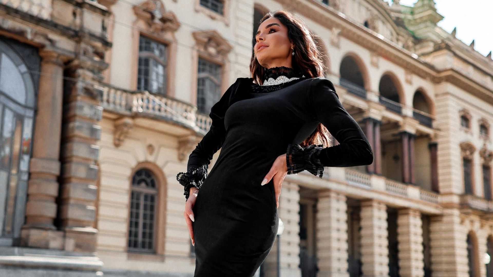
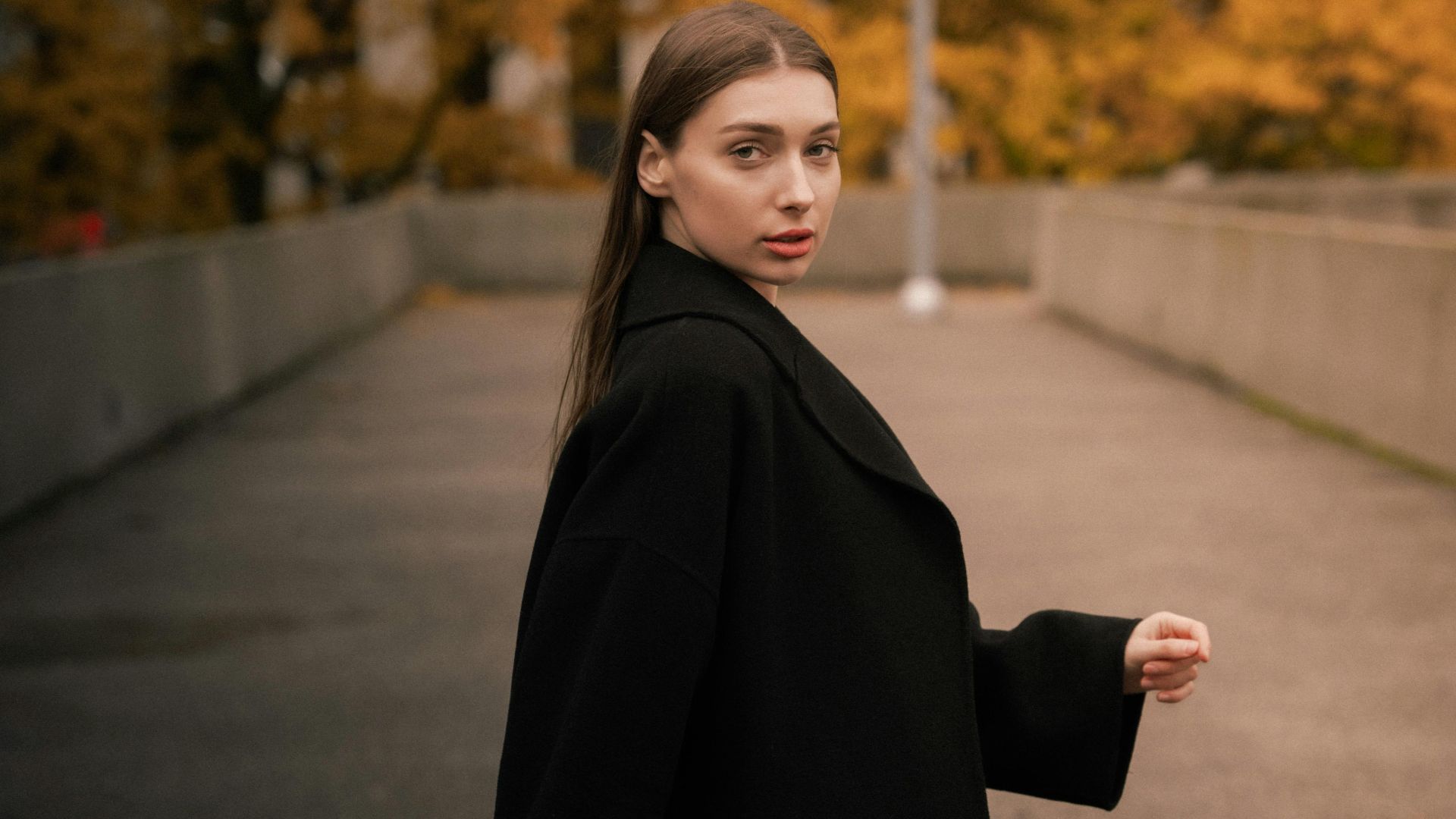
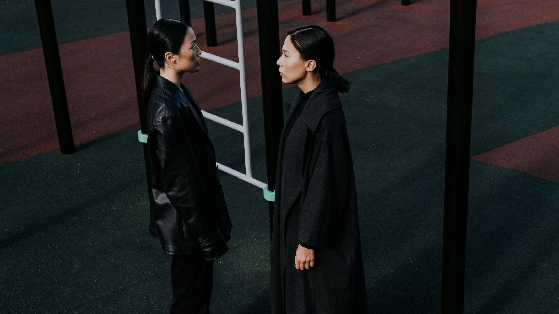
3. Timeless Elegance
Trend cycles spin quickly, yet this color stays steady through all of them. It moves comfortably from casual moments to formal nights and holds a long track record in fashion history. Its reputation for sophistication renews itself each time someone reaches for it again.
4. Contrast Amplifier
It’s tough to miss how quickly other colors brighten when this shade joins the mix. Bold tones look stronger, and pastels gain clearer edges. Designers also use it to push accents forward to give the whole look more direction. A little contrast goes surprisingly far.
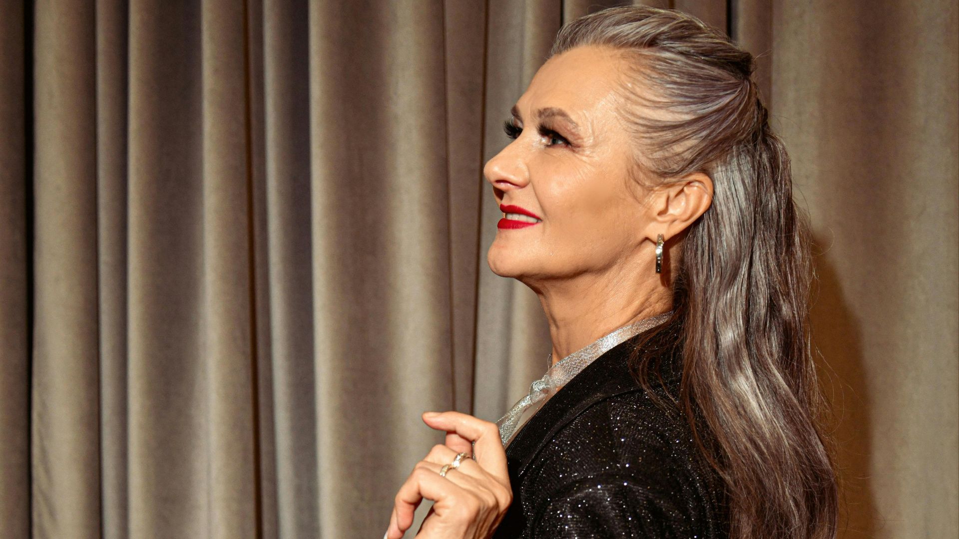
5. Age Inclusivity
Style habits shift from one generation to another, though this color settles into each group without hesitation. Younger people lean on it for confidence, and mature wearers appreciate how refined it feels. Even older generations view it as an easy path to elegance.
 Konstantin Mishchenko on Pexels
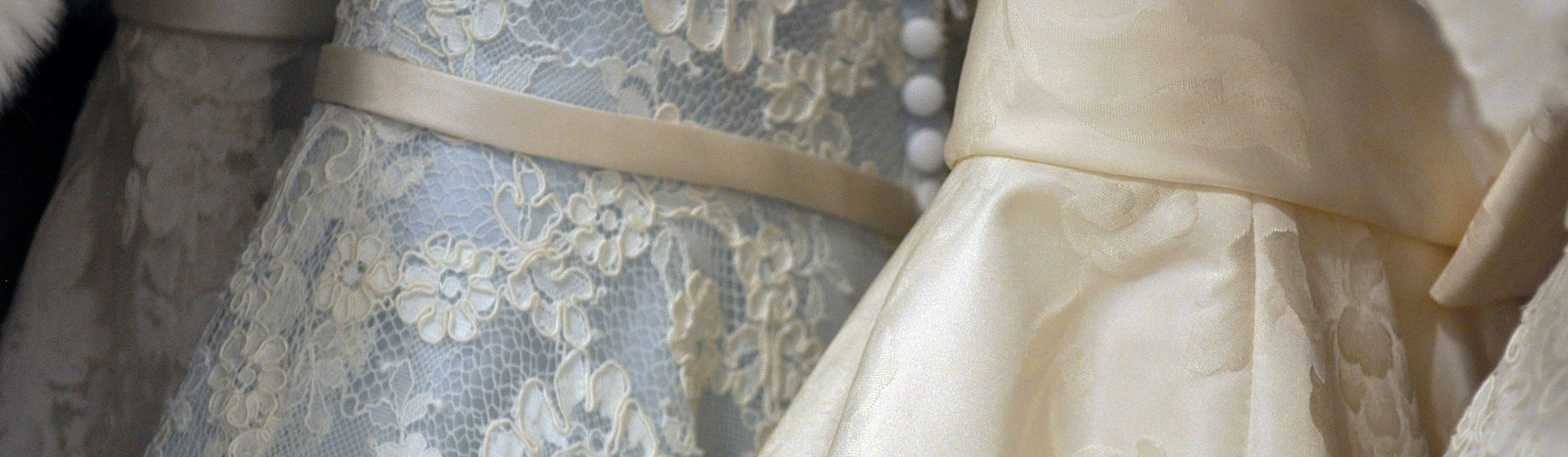
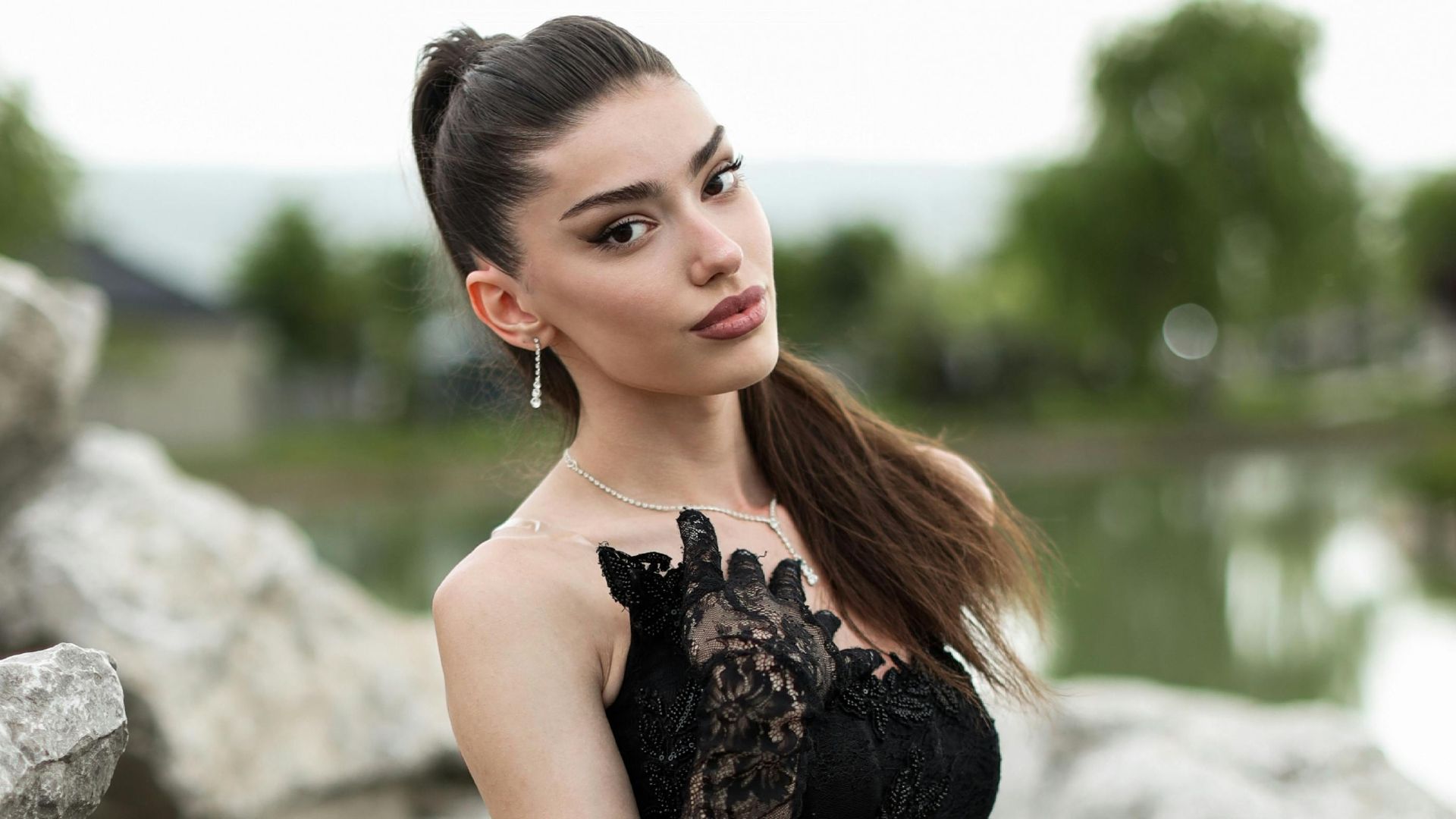
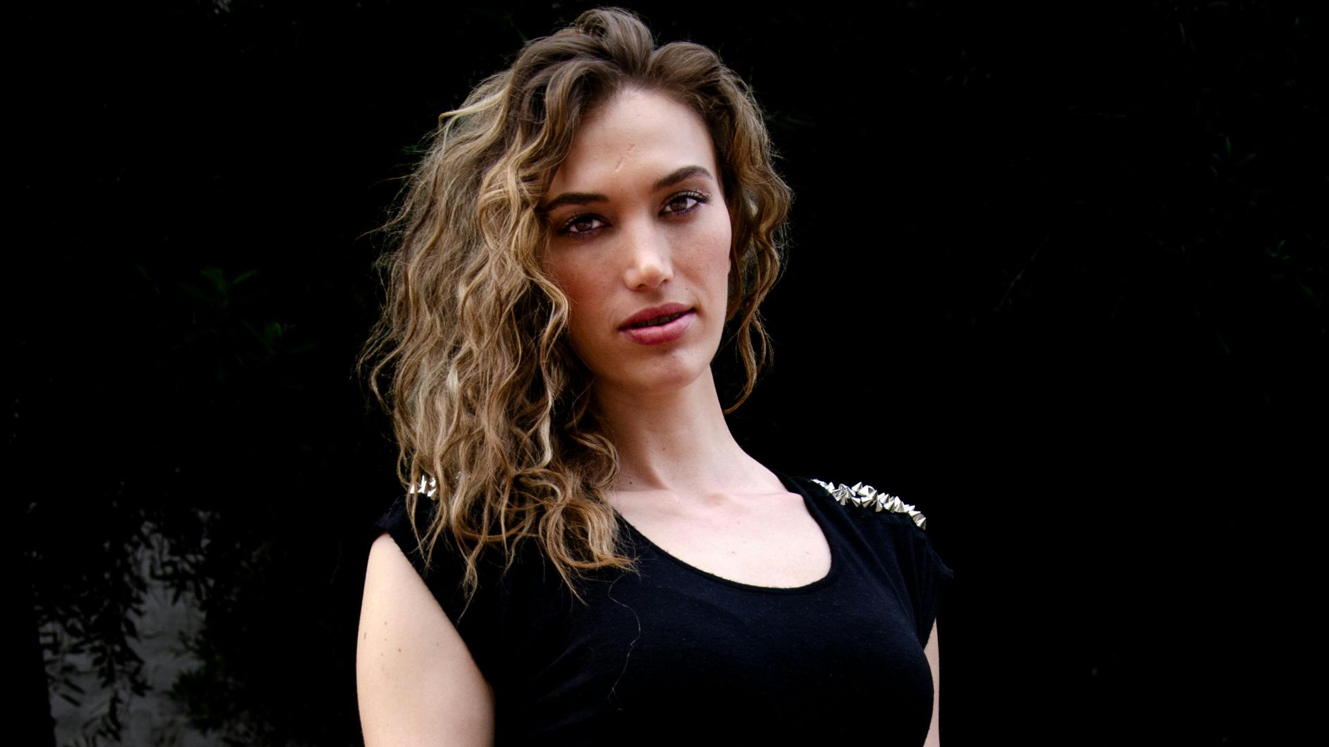
6. Texture Highlight
Fabrics tend to reveal more personality under this shade. Lace shows finer detail, leather feels richer, and sequins catch light with extra confidence. It gives textures a clearer voice, which is why designers reach for it whenever surface details deserve attention.
 Photography Maghradze PH on Pexels
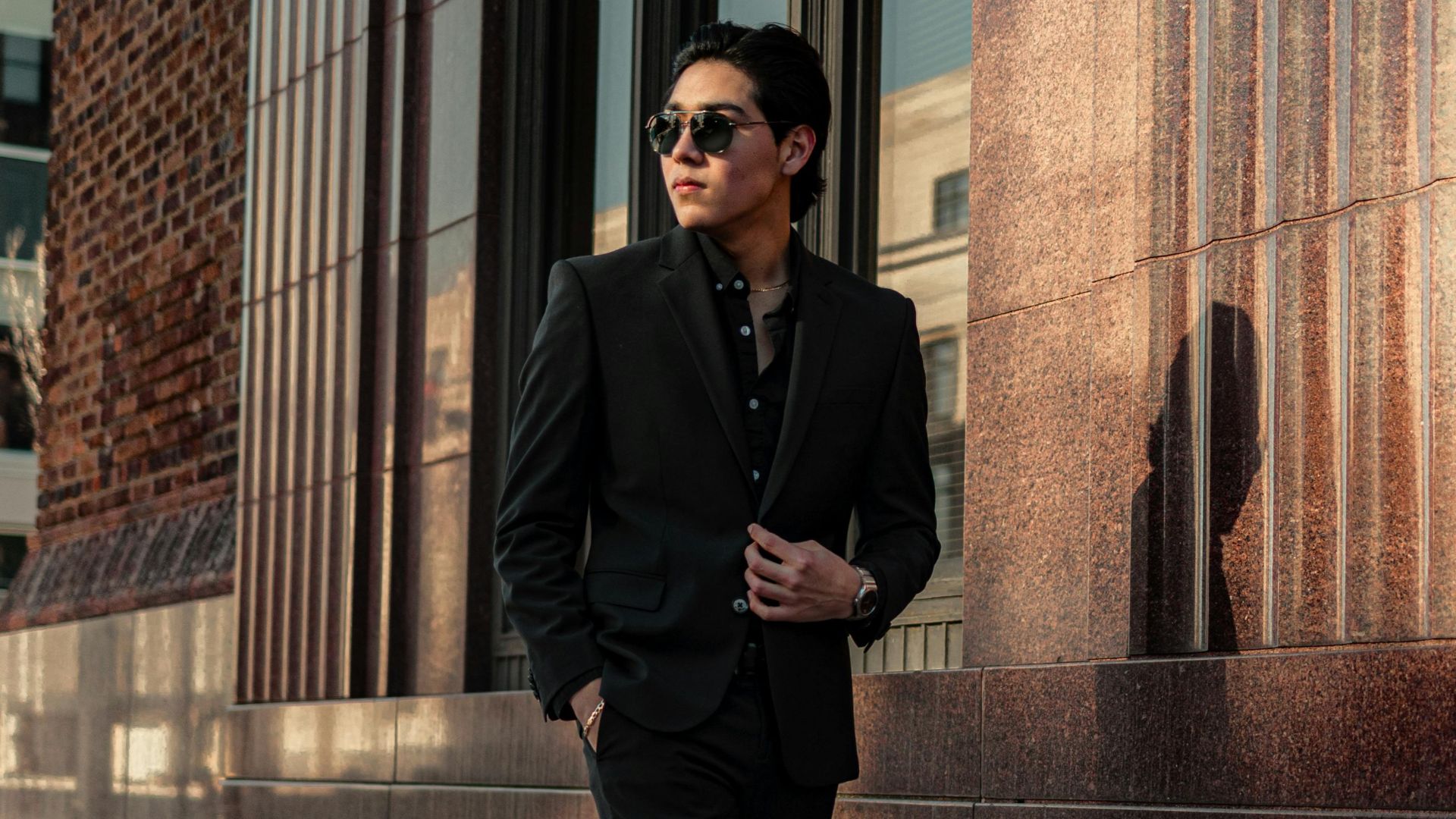
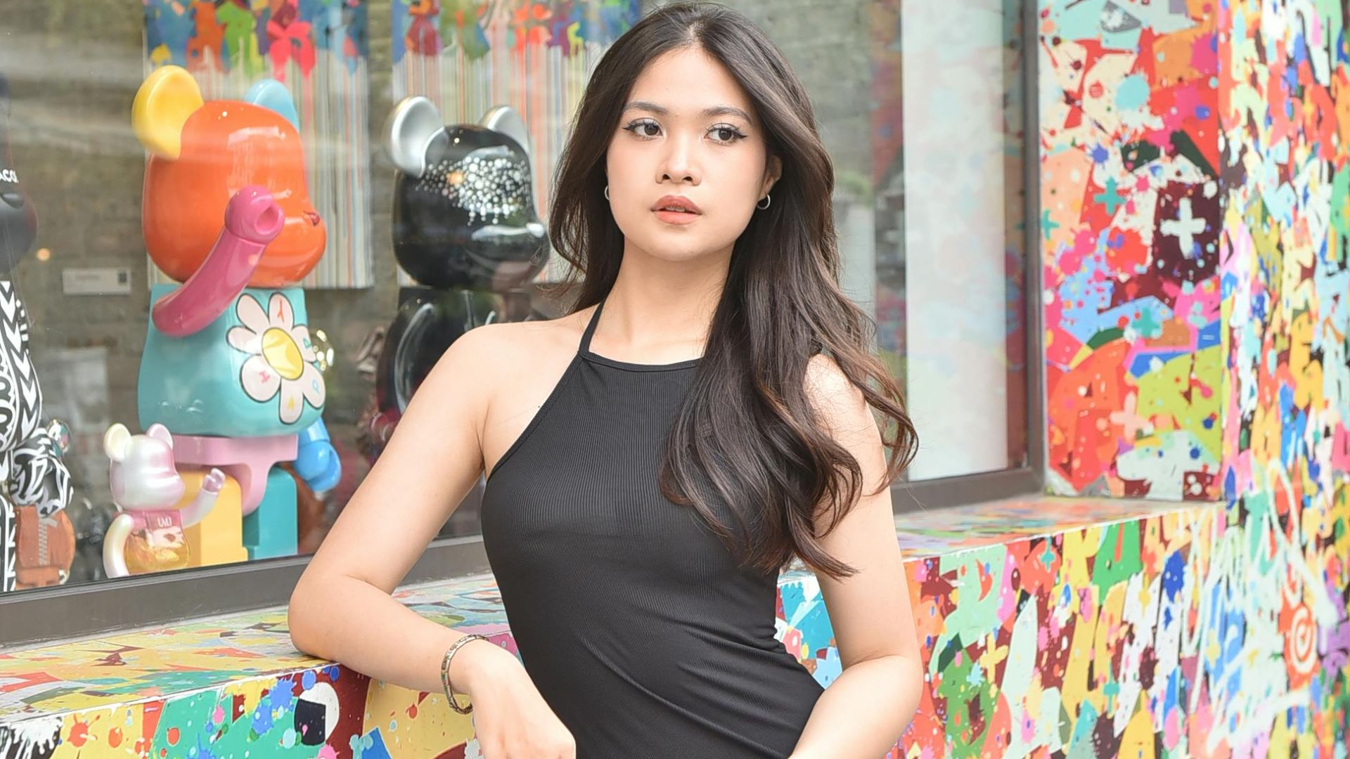
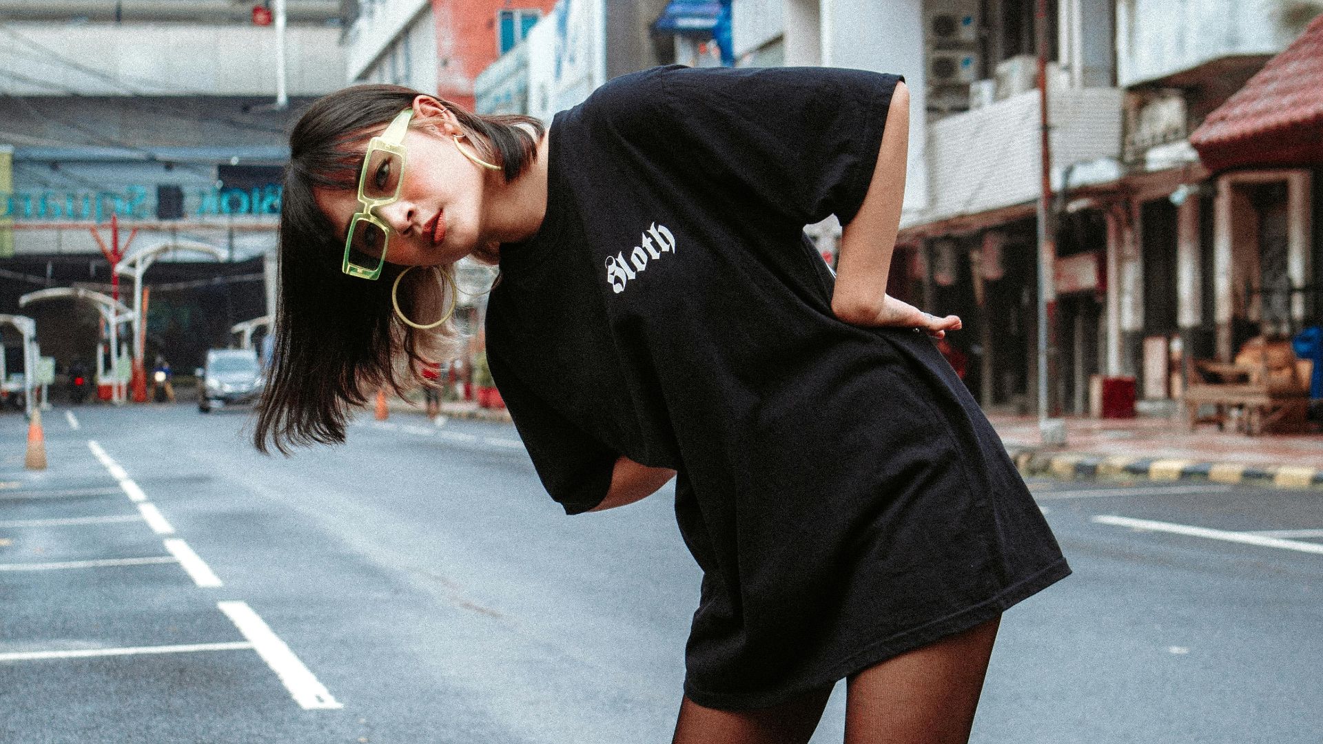
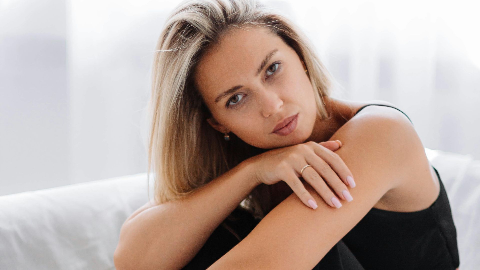
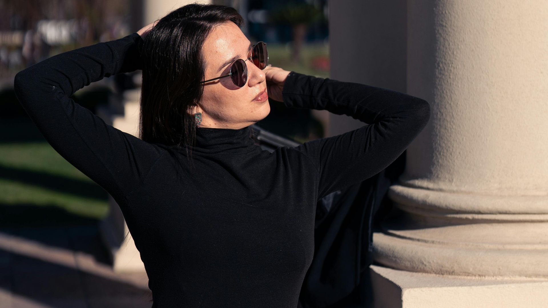
7. Gender-Neutral Appeal
In a world full of style rules, it’s refreshing when a color welcomes everyone equally. This one fits all genders with ease and supports unisex pieces without calling attention to itself. Accessories lean on it for the same reason, and its openness lets personal style breathe.
 Sahid Nugroho Atmosejoyo on Pexels
8. Seasonal Flexibility
The weather rarely challenges this color. It works in summer without feeling heavy, settles into winter layers naturally, blends easily with autumn tones, and holds its own beside spring brights. No season pushes it out of place, which explains why it appears year-round without losing appeal.
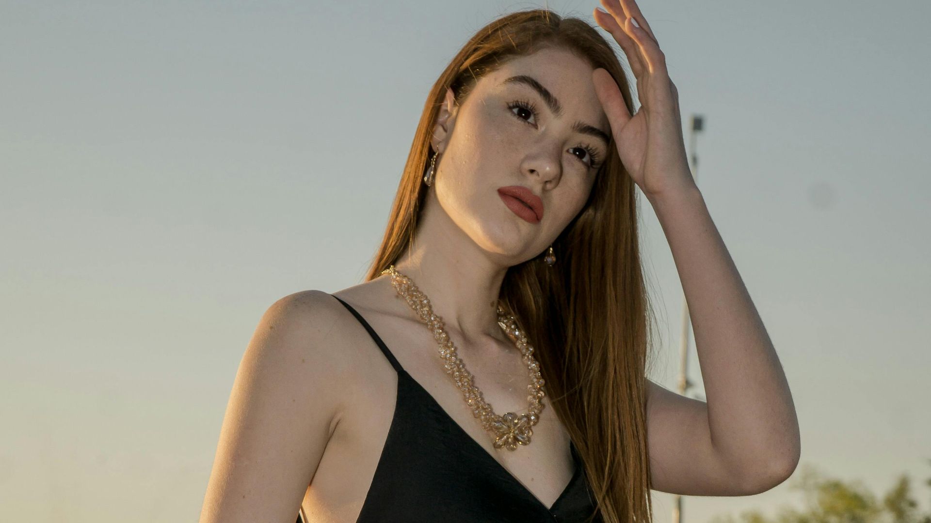
9. Luxury Association
The moment gold sits beside this color, everything looks more elevated. It carries signals of wealth and dominates premium packaging. Brands rely on it because the message comes through instantly. One glance communicates status long before anyone reads the label.
 Jose Ricardo Barraza Morachis on Pexels
10. Photographic Reliability
Photos can be unpredictable, but this shade refuses to complicate things. It cuts glare, keeps lighting even, and avoids the strange color distortion some fabrics cause. Backgrounds use it for the same reason: the main subject stands out immediately.

Still, black doesn’t win every style battle, and the next set of reasons proves it.
1. Fade Risk
Frequent wear makes this shade reveal a weakness you may not expect: it loses depth faster than most colors. Sunlight lifts the pigment, and repeated washing encourages uneven patches. Over time, the change alters the entire outfit’s tone.

2. Heat Absorption
Anyone who has stepped into bright sun while wearing this color knows the heat comes quickly. It pulls in sunlight and holds onto it, which makes outdoor moments uncomfortable. Summer outfits become harder to enjoy, especially in places where warm weather lasts far too long.

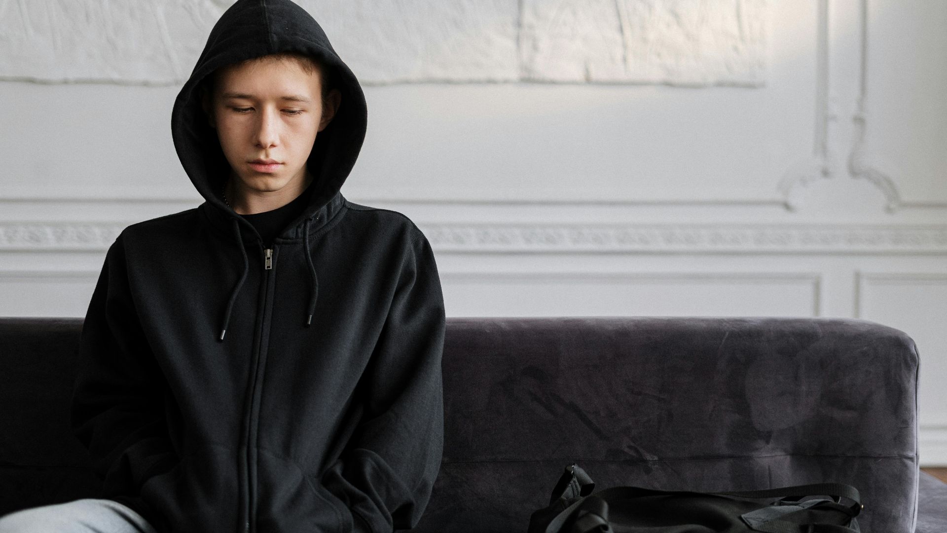
3. Mood Association
Wearing this shade can change how others read your mood, even when you feel perfectly fine. Many associate it with sadness, so the color can make you seem heavier or more serious. Instead of appearing upbeat, you may come across as subdued in a way you never intended.
4. Skin Tone Contrast
You may have seen this shade drain life from certain complexions. Pale skin loses warmth, and some undertones begin to clash with it. Faces that need a bit of softness can look dull instead, especially when uneven tones become more noticeable than the outfit itself.
5. Dust Visibility
If you’ve worn this shade regularly, you already know how quickly it attracts trouble. Lint appears out of nowhere, pet hair sticks without hesitation, and upkeep becomes nonstop. Even clothes straight from the dryer pick up fuzz instantly, as if the fabric invites every stray fiber to stay.

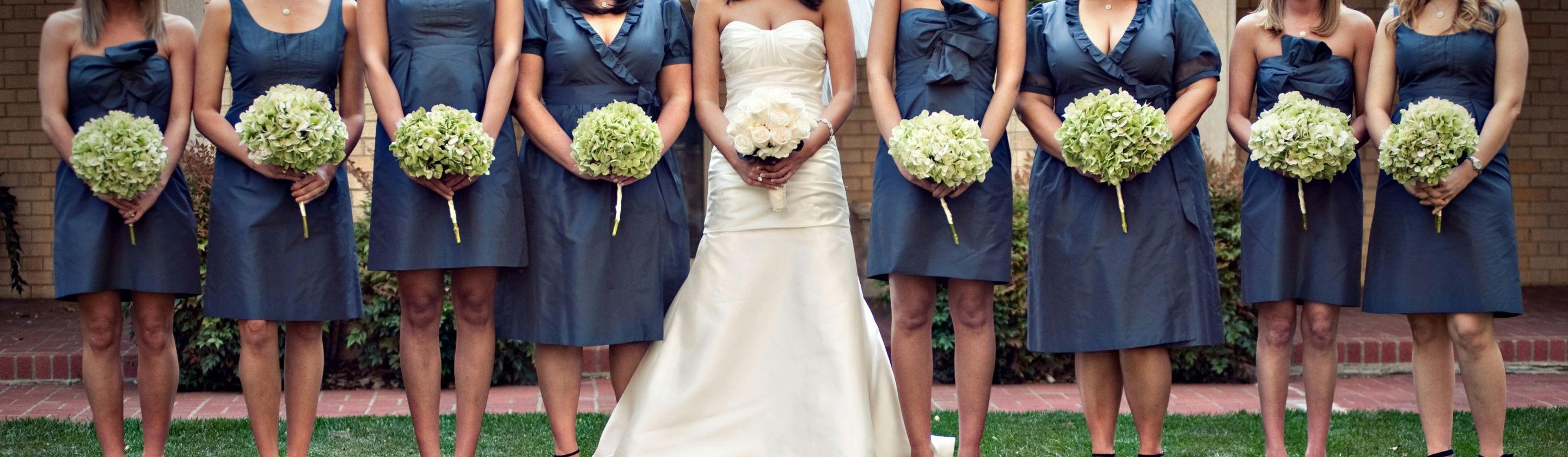
6. Overuse Fatigue
Even fans of this color notice how repetitive it becomes when it dominates every outfit. Too much of it starts to feel monotonous, wiping out variety and making style choices look uninspired. Heavy reliance on one shade can flatten creativity faster than most people expect.
7. Interior Overload
Rooms can change dramatically when this shade dominates the space. Too much of it makes areas feel smaller, and walls lose brightness quickly. Additionally, the ceilings appear lower than they are. What begins as bold styling can end up feeling heavy and closed in.
8. Makeup Transfer
Foundation and powder love to stick to this color, unfortunately. Even a quick hug or a light shoulder tap can leave marks that draw more attention than the outfit itself. Cleaning those spots takes patience, and the constant worry often disrupts the confidence you hoped it would give.
9. Energy Dampening
Outfits built to feel lively can lose momentum once this color takes over. Bright pieces look muted beside it, and the overall setting becomes less dynamic. Playful energy in fashion slips away quietly, replaced by a calmer tone that doesn’t always match the spirit of the look.
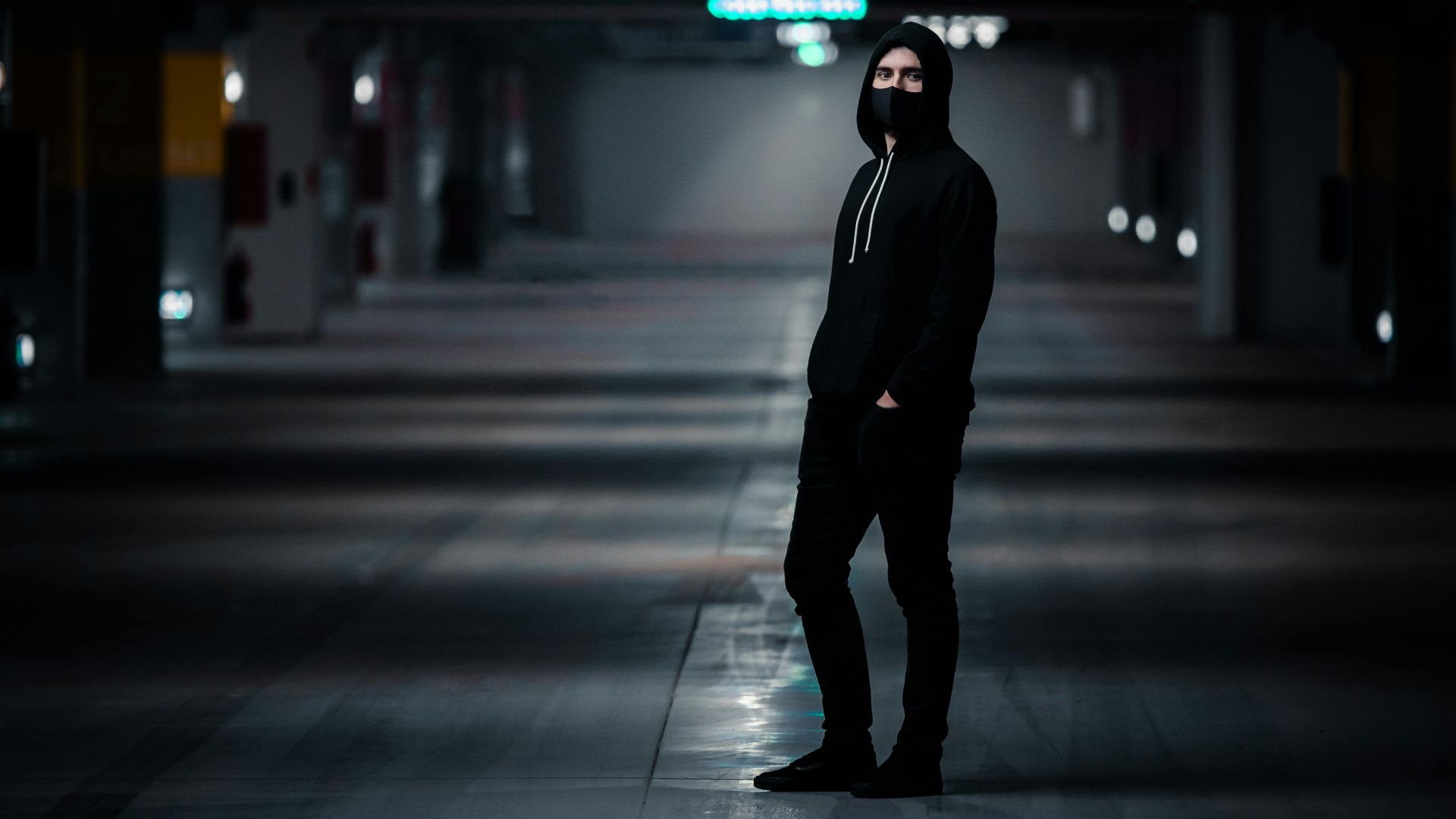
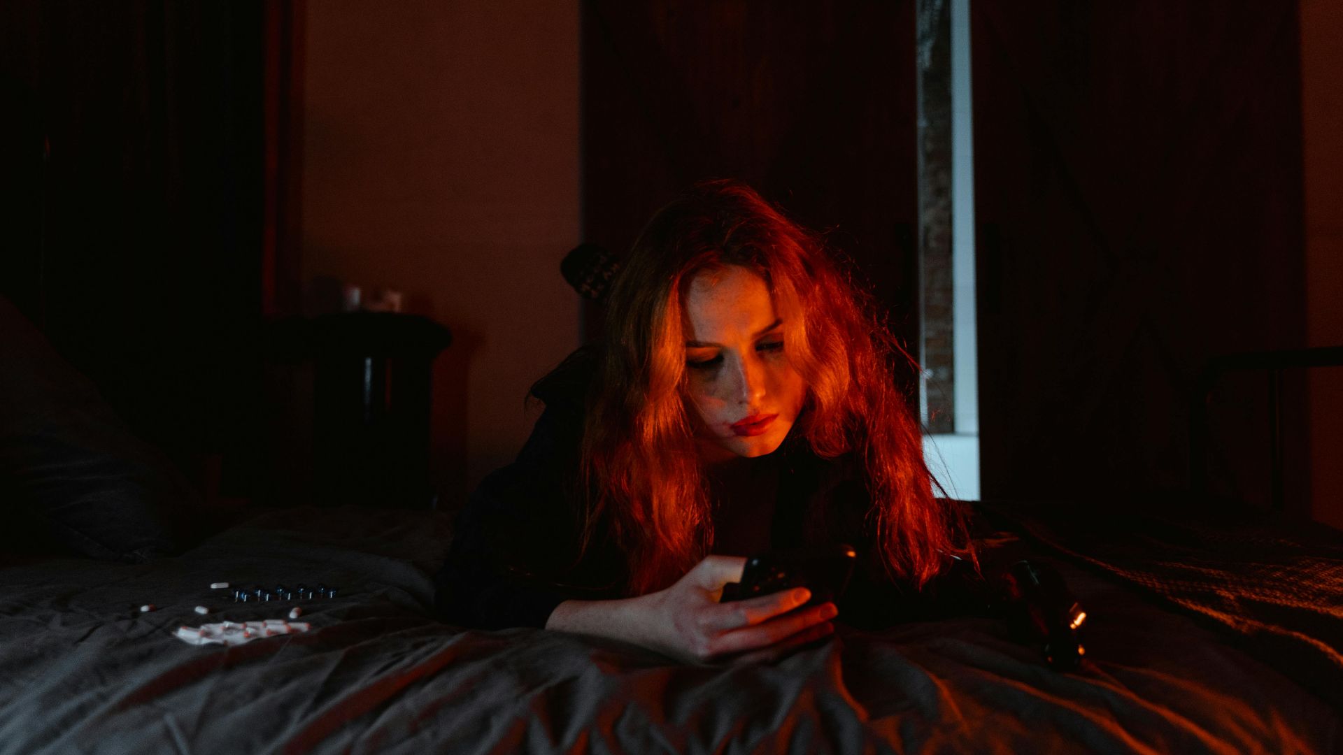
10. Nighttime Hazard
Walking after dark becomes riskier when this shade blends into the surroundings. Drivers struggle to spot it, and visibility drops near traffic. As outdoor areas with low light turn it into a safety concern, nighttime movement feels far less secure than it should.