

Some Logos Stayed Iconic, Others Didn’t
Logos are a weird social shorthand, because everyone pretends they do not matter while reacting to them instantly. You can spot a familiar mark from across a restaurant, on a subway platform, or slung over the back of a chair at a coworking space, and your brain fills in the rest. Some logos keep their power because they stayed tied to craft, scarcity, and a consistent point of view, even as trends churned. Others got memed into something people start to hide in the closet, the same way a once-loved party dress starts to feel like a costume. Here are ten that still get worn like a quiet trophy and ten that became an embarassing relic in the back of your closet.
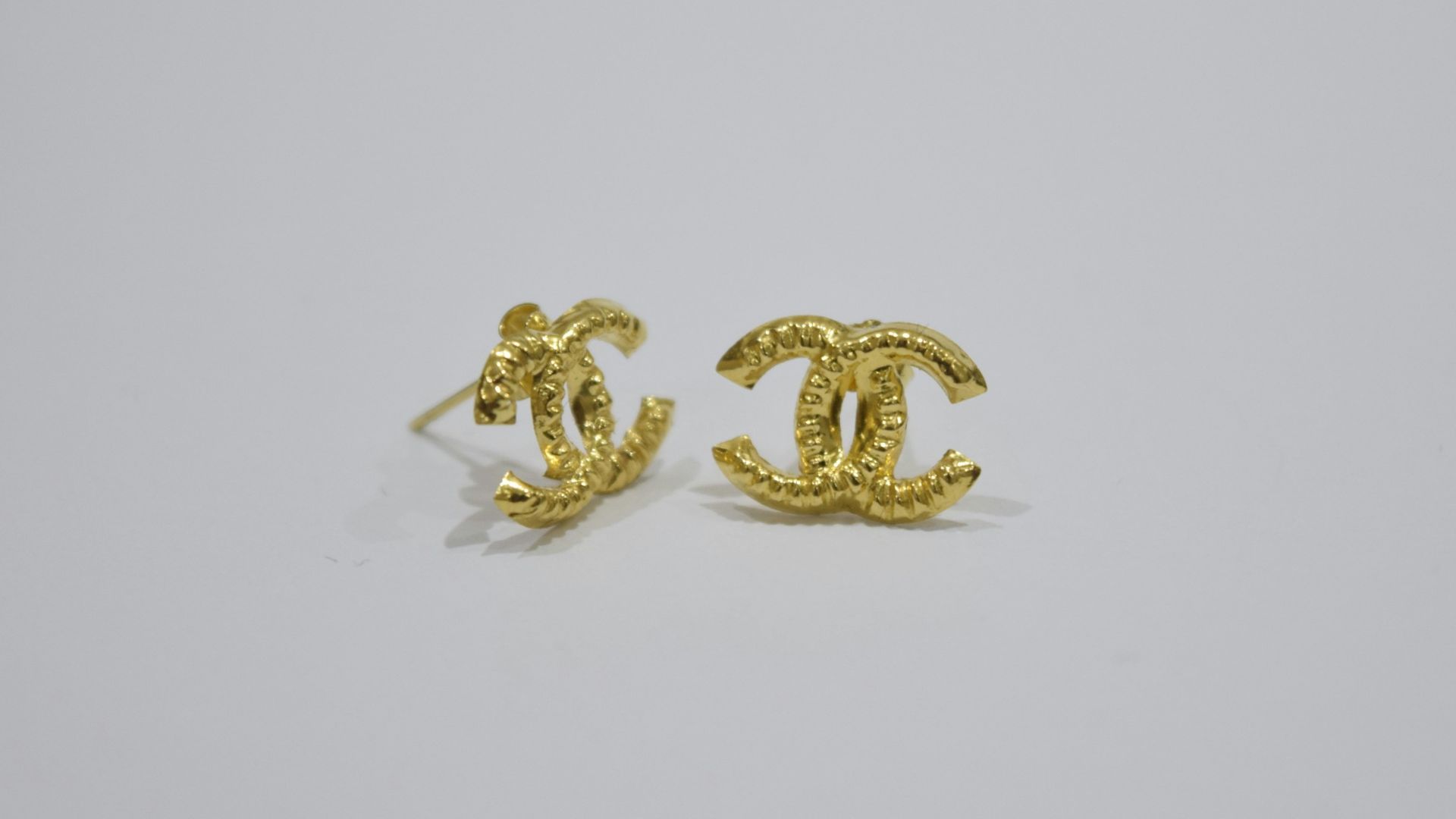
1. Chanel Interlocking Cs
The double C still signals old-school luxury without needing extra explanation, partly because the brand keeps it controlled and consistent. It shows up on hardware, jewelry, and sunglasses in a way that feels intentional rather than frantic.
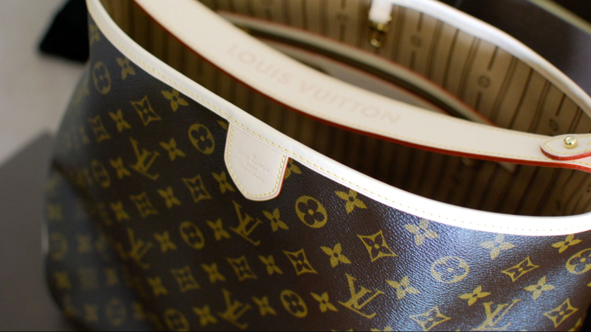
2. Louis Vuitton Monogram
The LV monogram stays in rotation because it is instantly recognizable and historically entrenched, and people still treat it like a passport into certain rooms. Even when styles shift, that pattern keeps getting reworked into something current instead of being abandoned.
 Janine from South Korea, United States on Wikimedia
3. Hermès Horse And Carriage
Hermès gets flexed in a slightly different way, because the branding leans on heritage and craft more than hype. The carriage motif and the overall visual language feel like a signal to people who already know, especially when it is paired with restrained colors and clean leather.
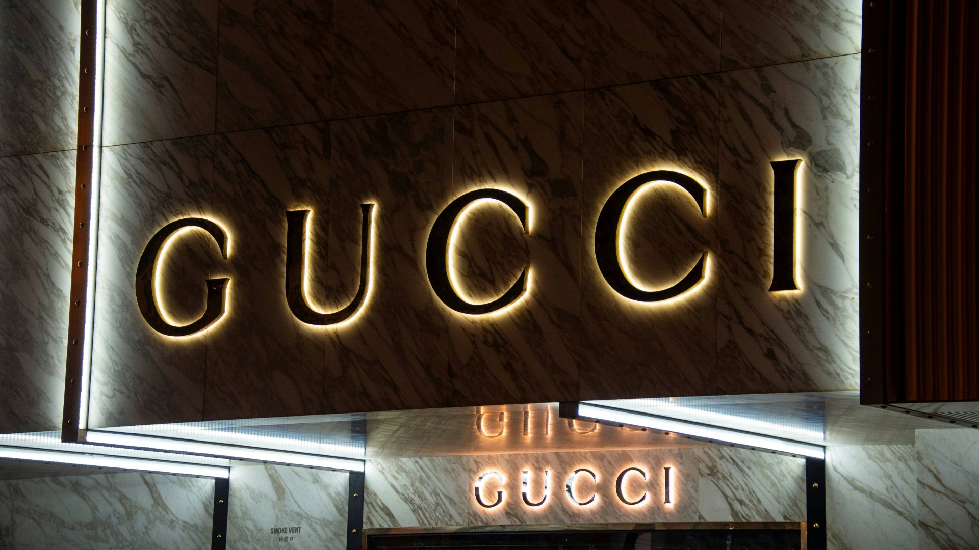
4. Gucci GG
The double G has survived multiple eras of Gucci reinvention, which is rare for a logo that bold. It reads playful and brash, yet it still lands as luxury because the house keeps anchoring it in recognizable silhouettes and materials.
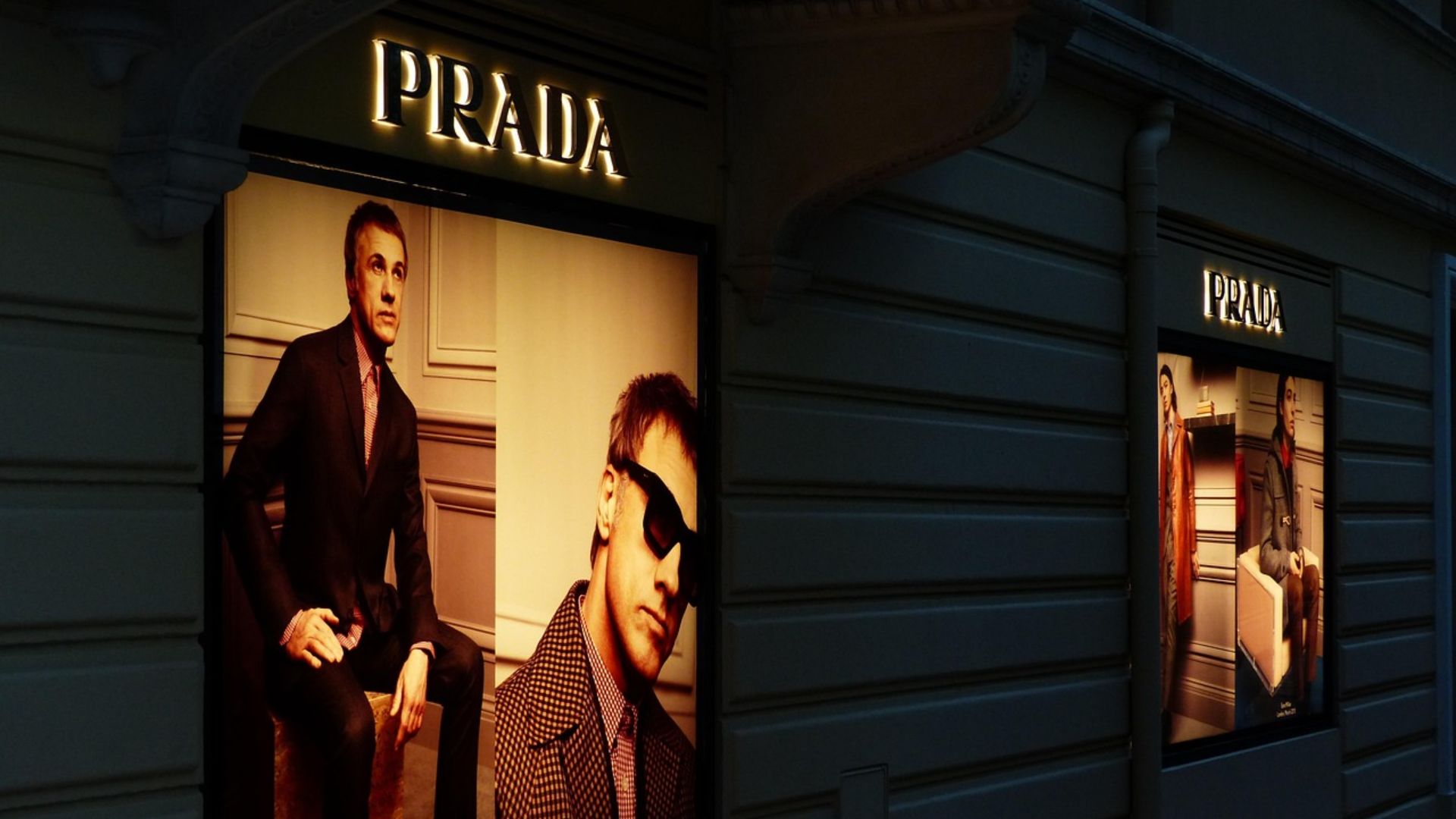
5. Prada Triangle
The Prada triangle works because it can look almost utilitarian while still feeling expensive, especially on nylon or minimal leather. It is small enough to feel deliberate, which helps it avoid the desperate energy that loud logos can pick up over time.
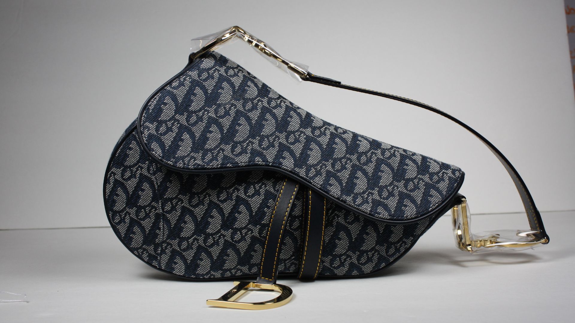
6. Dior Wordmark
DIOR still hits because it feels like fashion history that kept its posture, not a trend trying to keep up. It also sits well on both discreet pieces and more visible ones, so it flexes without forcing the issue.
 commons.wikimedia.org on Google
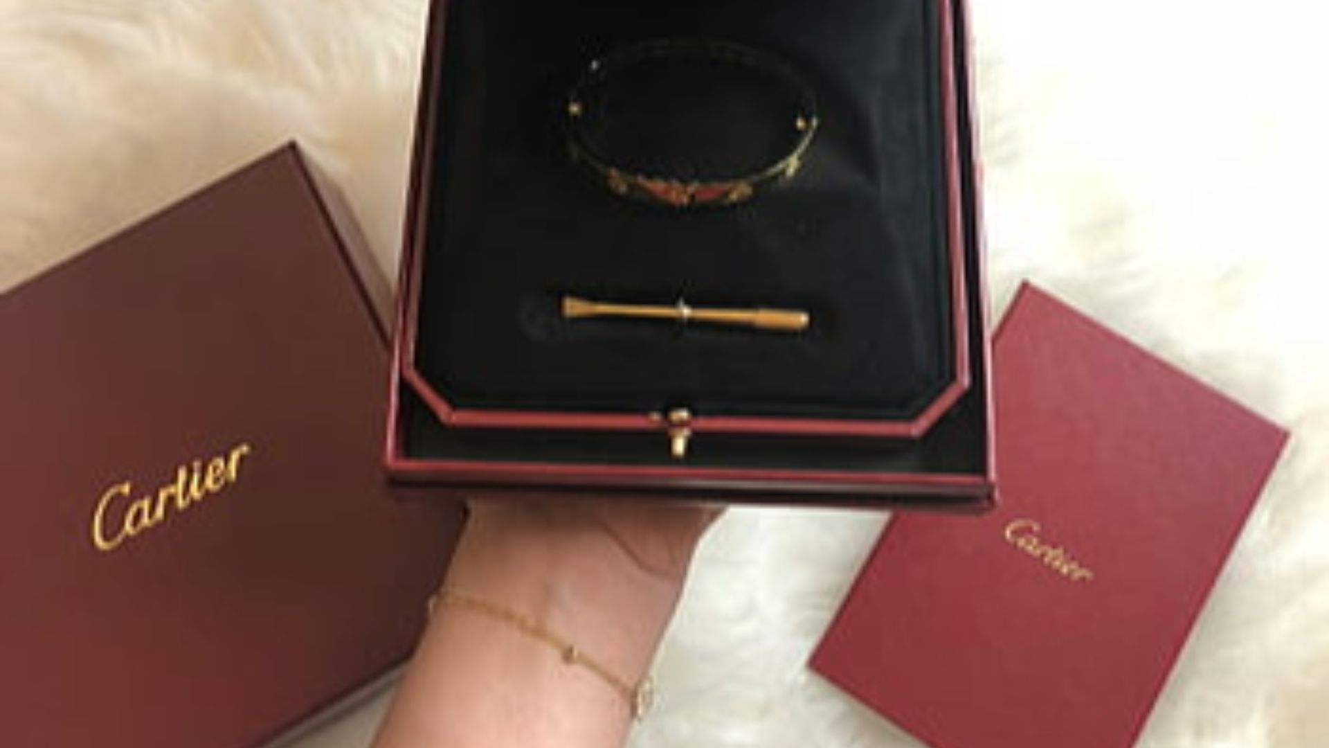
7. Cartier Panthère And Wordmark
Cartier branding, especially the panther icon, reads like generational money even when it is worn by someone who just discovered it last year. It has the advantage of being attached to jewelry, which keeps it from swinging as hard with clothing trends.
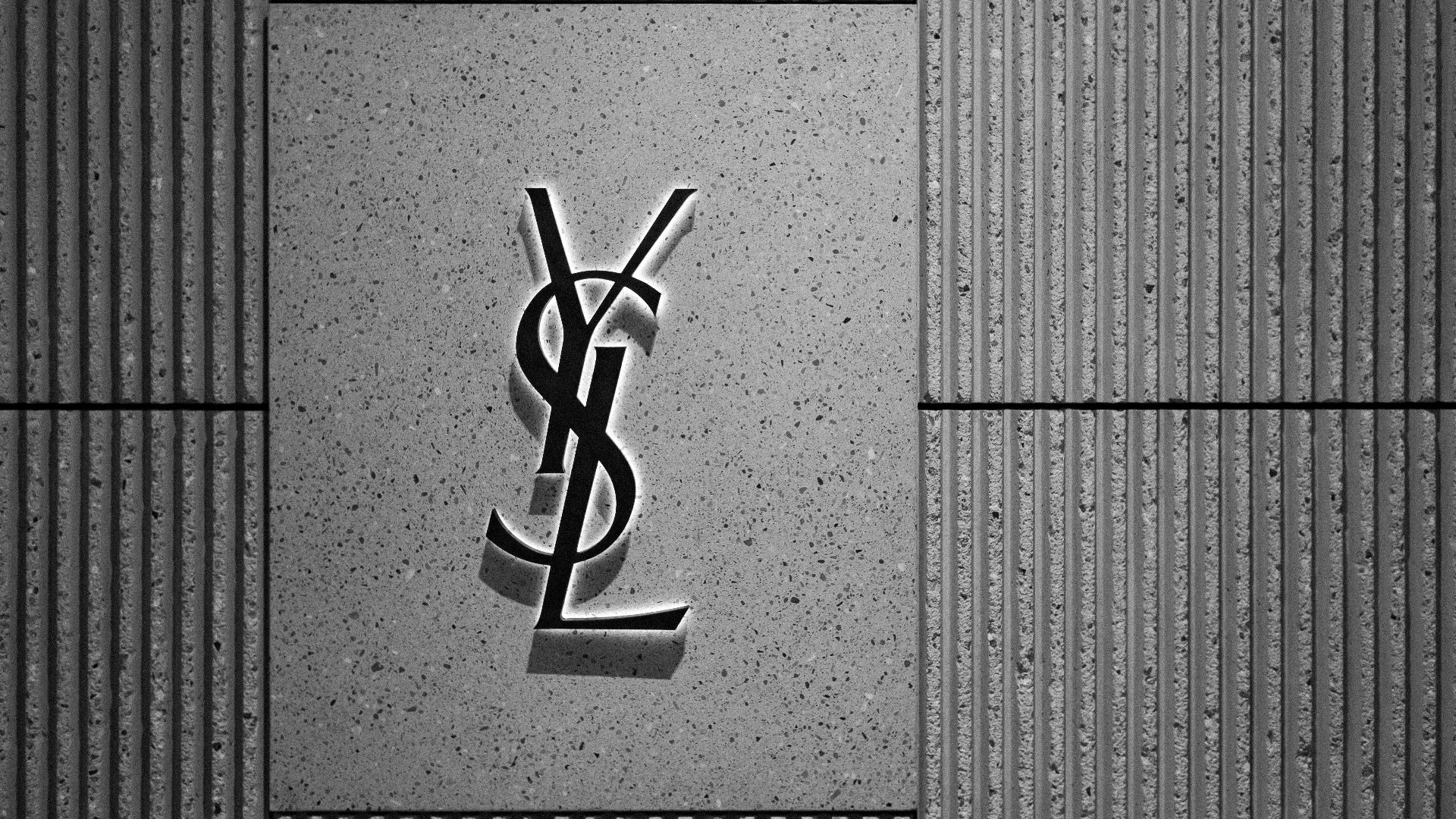
8. Saint Laurent YSL Monogram
The YSL monogram stays sharp because it looks like a finished design, not a decorative stamp. It tends to show up in places that feel considered, like a clasp or hardware, which makes it easier to wear without looking like a walking billboard.
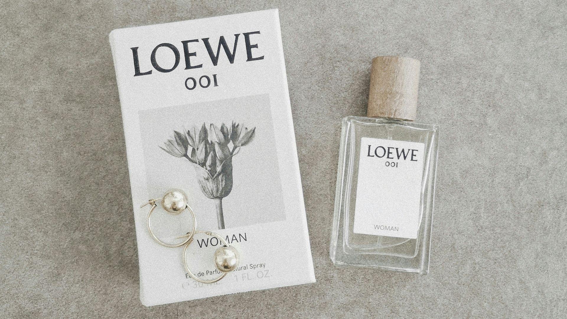
9. Loewe Anagram
The Loewe anagram has a nerdy design appeal that makes it feel cooler the more someone knows about it. It signals taste more than conquest, which is why it pairs so well with simple outfits and quiet accessories.
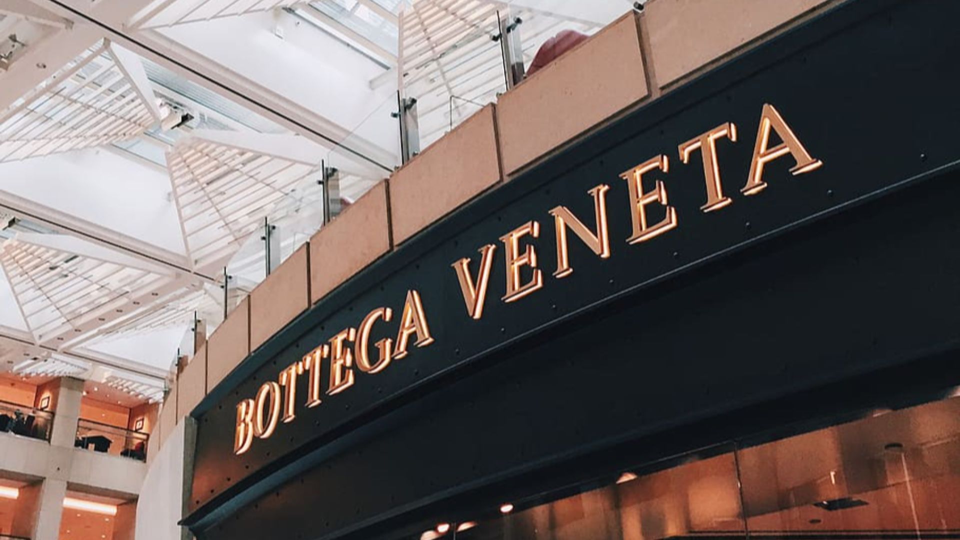
10. Bottega Veneta Intrecciato
Bottega’s flex is often the lack of a logo, with the weave acting like a signature for people who pay attention. That kind of branding holds up because it stays rooted in materials and technique, which does not get dated as fast as a printed mark.
One list is about symbols that stayed aspirational, and the next ten is about symbols that started to feel like a punchline.
 www.wallpaperflare.com on Google
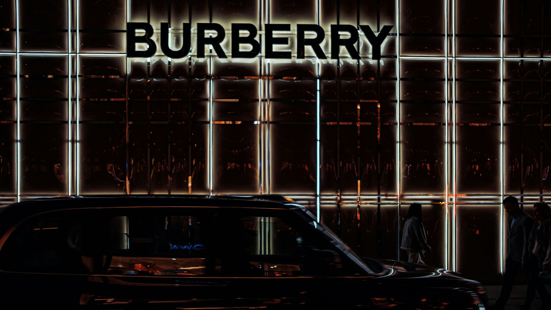
1. Burberry Nova Check As A Full-Body Uniform
The check went through a period where it picked up a loaded cultural reputation in the UK, and it stopped reading purely as luxury for a lot of people. Even fashion media has traced how that association turned the print into something venues sometimes pushed back on, which is not exactly the vibe most buyers want from an expensive scarf.
 Samuel Regan-Asante on Unsplash
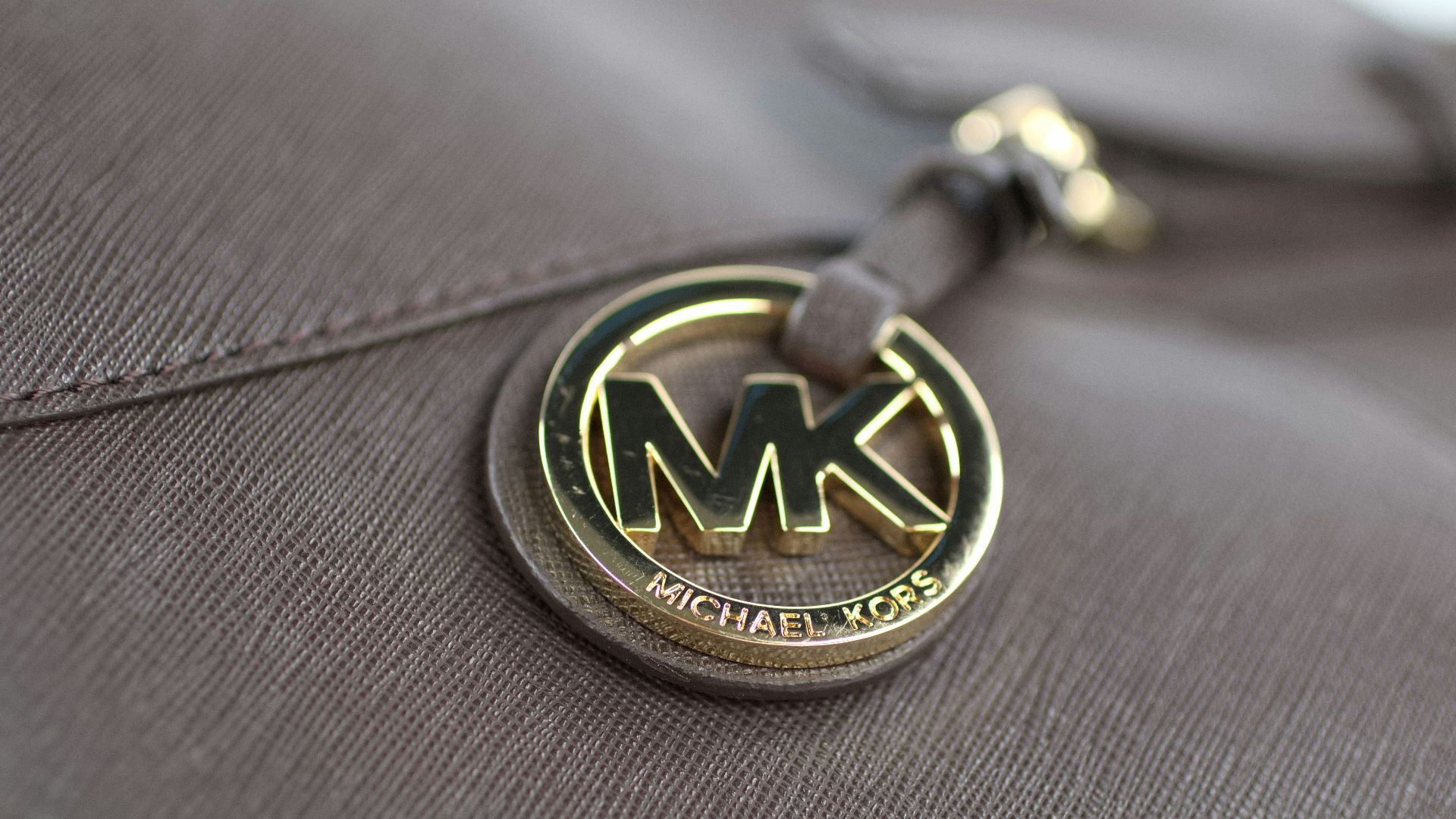
2. Michael Kors Circular MK
The MK medallion had a long moment where it was everywhere, especially on coated-canvas bags that traveled through office lobbies and airport security lines. Overexposure can flatten any logo, and this one started to read more like mass distribution than aspiration in the late 2010s.
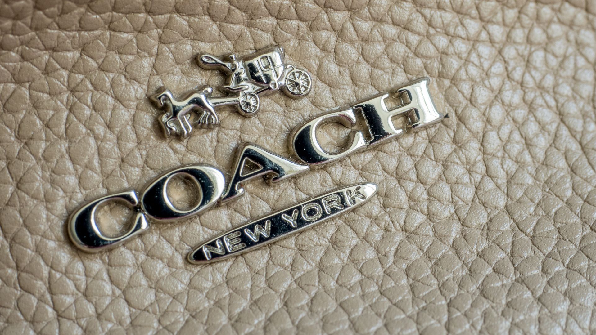
3. Coach Signature C
Coach’s C pattern is a classic example of a logo that got so saturated it started feeling like a default gift rather than a choice. The brand has put in serious work to make it feel current again, yet the loud all-over print still carries a whiff of mid-mall nostalgia for a lot of people.
 Ajay Suresh from New York, NY, USA on Wikimedia
4. Tory Burch Double T Medallion
The double T medallion became a uniform in certain circles, especially when it was stamped on ballet flats and tote bags in the early-to-mid 2010s. Once a logo turns into a social shorthand for a specific era of Instagram outfits, it can start feeling less like taste and more like a time capsule.
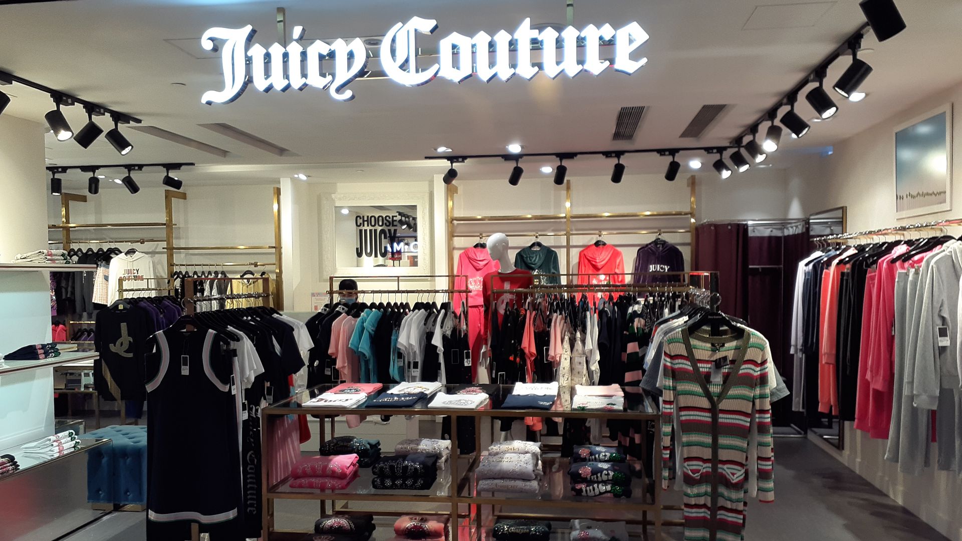
5. Juicy Couture Crown And Gothic Script
Juicy’s branding is inseparable from a particular celebrity-driven moment, and that makes it hard to wear without leaning into the throwback. The logo reads playful, yet it can also read like a costume accessory unless the styling is very deliberate.
 commons.wikimedia.org on Google
6. Von Dutch Flying Eyeball
Von Dutch became the punchline version of status, the kind of thing that felt edgy until it got copied a thousand times. The logo carries such strong early-2000s energy that it can overwhelm the person wearing it, even when the rest of the outfit is modern.
 www.wallpaperflare.com on Google
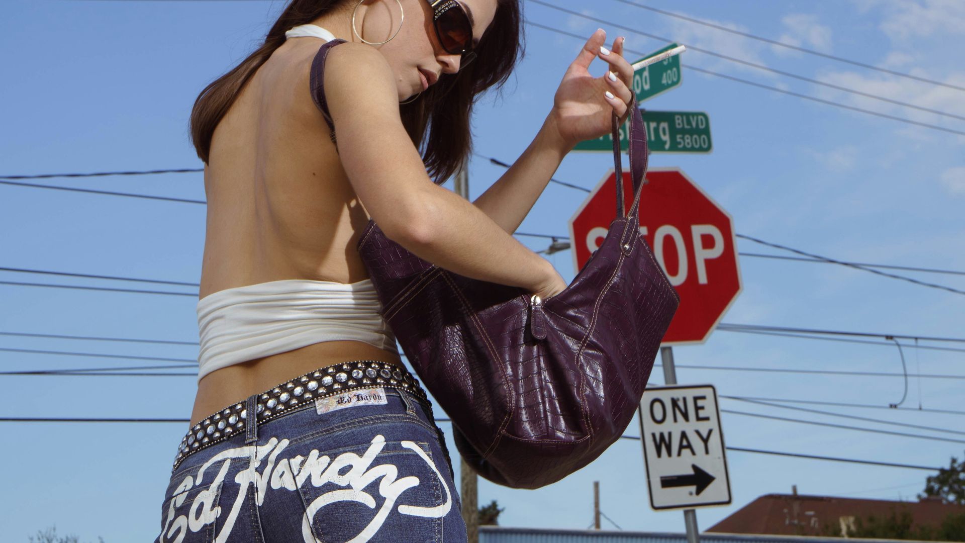
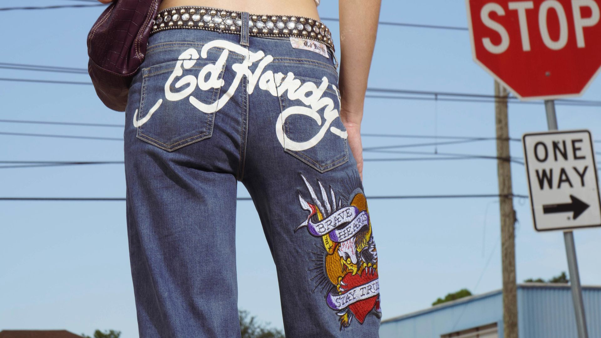
7. Ed Hardy Tattoo Graphics And Signature
Ed Hardy logos and graphics got tied to a loud, hyper-specific aesthetic that many people now associate with bad club lighting and regrettable photos. The branding is so dominant that it can read like trying to revive a trend that never needed reviving.
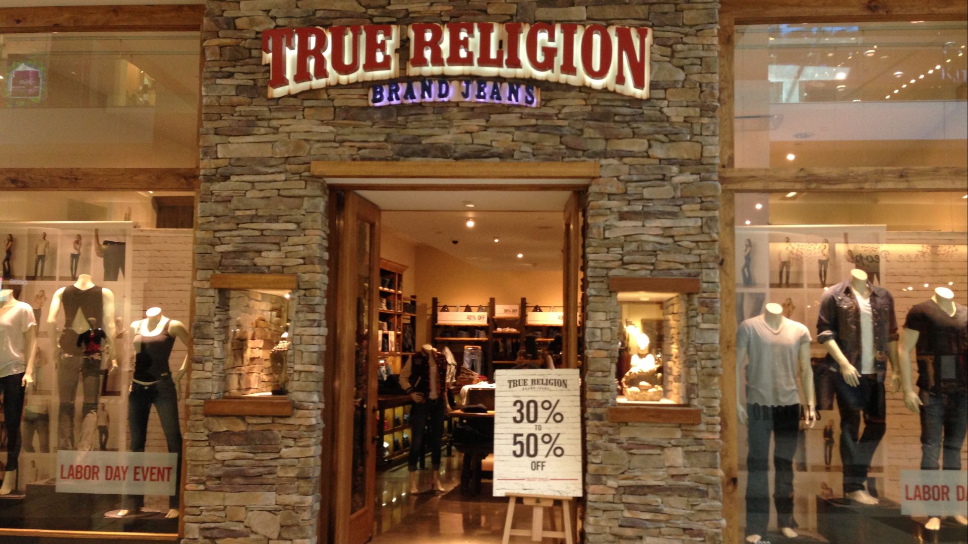
8. True Religion Horseshoe
True Religion’s horseshoe became a signal for a very particular nightlife lane, especially when paired with heavy stitching and flashy washes. Once denim trends moved on, the logo started to feel like a leftover badge from an era when more decoration automatically meant more premium.
 commons.wikimedia.org on Google
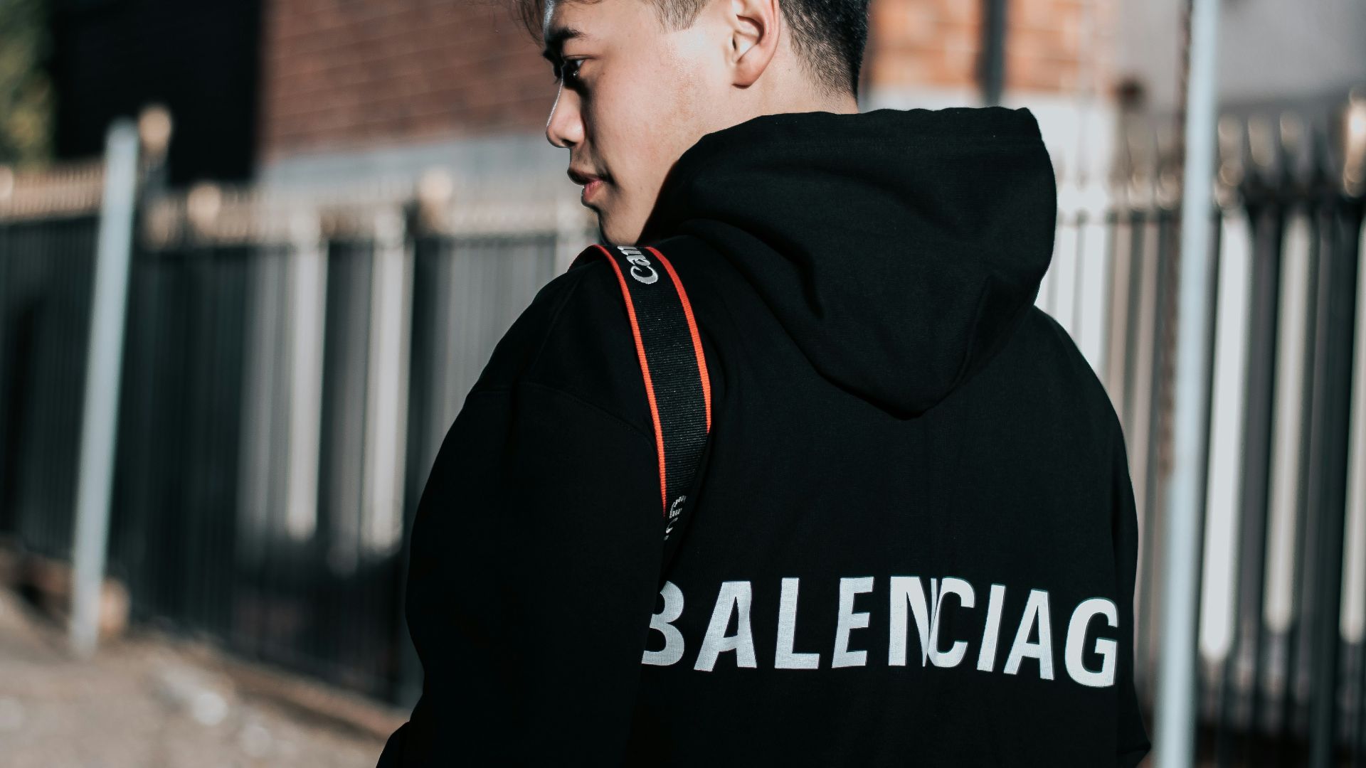
9. Balenciaga Oversized Block Logos
The huge BALENCIAGA wordmarks on tees and hoodies had a run where they signaled fashion fluency through sheer visibility. When a logo becomes part of a wave of meme-fashion and constant drops, it can start reading more like hype mechanics than design, which turns embarrassing fast for anyone who wants longevity.
10. Any Luxury Monogram Done Head-To-Toe
Even the strongest monograms can tip into cringe when they are worn like wallpaper, covering every surface with no break. It stops feeling like a personal style choice and starts feeling like the outfit is doing the talking for you, which is usually a sign the logo has taken over the job of taste.


