When Colors Turn Against Each Other
Some color pairings make your eyes twitch the moment you see them. You know the feeling—a bold outfit that just feels wrong or a room that somehow screams at you in silence. When hues fight instead of complementing each other, everything falls apart visually. Designers spend years learning which combinations to avoid at all costs. Here are the worst offenders that should never share the same space.
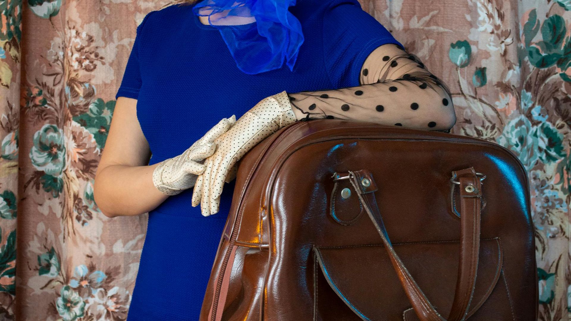
1. Red And Purple
Have you ever tried mixing red and purple? The result usually feels off. Both are bold and emotional—one fiery, the other mysterious—but their strong undertones fight for attention. When placed together, they overwhelm the eye instead of blending, turning powerful shades into visual noise.

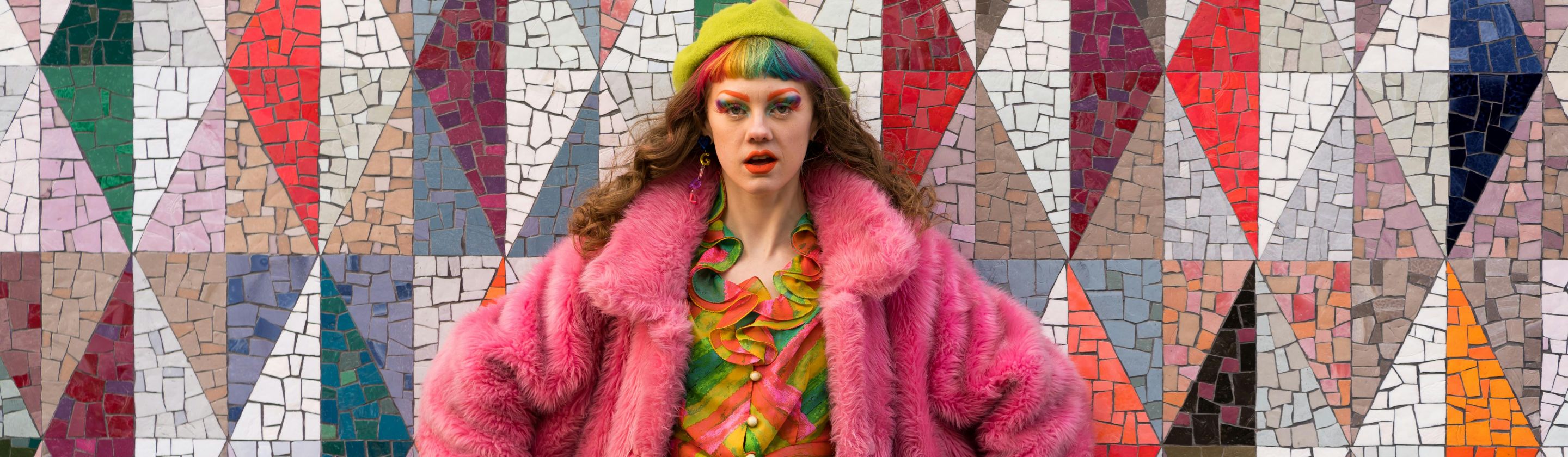
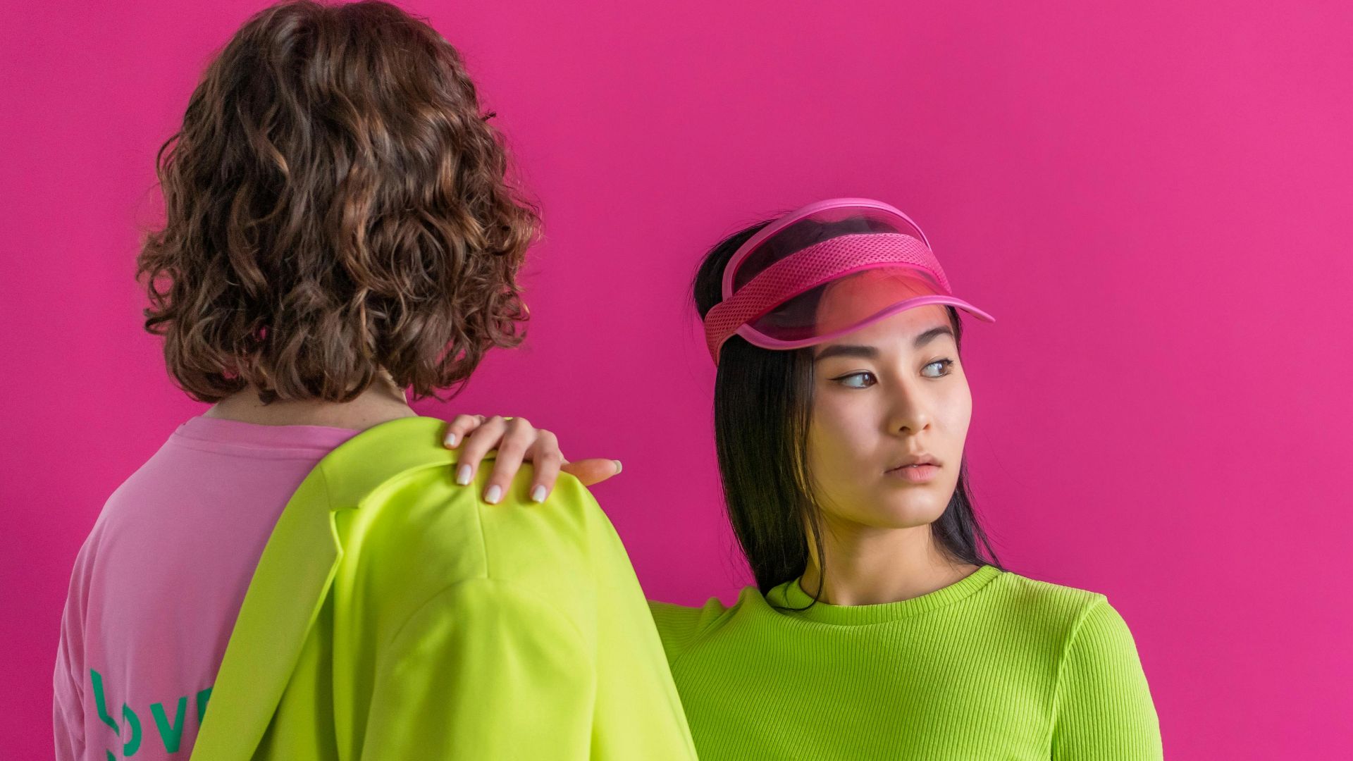
2. Neon Green And Hot Pink
This pairing screams for attention, and not in a good way. Neon green and hot pink compete so fiercely that they make any design feel chaotic. What starts as bold ends up blinding. Even daring designers rarely risk this high-voltage combo for long.
3. Orange And Blue
Opposites on the color wheel, they can work only in small doses. Their contrast grabs the eye and then quickly turns harsh when overused. The secret is balance. Otherwise, the clash takes over and ruins any sense of harmony.
 Marcus Queiroga Silva on Pexels
4. Mustard Yellow And Olive Green
At first glance, mustard yellow and olive green seem like natural partners. However, once combined, their muted tones blend too closely, creating a dull, muddy look. Instead of cozy warmth, the mix often feels flat and lifeless—like faded fabric left in the sun.

5. Brown And Gray
Brown and gray might sound safe, but together they drain all energy from a design. Their similar undertones cancel each other out and create a murky, washed-out feel. The palette usually ends up looking tired and uninspired.

6. Lime Green And Maroon
Few combinations startle the eye like lime green and maroon. One shouts with brightness, the other broods in darkness, and their undertones clash hard. Designers sometimes use it for dramatic flair, but without control, it looks more chaotic than creative.

7. Teal And Crimson
Though teal and crimson might seem adventurous, their saturated tones immediately start competing. Each color demands the spotlight, leaving no room for balance. What could be bold and modern often ends up feeling tense and uncomfortably intense to look at.

8. Lavender And Chartreuse
Lavender’s cool and chartreuse’s warm glow don’t mix well. The soft purple soothes while the yellow-green blazes, which creates a push-and-pull that tires the eye. What seems playful on paper often turns jarring and confusing in real-world designs.
 Javier Hernández Montes on Pexels
9. Navy Blue And Tan
Navy and tan used to be a design classic, but times have changed. The combo now feels a bit tired and overly safe. Without contrast or freshness, the pairing leans dull and misses the spark modern palettes usually bring.
10. Copper And Cyan
Copper glows with the memory of metalwork, and cyan recalls bright seas and skies. Their worlds don’t overlap naturally. Warm orange undertones collide with sharp blue-green energy, forming a visual argument that even skilled designers struggle to turn into harmony.

11. Turquoise And Burgundy
Designers love the idea more than the execution—one wrong proportion, and the combination quickly turns overwhelming and hard to enjoy. Turquoise and burgundy both shine on their own, but struggle together. Their rich, saturated tones compete instead of complementing.

12. Peach And Kelly Green
Peach and Kelly green seem perfect for spring themes, yet the chemistry falls apart fast. Peach’s soft warmth can’t keep up with Kelly green’s sharp, cool energy. The result feels awkward, proving that not all nature-inspired pairs belong together.
13. Charcoal And Lemon Yellow
Few duos are tougher to tame than charcoal and lemon yellow. The near-black tone absorbs everything around it, while bright yellow blasts light right back. Their extreme contrast creates more tension than charm, and they leave the designs feeling restless and off-balance.
14. Canary Yellow And Fuchsia
When canary yellow meets fuchsia, subtlety disappears instantly. Both shout for attention. The combination feels bold for a moment, then becomes exhausting—a visual overload that even confident designers rarely manage to control gracefully.

15. Plum And Neon Orange
Plum’s moody richness meets neon orange’s electric burst head-on. The two colors compete for attention from the start, one dark and reserved, the other loud and unrelenting. Designers often avoid this overwhelming pairing entirely.
16. Gold And Aqua
Gold carries warmth and grandeur, while aqua cools things with watery freshness. Together, they pull apart like fire and tide. Their beauty shines when used separately, as combining them often disrupts balance and dims the glow both colors deserve on their own.

17. Silver And Mustard
Designers often test silver with mustard, hoping contrast will spark energy. Instead, the cool shimmer meets heavy warmth halfway and stalls. The result feels uneven, almost confused—a palette that can’t decide if it wants to shine or settle.
18. Magenta And Olive
The clash between magenta’s punchy coolness and olive’s grounded warmth happens instantly. Their undertones move in opposite directions, leaving the eye unsure where to land. Though each color thrives beautifully when paired with gentler, more cooperative tones.

19. Salmon And Emerald
At first glance, salmon and emerald look playful, almost luxurious. Then their conflicting undertones start to fight for dominance. What could be soft and elegant turns demanding fast. Only careful proportioning keeps this pairing from crossing into full visual chaos.

20. Beige And Violet
Beige brings calm, while violet sparks energy. When combined, they rarely agree—one whispers warmth, the other radiates coolness. Their undertones fight for space, which creates tension rather than balance. The mix looks intriguing on paper, yet feels oddly mismatched in practice.