Timeless Versus Tawdry
Listen— you should be allowed to plan your wedding exactly how you want. You have full control over the dress, the venue, the bridal party, and just about anything else. However, being considerate of your guests should be an important element of your big day, and that means not bombarding them with a visually overwhelming or positively yawn-worthy color combination. Take a look ahead for some color combo dos and don’ts.
1. All White
An all white wedding sounds heavenly - literally - And if done correctly, you might be able to get away with something chic. However, this theme is risky, as there is countless potential for dirt, food, drink, and other stains to ruin your pristine aesthetic.

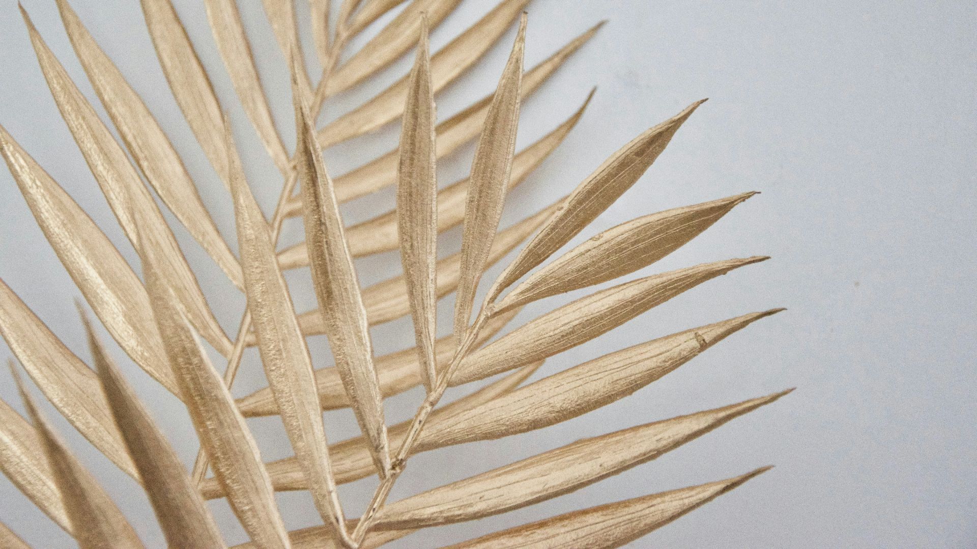
2. White And Gold
This classic duo represents luxury, opulence, elegance, synonyms…but it’s very much overdone. Sure, the colors look great together, but it can make the venue feel washed out, and you might come across as boring and uncreative.
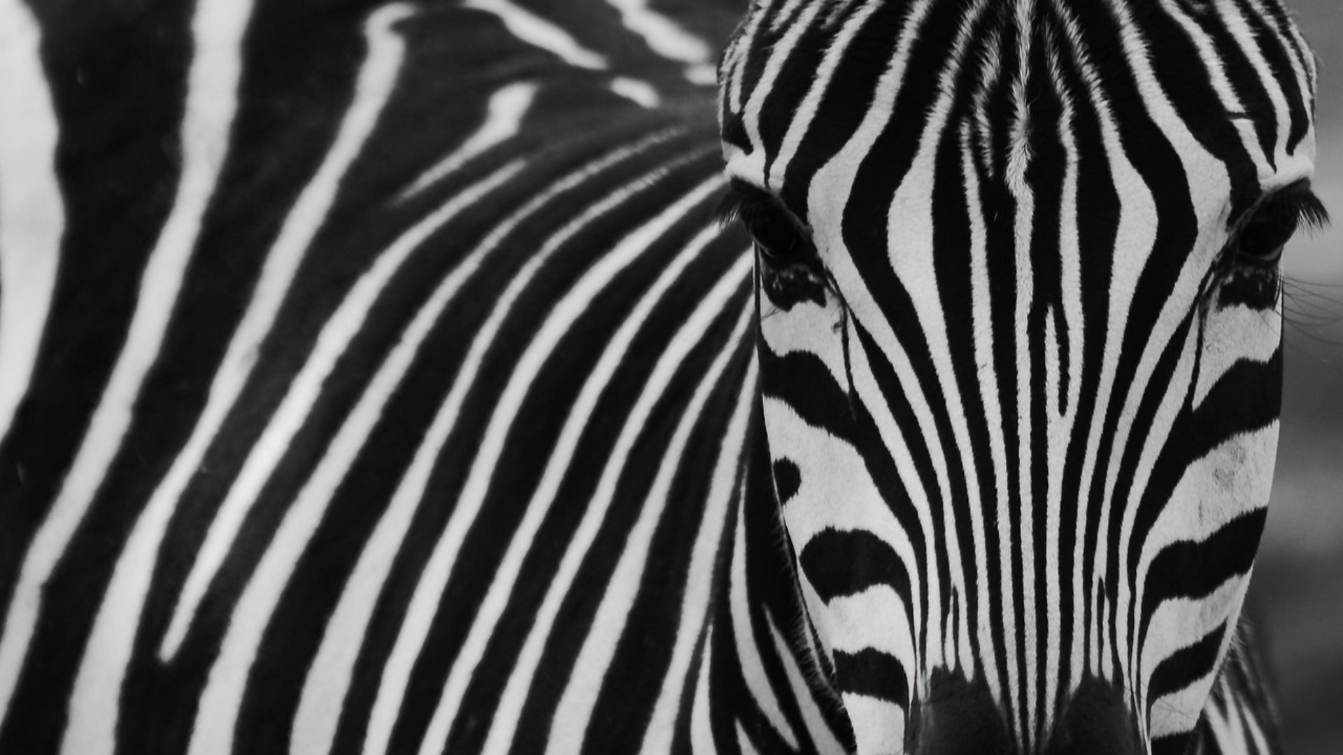
3. Black And White
If you go for a black and white color scheme, at least throw in a pop of color to shake things up a bit. If done correctly, you can achieve a strikingly bold venue, but black as a main color tends to intimidate people. If you’re trying to pull this off, do not show fear.
4. Turquoise And Beige
The early 2000s called, and they want their prom theme back. Turquoise and Beige just don’t look great together. It can come across as juvenile, immature, and generally inharmonious. If you’re really sold on beige at your wedding, switch the bright turquoise for more of a jeweled tone.
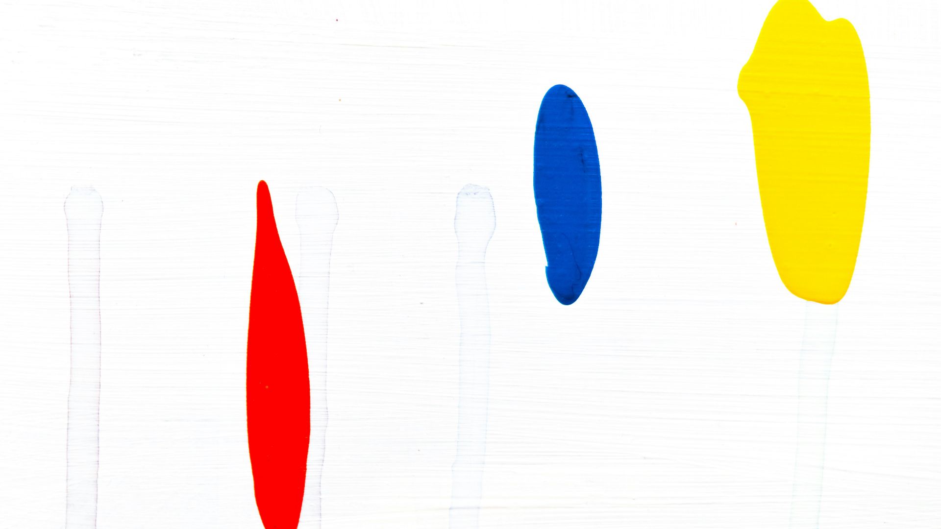
5. Primary Colors
Going for bright reds, blues, and yellows can be a little jarring for your guests. While red and yellow are probably the best of the three, red and blue, and blue and yellow, will just overwhelm the space.
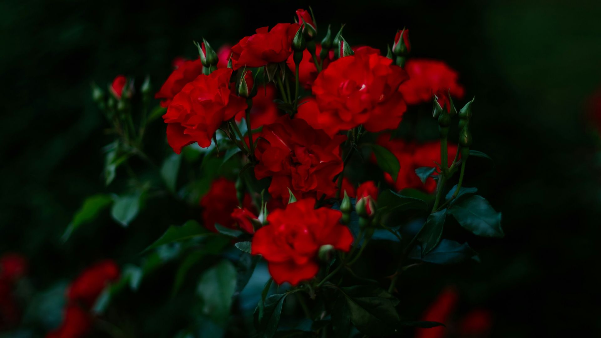
6. Red And Green
And a very happy Christmas to you! If you love how red and green look together, you have to be really, really careful not to slip into a holiday theme. Instead of having your venue look like Santa’s workshop, opt for darker greens and burgundies to get your dream across.
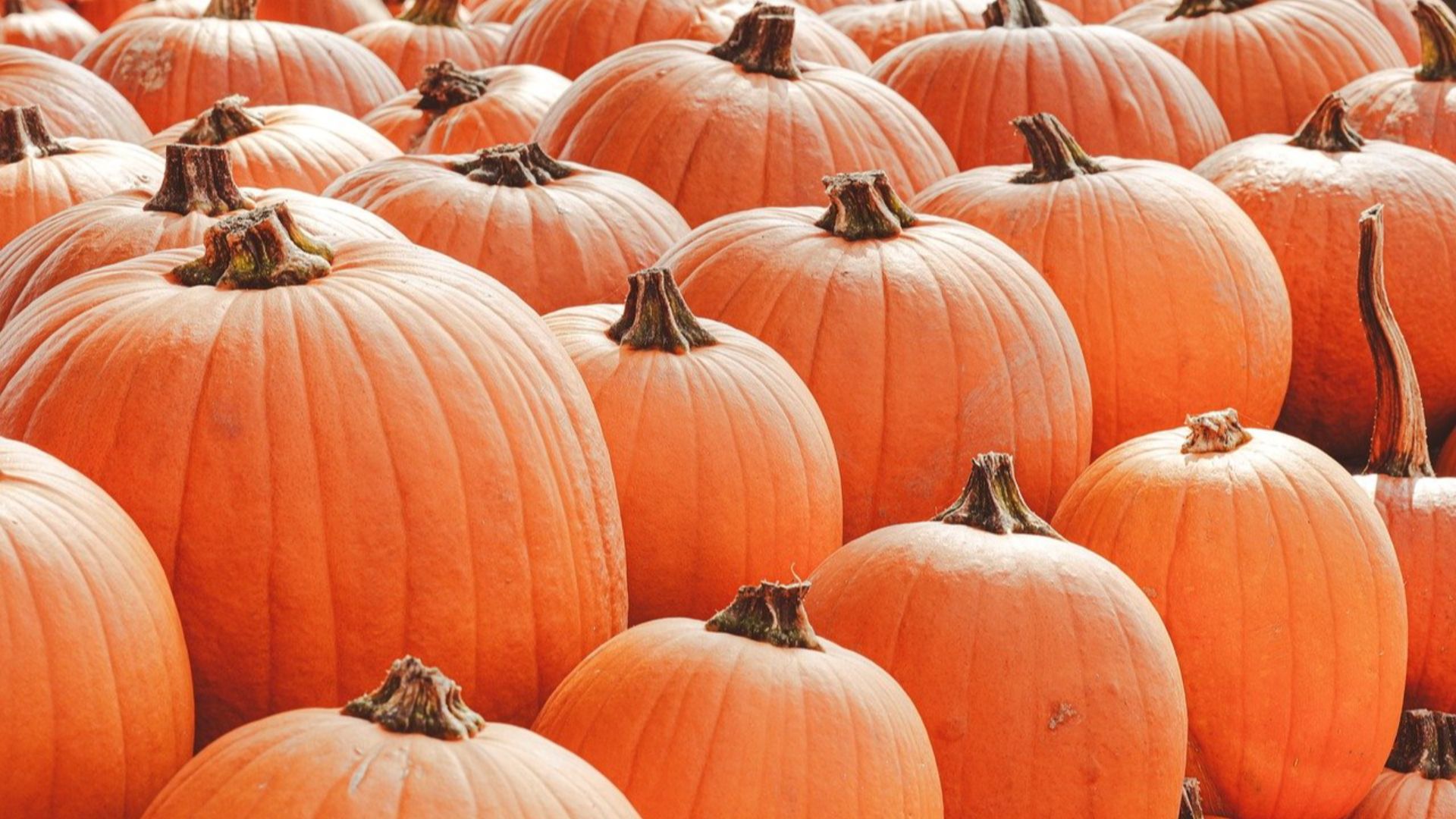
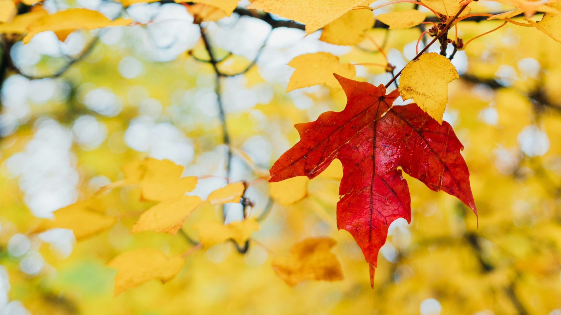
7. True Orange With Anything
Unfortunately, orange is one of those colors that struggles to work with anything. Its bright, vivid hue is unpleasing to the eye, even if you pair it with a more muted color. Also, it tends to make people think of Halloween.
8. Pink And Blue
Unless this is a combination wedding and gender reveal party, pink is blue is usually a nuptial no-go. These two colors will always remind people of babies, which is usually a conversation for the wedding night.
9. Navy And Blush
Navy is generally difficult to pull off if you don’t incorporate it properly. The dark color combined with the fragility of a blush can be a little jarring. Really, it just looks like you still went for a gender reveal party but changed the colors just a little bit.
10. Neons
We love a little neon sign or neon elements for the couple that can pull it off, especially if you’re getting married somewhere close to the equator. However, lime green, fuchsia, and bright yellows can be unflattering and downright irritating to the eye.
1. Navy And Sage
Welcome back, navy. Unlike blush, using a cool-toned navy with the serene vibes of sage and eucalyptus gives your wedding a clean, almost eco-friendly edge. Pair these colors with an ivory hue, and you’ll make a timeless wedding look.
2. Lavender And Sage
For those looking to have a spring wedding, nothing beats the fresh, budding colors of lavender and sage. These colors represent the beginning of warmer weather while still maintaining an elegance about it, especially if you also pair the two with a plum or eggplant color.
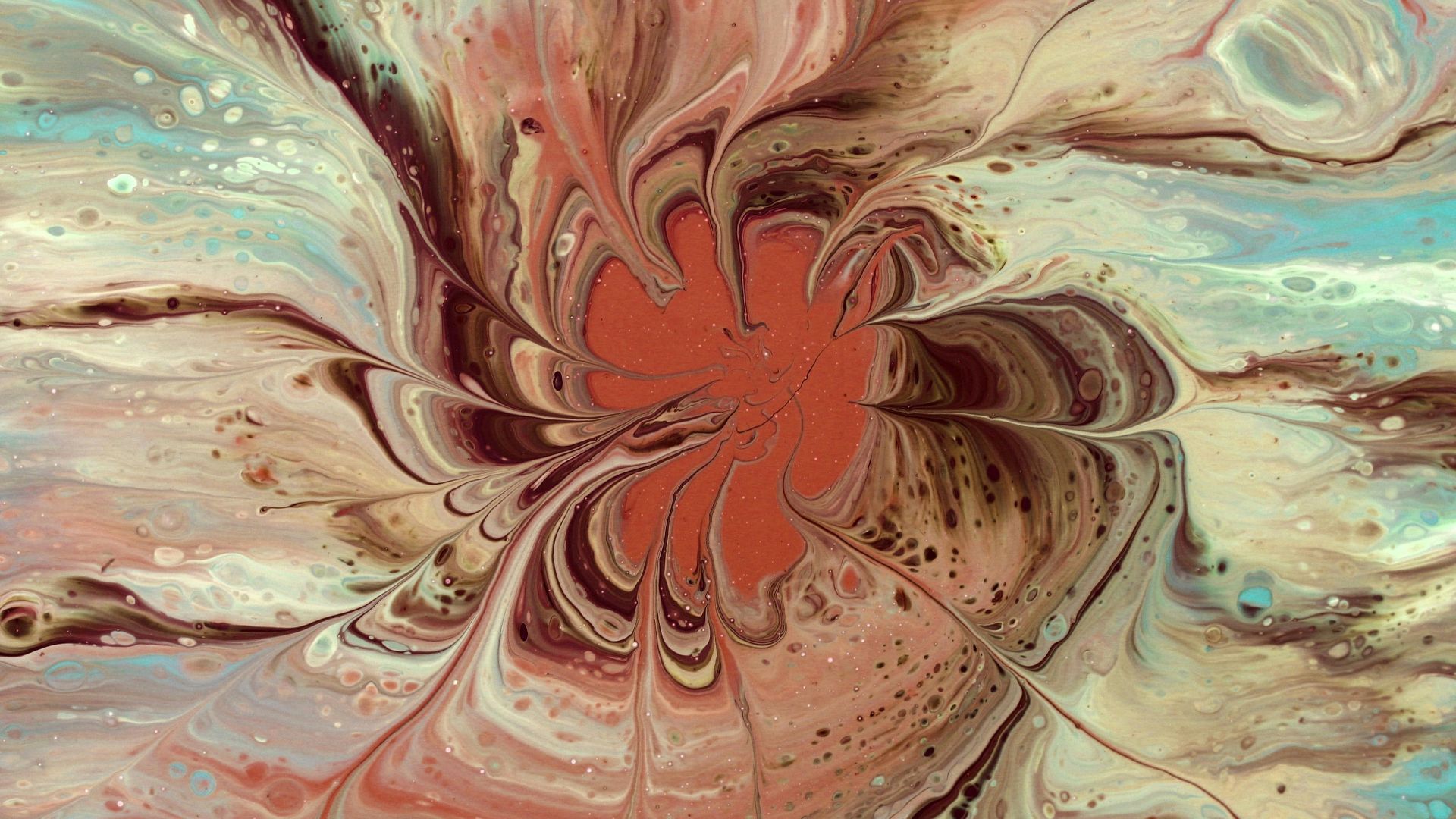
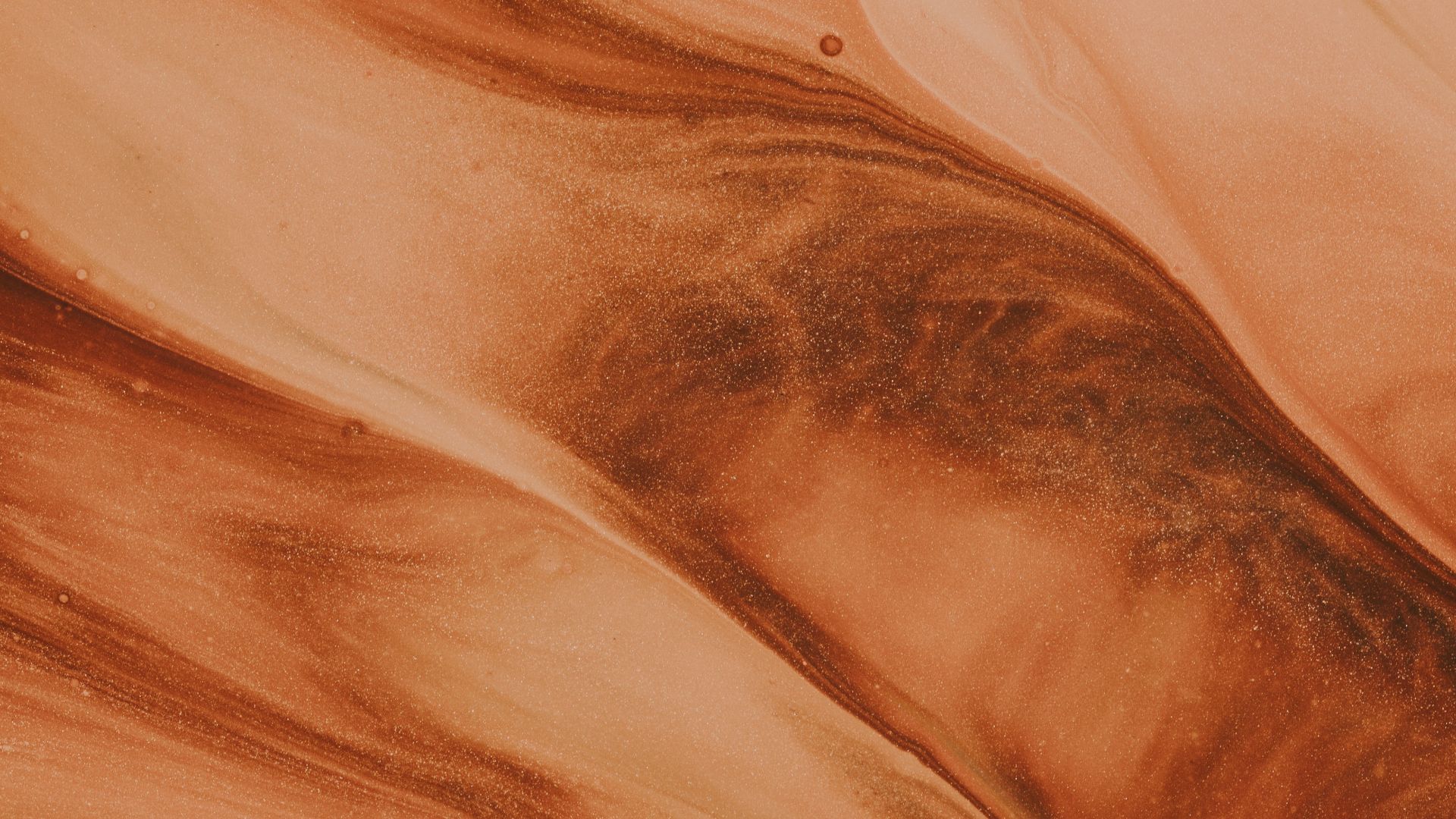
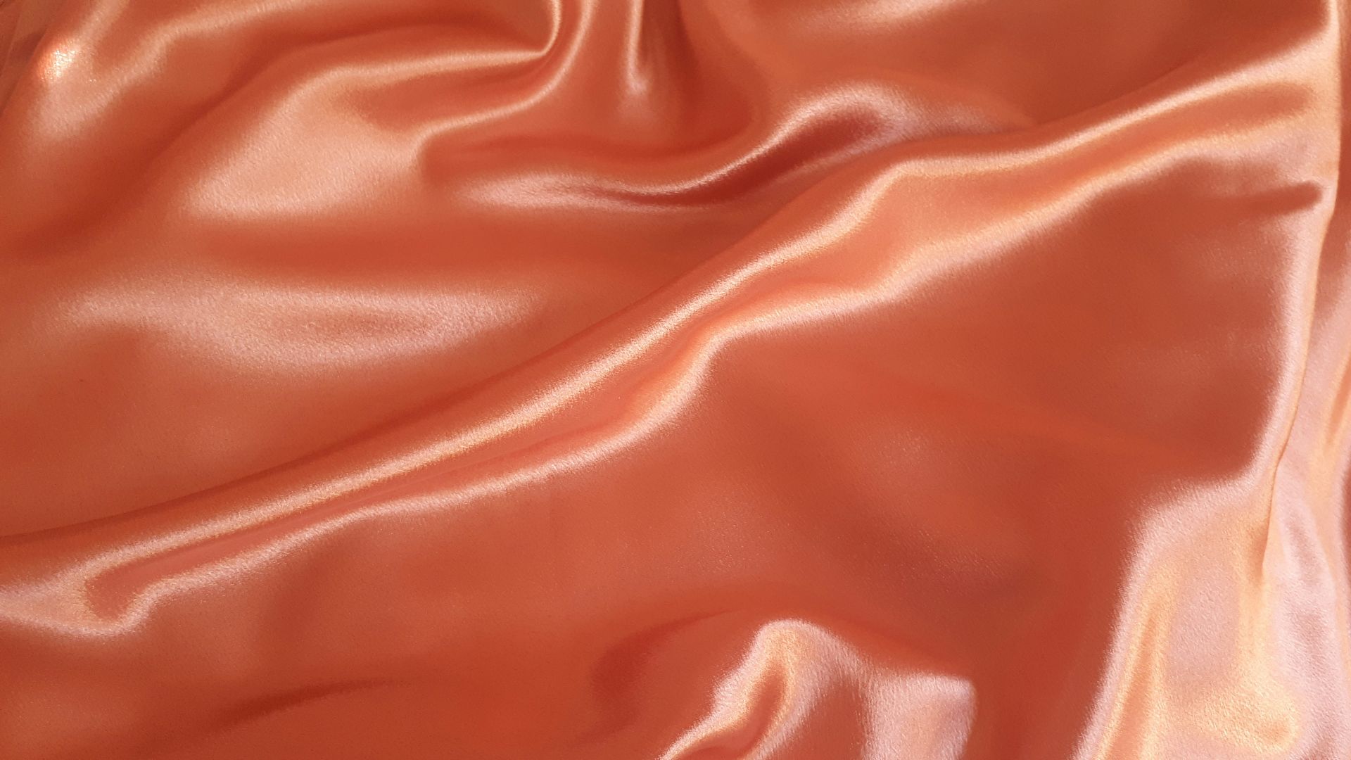
3. Burnt Orange
Maybe you love fall, or maybe you love the 70s; either way, going into the burnt orange hues can be a great option for your wedding. Using a spectrum of rust, sienna, and darker yellow will give you color and consistency without overwhelming your guests.
4. Brown
A lot of folks don’t look to incorporate brown into their wedding, maybe out of fear that it’s boring or dull. However, brown can be a very anchoring color, allowing you to explore lighter pinks, reds, greens, yellows, and the like.
5. Red And Gold
If you’re looking for that classic wedding elegance, look no further than your red, white, and gold. The red signifies radiance and passion, but also reacts well with the luminescence of your gold elements. Just be careful not to overdo it on the red.
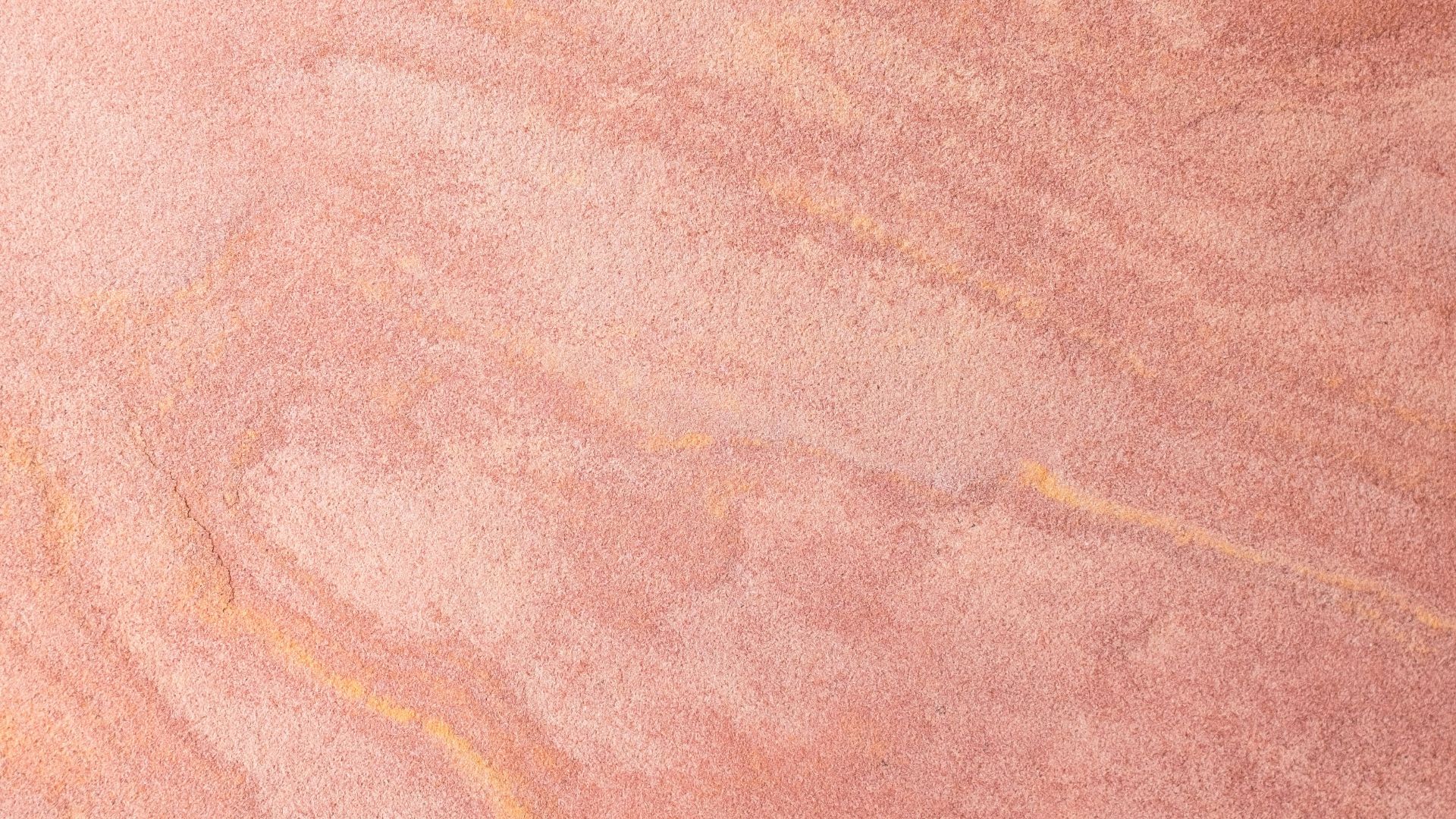
6. Rose Gold
Incorporating rose gold into your wedding makes for a very romantic vibe, and it generally pairs well with blues, reds, purples, and browns. It’s a more contemporary color, so your wedding will have a very modern feel to it.
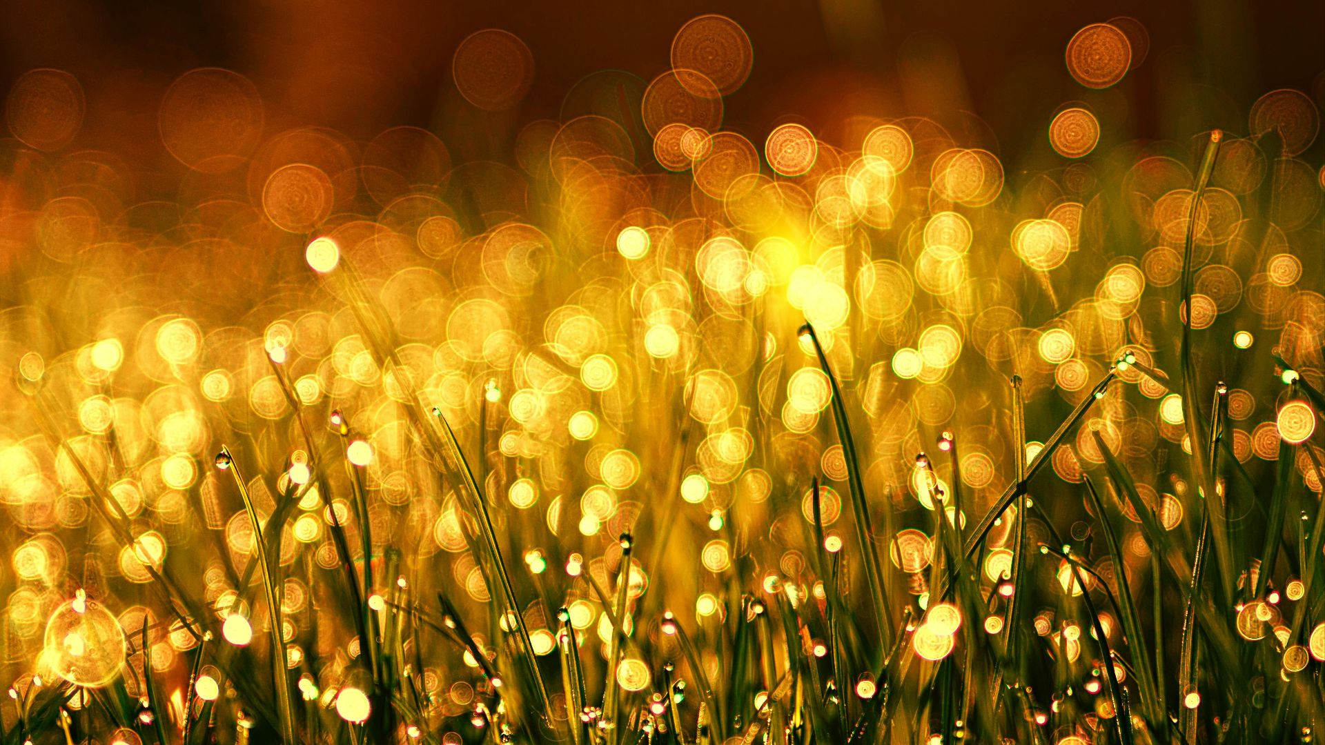
7. Amber, Gold, And Salmon
This combo is all about elegance and glamor. The warm tones will make your wedding feel comfortable and homey, but still have that look of sophistication and romance. These colors can be used across several broader wedding aesthetics.
8. Terracotta And Sage
For an incredibly earthy feel, go all in on the terracotta and sage. These colors work especially well for late summer/early fall weddings, allowing you to fill your bouquets and venue with a variety of floral and greenery styles. These particular colors also make for a great vintage feel if that’s what you’re going for.

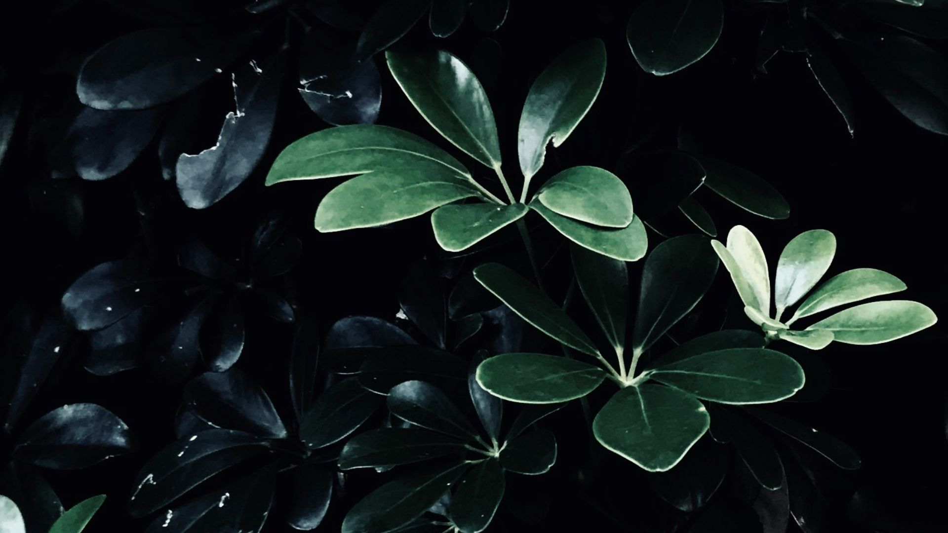
9. Emerald And Black
These classic colors will make you feel like a princess. They’re bold, lush, and will give your wedding a darker feel without it being too overwhelming. Pair with some candles and gold flatware, and you’ll be feeling the fantasy.
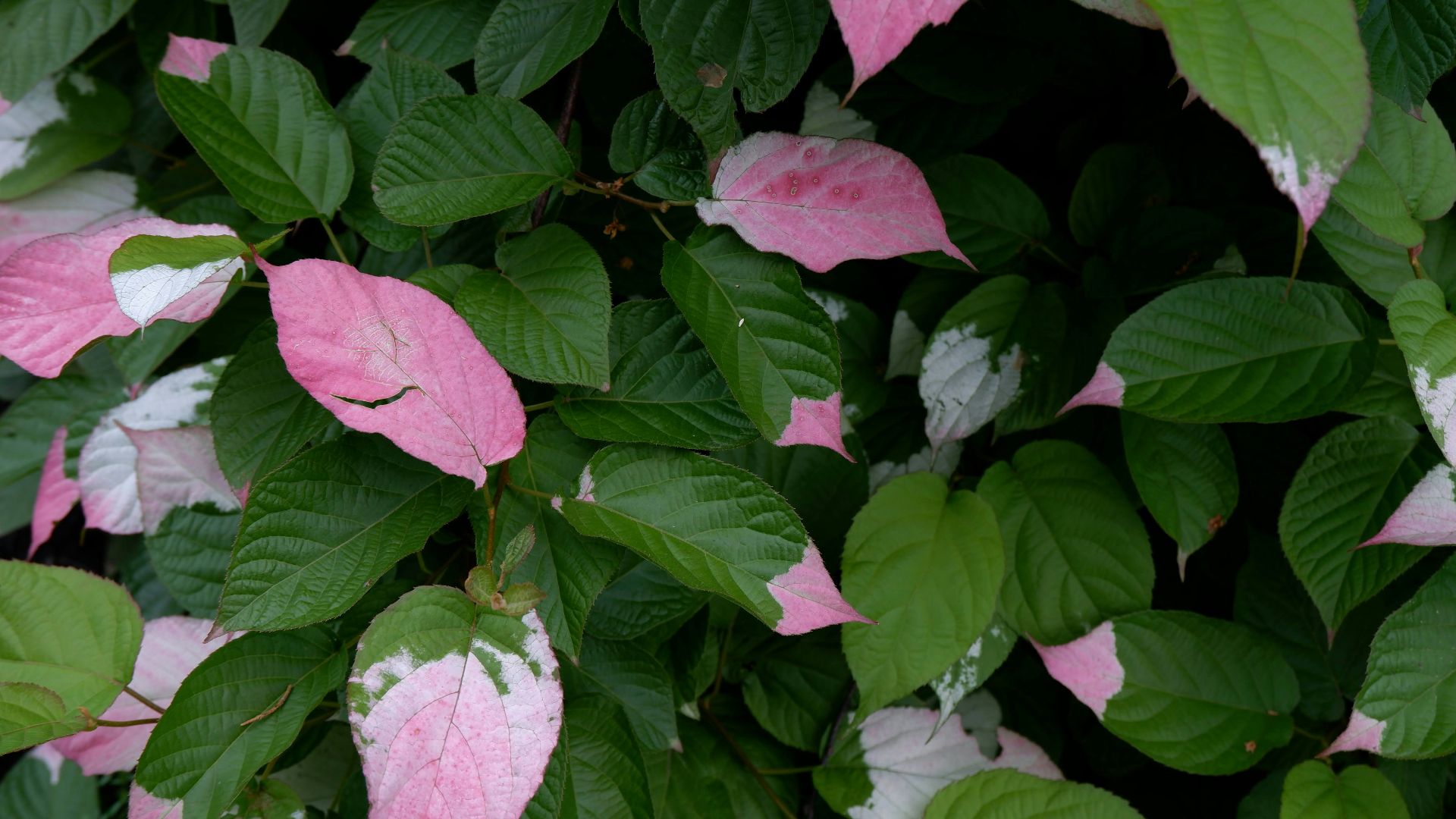
10. Pink And Green
Another fantastic spring combination, pink and green generally work well together. You can opt for more muted tones, add a pop of vivid, or go for a jeweled tones theme. Regardless, this timeless combination will still make your big day feel fresh.