The Quiet Version Is Almost Always the Better Version
There is a version of almost every fashion choice that works, and a version that announces itself so loudly it stops being about style and starts being about effort. The line between the two is not always obvious, which is why so many otherwise good outfits tip into too much. Subtlety is not playing it safe. Here's 20 fashion choices that consistently reward a lighter touch.
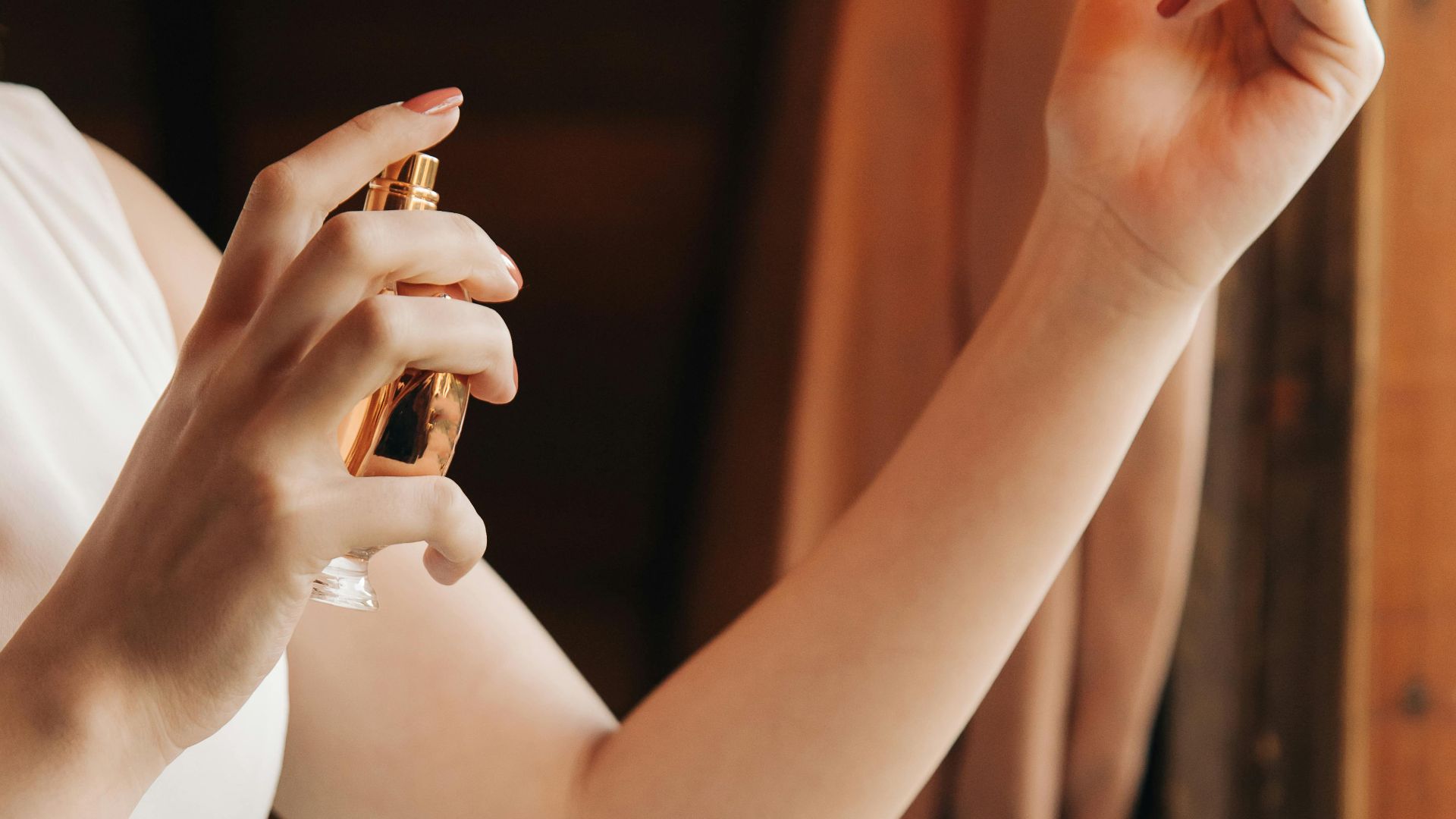
1. Fragrance
A scent that enters the room before you do is not a signature, it is an imposition. The right amount is detectable only when someone is close enough that it would be appropriate for them to notice, and even then it should read as a suggestion. Two sprays on skin, never into the air to walk through.
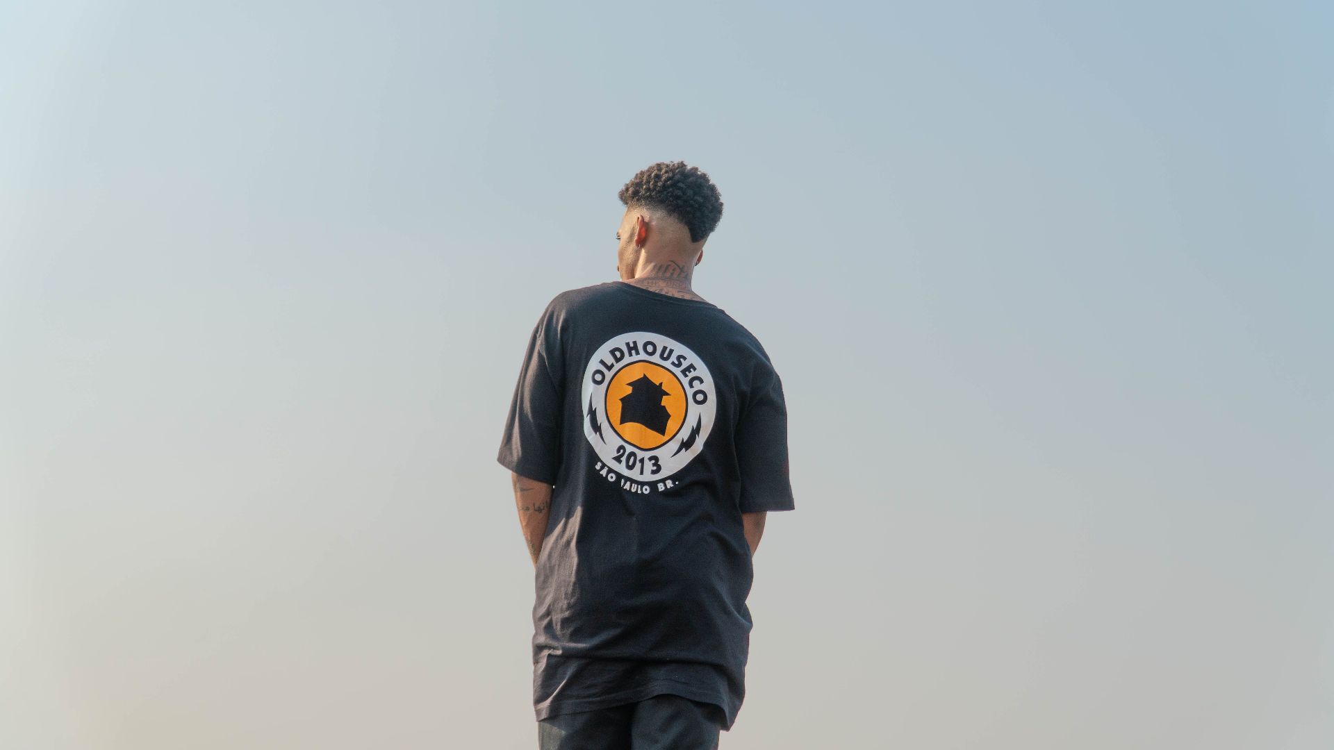
2. Logo Visibility
There is a meaningful difference between wearing a brand and advertising one, and most people wear logos at a size that tips into the latter. A small, tonal, or embroidered logo on a well-made piece signals taste. A logo readable from across the room signals something else, and that something else has become less aspirational than it once was.
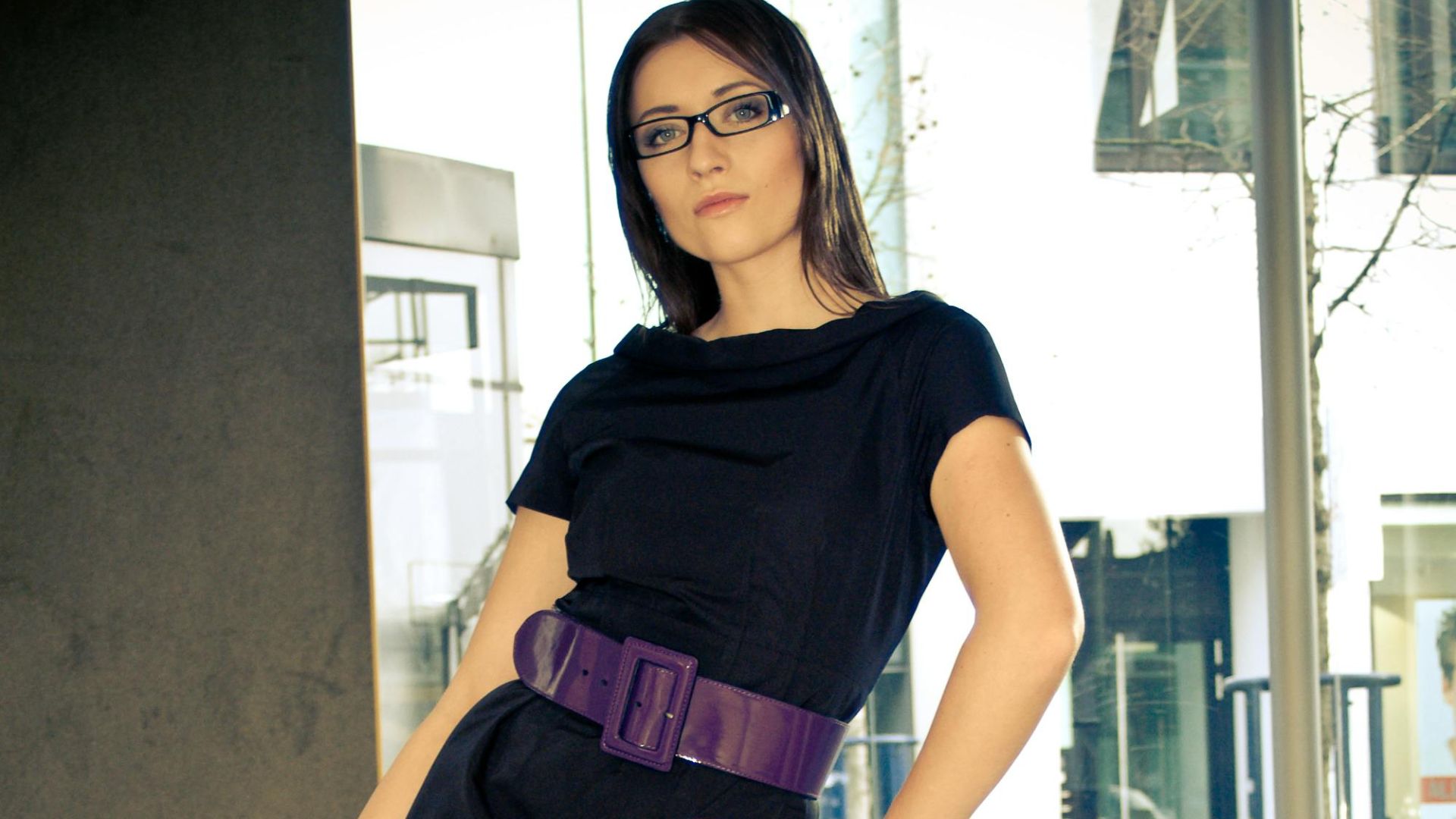
3. Belt Width
A very wide belt has a theatrical quality that requires the rest of the outfit to be theatrical enough to absorb it. Most outfits are not, which is why a narrower belt in clean leather almost always integrates better. It defines the waist without competing with everything else.
 Christian Kelm-Jongebloed on Pexels
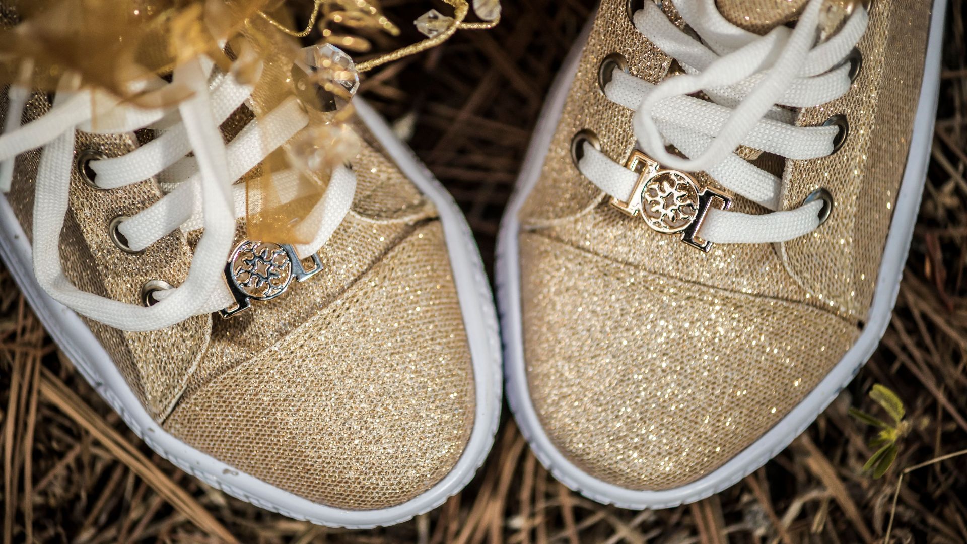
4. Shoe Hardware
Shoes with significant hardware carry visual weight that can overwhelm an otherwise clean outfit. The same silhouette in a minimal version tends to read as more expensive and more versatile. Hardware should feel intentional rather than decorative, and the threshold for intentional is lower than most shoe designers seem to believe.
 Luis Becerra Fotógrafo on Pexels
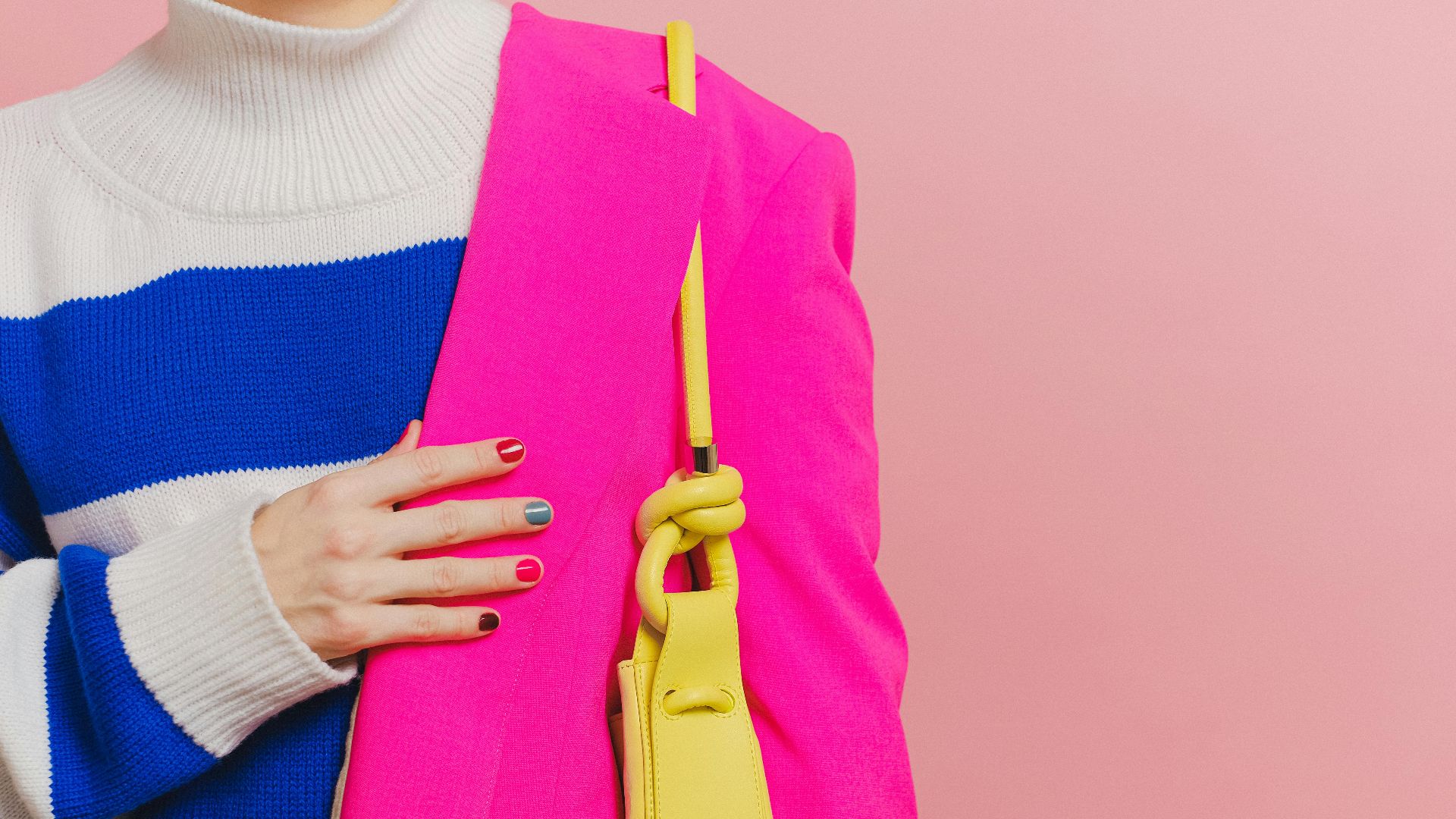
5. Color Blocking
Two strong colors in large equal blocks can read as a costume rather than an outfit. The subtler approach lets one color dominate and uses the second as an accent, or chooses colors close enough in temperature that the contrast feels considered. Deliberate color blocking requires a commitment that not every occasion supports.
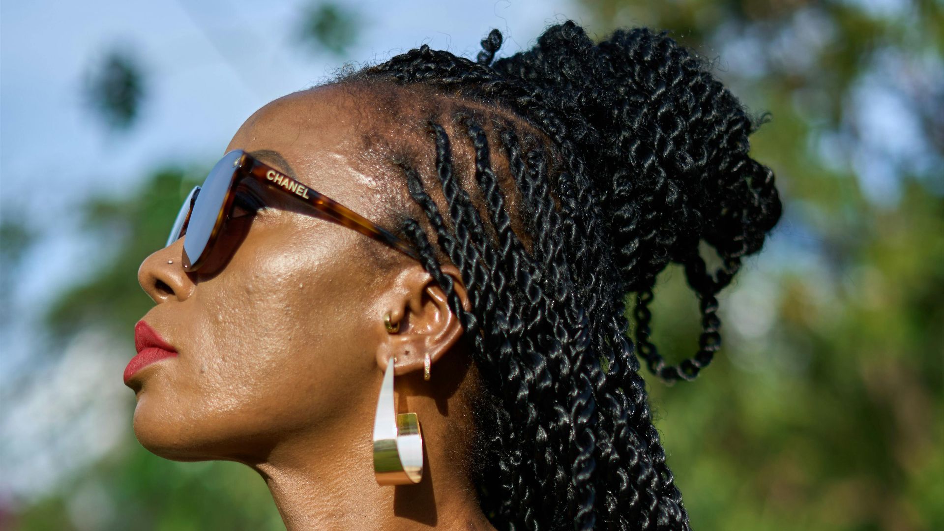
6. Statement Earrings
The appeal of a large sculptural earring is real, but the execution requires the rest of the look to step back and let them lead. When earrings compete with a patterned top, a bold lip, and layered necklaces, the effect is congested rather than composed. A genuinely interesting earring needs clean surroundings to do its job.
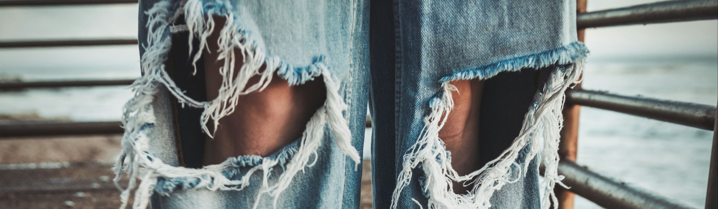
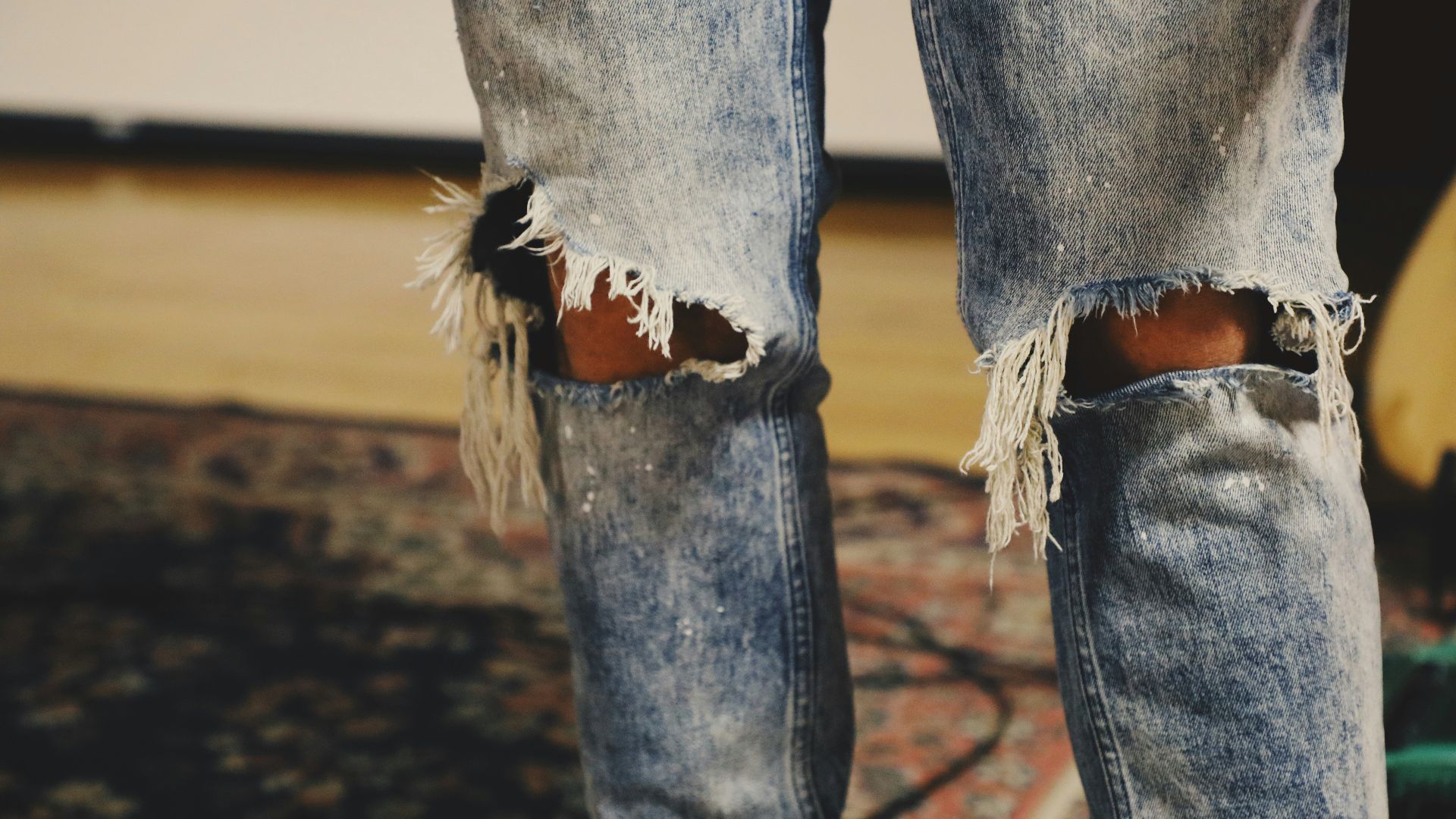
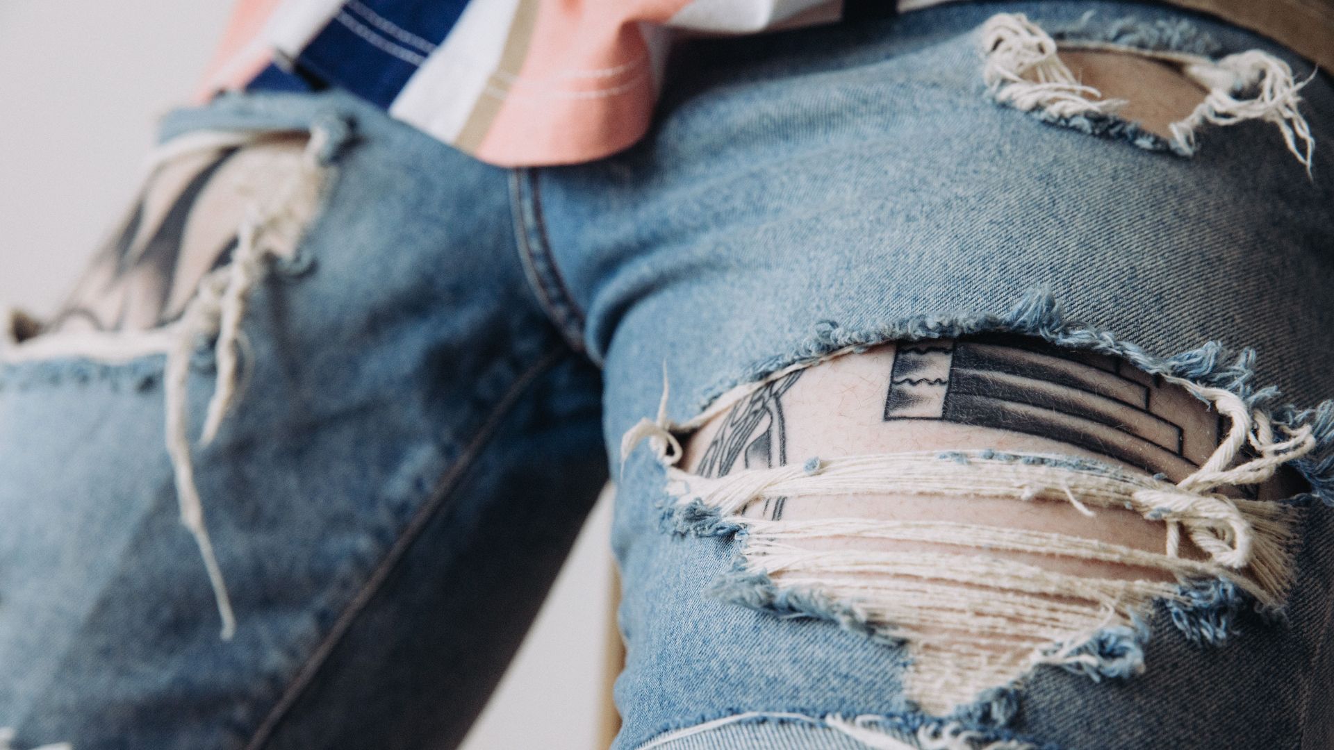
7. Distressing on Denim
A small amount of fading or a single worn area reads as lived-in. Multiple tears, heavy whiskering, and shredded hems together read as a decision made too many times in the same pair of pants. Subtle distressing suggests a history. Heavy distressing suggests someone wanted you to know about it.
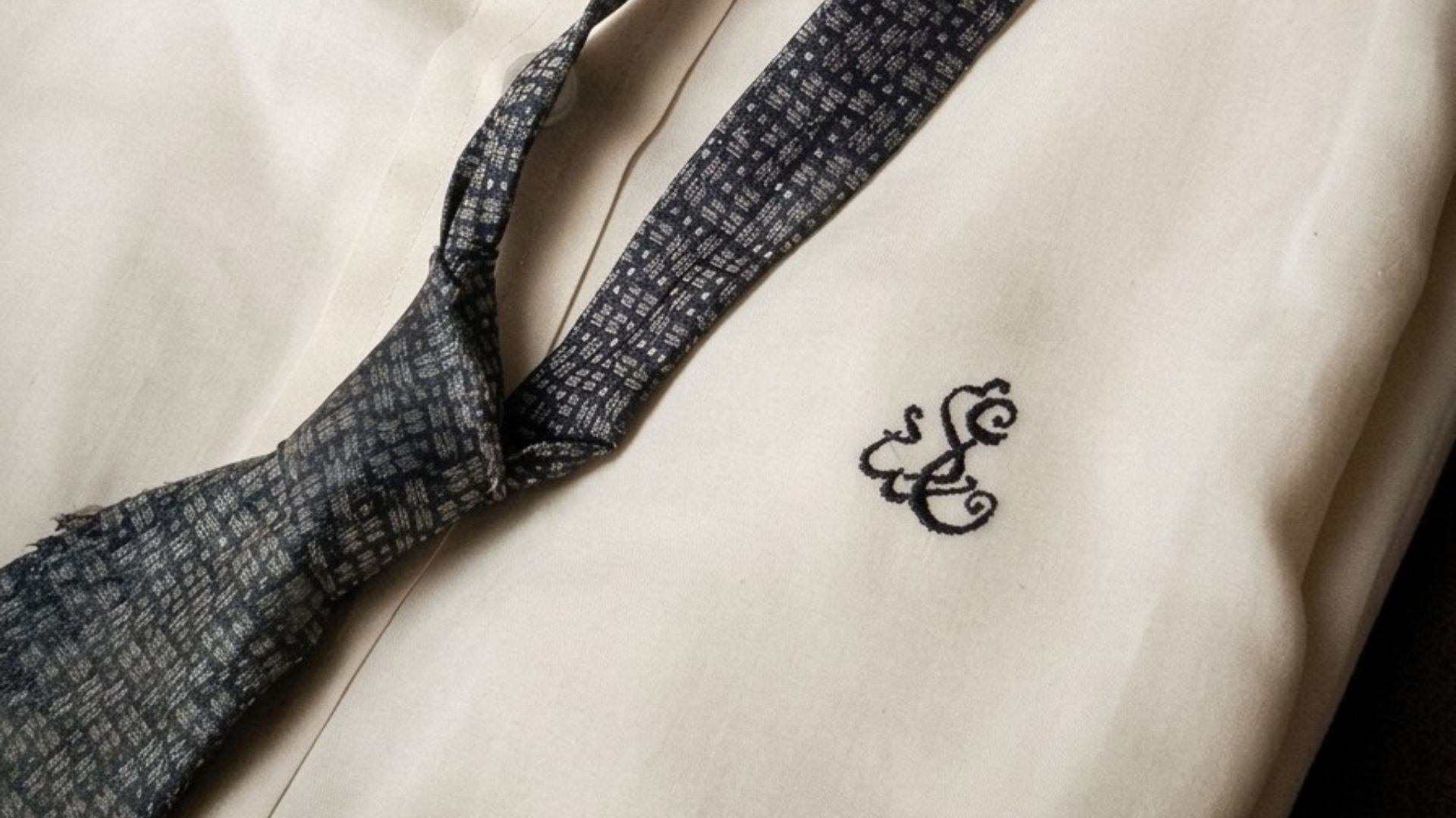
8. Monogramming
A monogram on a shirt cuff or small leather good is a quiet signal of personal investment. One on the chest of a shirt or the front of a bag functions as branding and loses the point entirely.
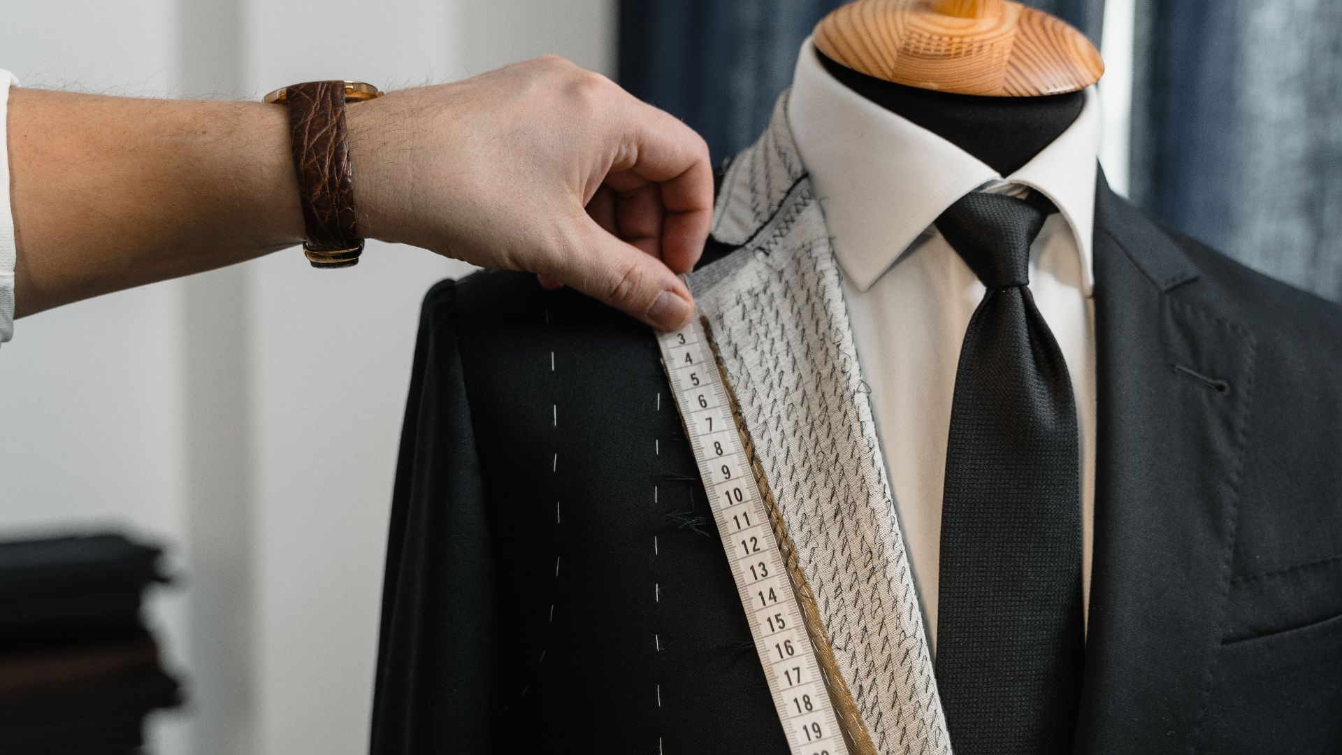
9. Suit Pattern
A bold plaid suit is a commitment that limits where and how often the piece can be worn. A subtle herringbone or fine stripe adds the same visual interest without narrowing its range. The best suits tend to look plain from across the room and interesting up close.
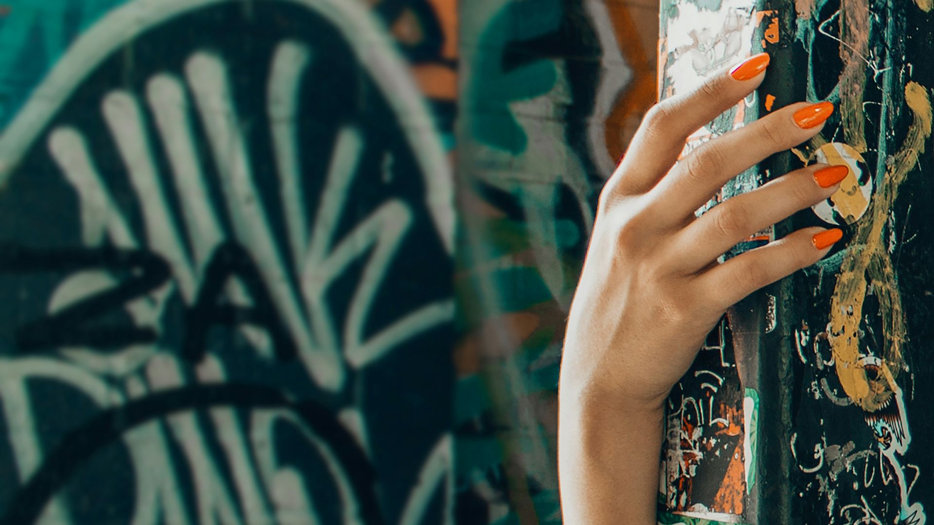
10. Nail Length
Nails long enough to interfere with how you use your hands have crossed from aesthetic into performance. A medium length, well-shaped and carefully maintained, reads as put-together in a way that very long nails rarely do. Shape and finish matter more than length, and the cleanest option is almost always the most versatile.
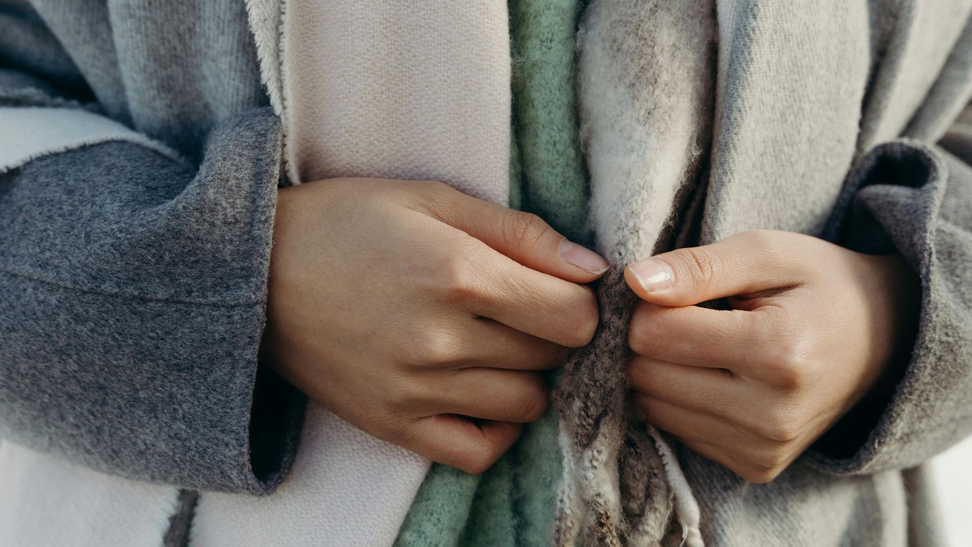
11. Layering
Layering works when each piece has room to register before combining with the others. When every layer competes for attention, the outfit reads as cluttered rather than considered. Effective layering involves one interesting piece and two that step back to support it.
12. Perforation and Cutouts
A single cutout detail is architectural and interesting. Multiple cutouts at different heights and angles on the same garment start to read as aggressive rather than intentional. The restraint to stop at one is what keeps the detail from overwhelming the silhouette.
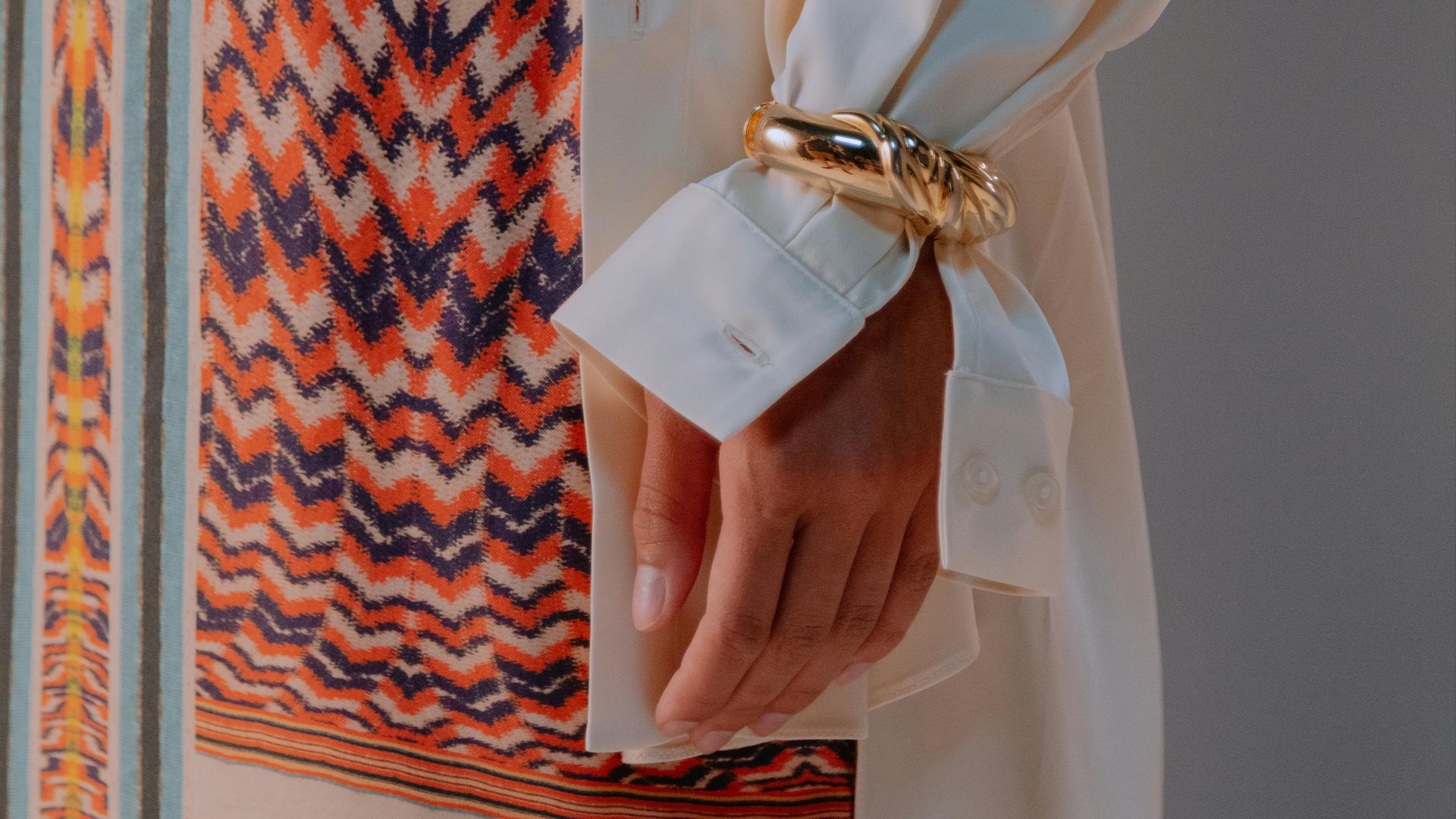
13. Cuff Width
A wide structured cuff can be striking but requires the right proportions throughout the garment to justify the formality. A narrower cuff in good fabric does most of the same work with less maintenance. Details that remind you they are details are the wrong size.
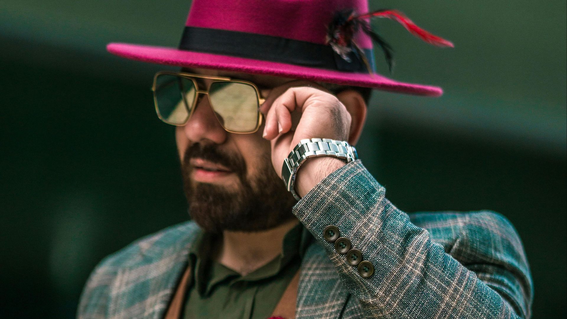
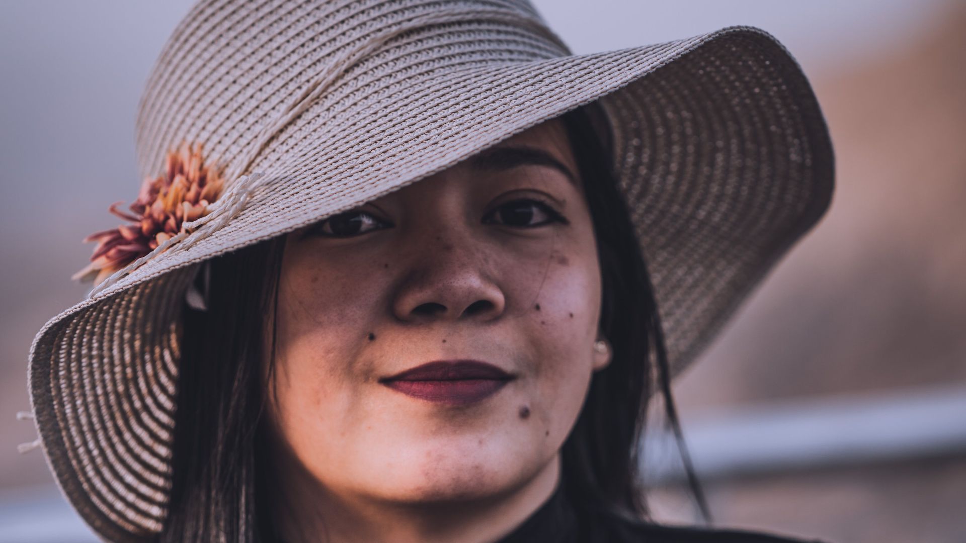
14. Hat Brim
A very wide brim requires a simplified everything else to balance it. When it competes with volume, pattern, or strong accessories, the hat stops being a finishing touch and becomes a problem. A medium brim in a clean neutral integrates without requiring the rest of the outfit to reorganize around it.
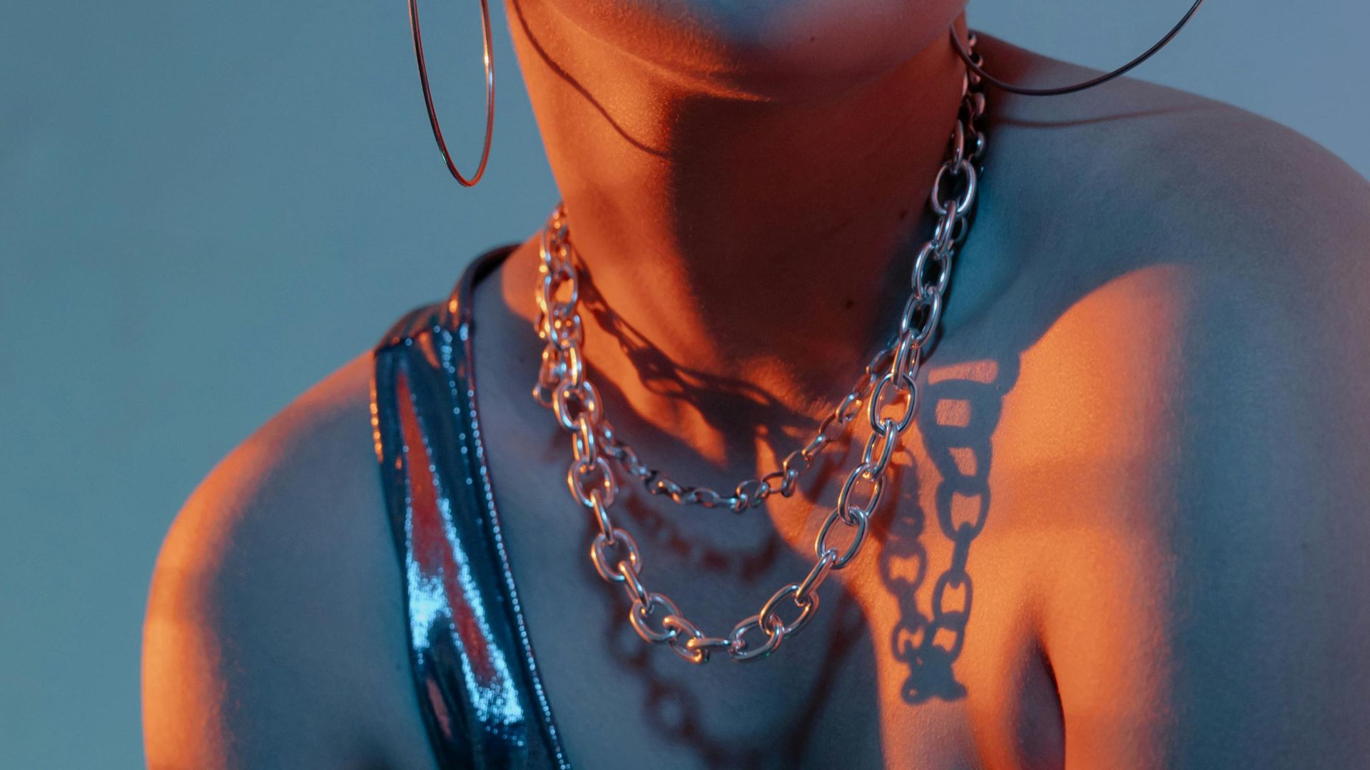
15. Chain Necklace Weight
A heavy chain makes a specific statement that is either exactly right or completely wrong depending on context, with little middle ground. A finer chain at the same length gives the same visual suggestion without the commitment. The weight of a chain changes the character of everything worn with it.
16. Lapel Width
A very wide lapel dates a suit quickly and can overwhelm the face. A very narrow lapel reads as either current or dated depending on the year, which makes it riskier than it appears. A medium lapel holds its relevance longer and reads as more expensive regardless of what it actually cost.
17. Print Scale
A large high-contrast print commands the entire outfit and leaves no room for anything else. A smaller-scale version can be worn as a component rather than the whole look. The smaller the scale, the more flexible the piece, and flexibility is what separates something worn twice from something worn once.
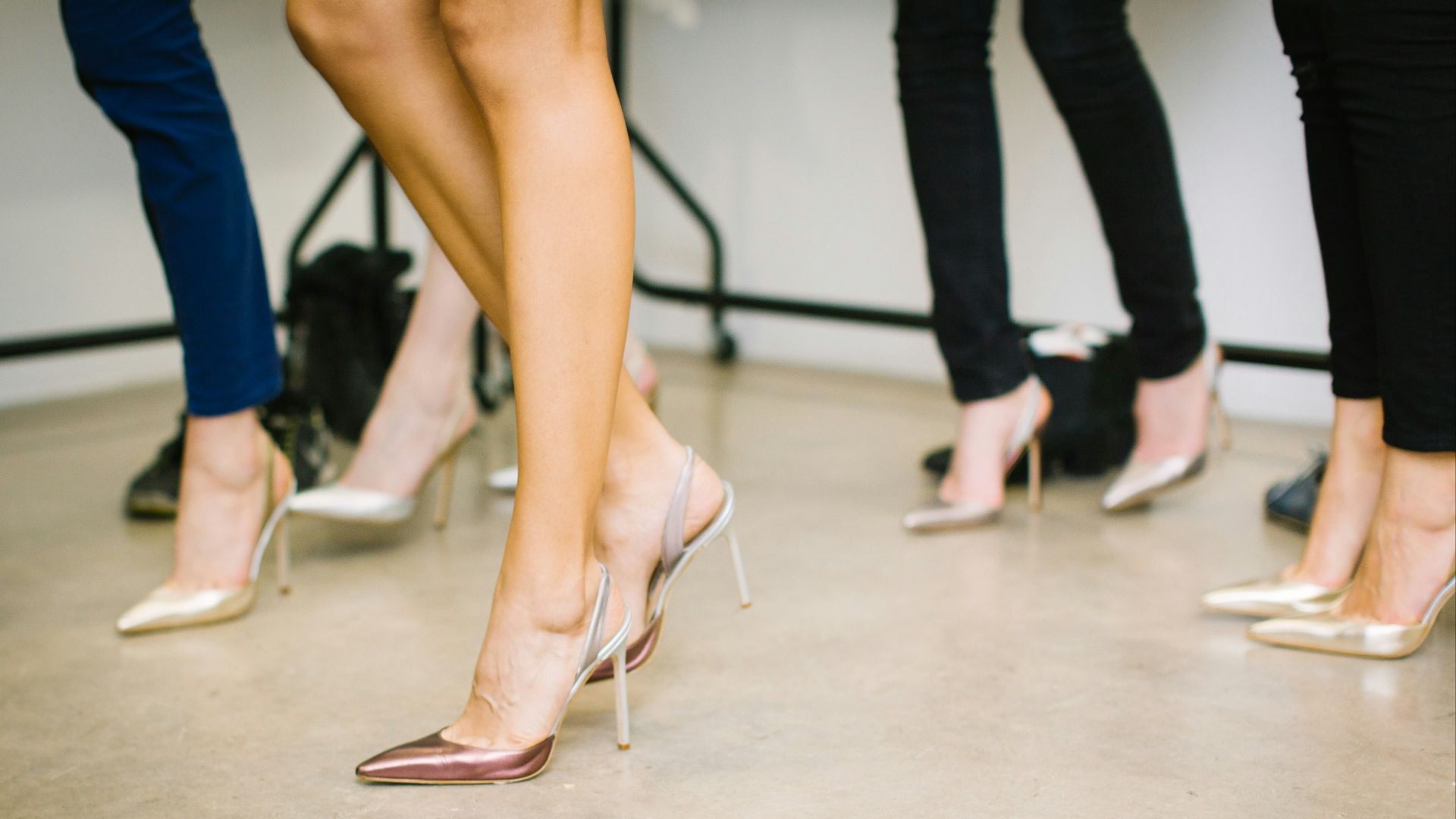
18. Heel Height
A very high heel changes posture and gait in ways that are visible whether or not the wearer is aware of them. A lower heel gives the same lengthening effect without requiring compensation in how you carry yourself. The shoe that lets you move naturally is almost always the more flattering shoe.
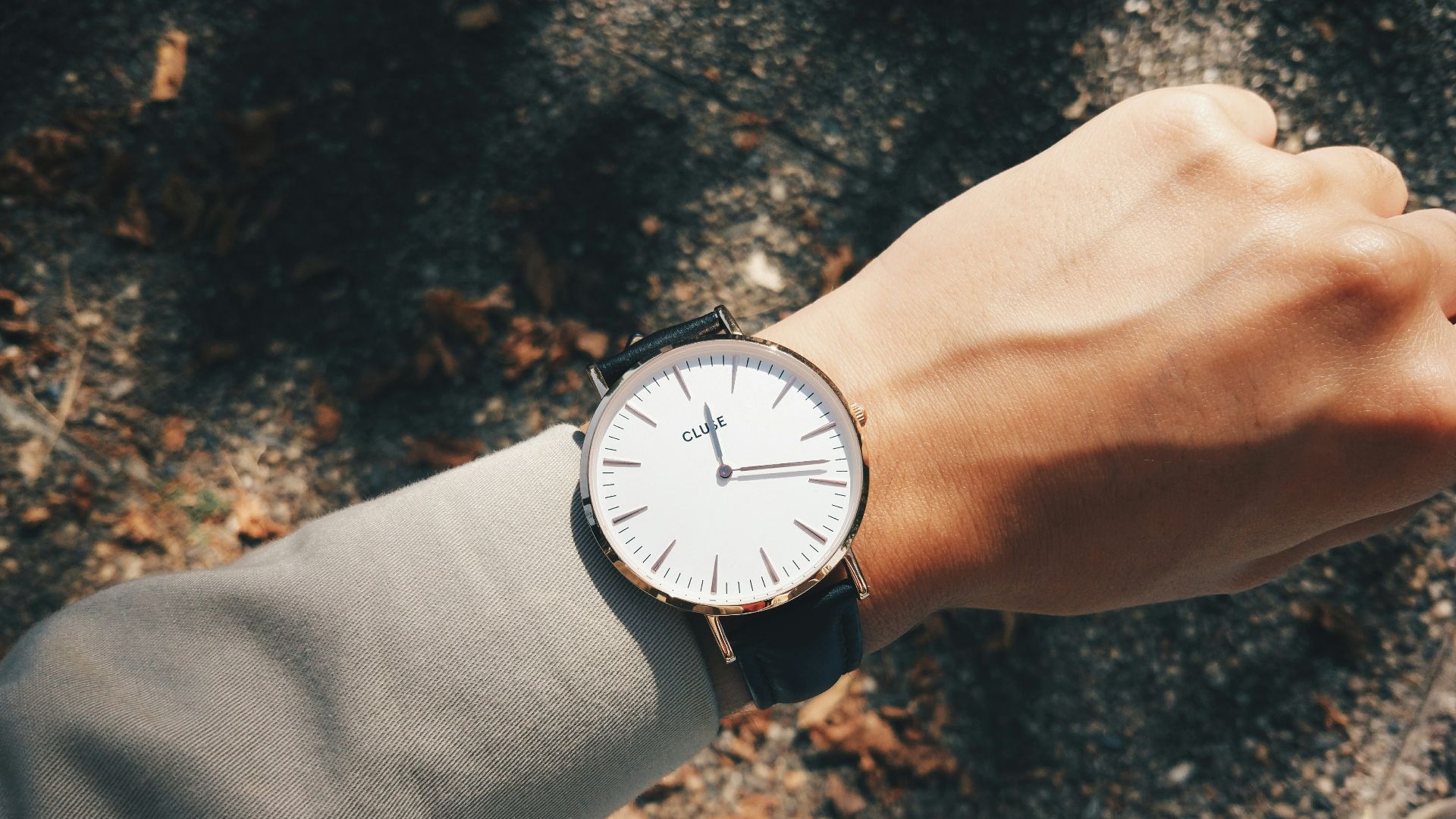
19. Watch Case Size
An oversized watch case that extends past the wrist bone competes with whatever sleeve it sits against and rarely improves the proportion. A case that fits within the width of the wrist reads as more refined in almost every context. Watch culture has spent years rehabilitating the smaller case size, and that rehabilitation is correct.
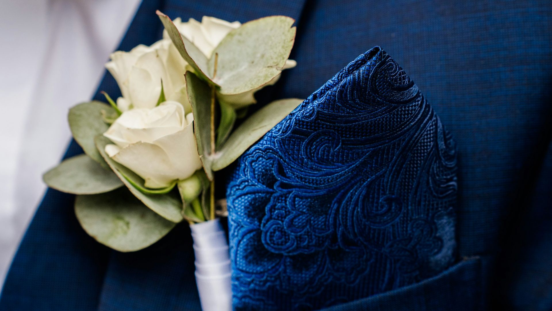
20. Pocket Square
A pocket square with significant volume or a color that vibrates against the suit fabric reads as trying. A simple flat fold in a color that quietly matches or contrasts the tie is enough. The pocket square is not the point of the outfit, and a well-chosen one communicates that it knows this.