From Pretty in Pink to Blissfully Blue
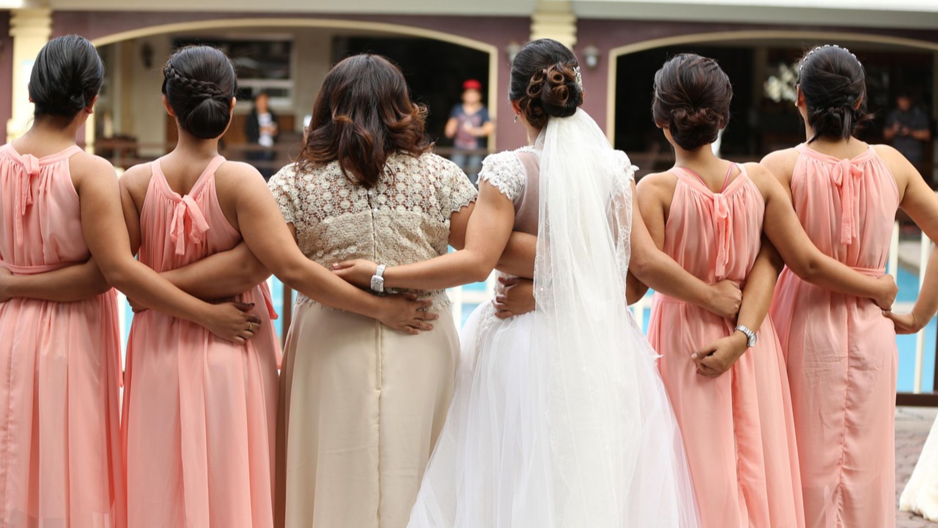
There are so many colors to choose from when it comes to weddings, from coordinating flowers to banners to even the cake. However, one of the most important color choices is related to the bridesmaid outfits. You don’t want your friends to hate you, but you don’t want to cause any clashing either. Luckily for you, this guide goes over the best and the worst bridesmaid dress colors.
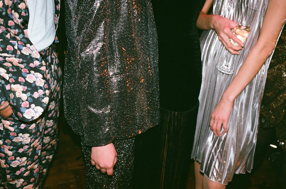
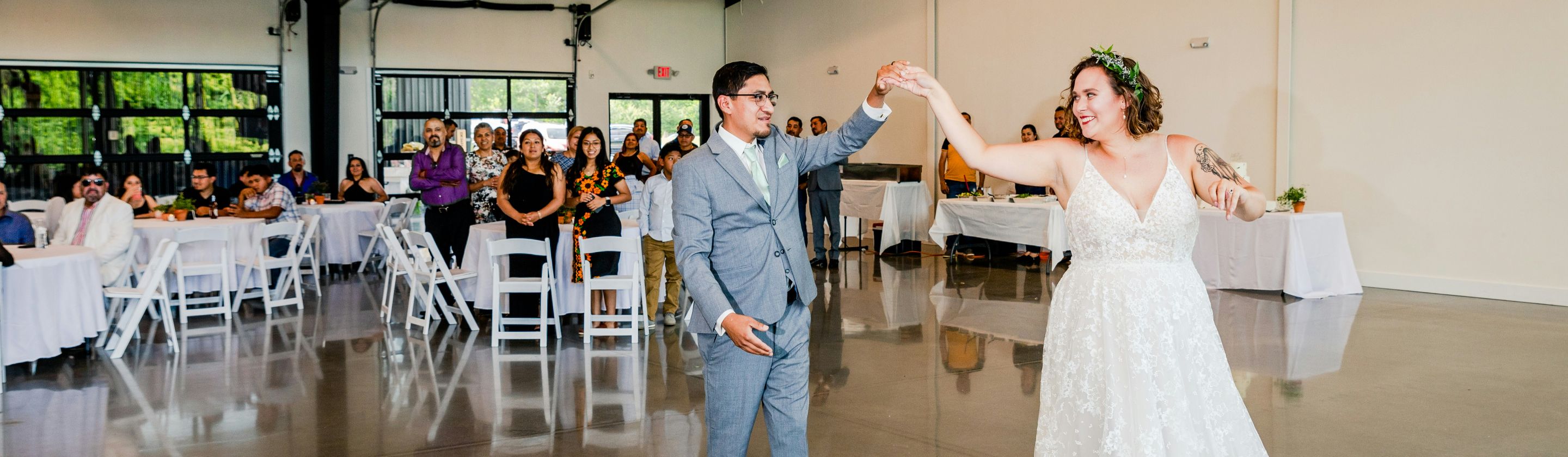
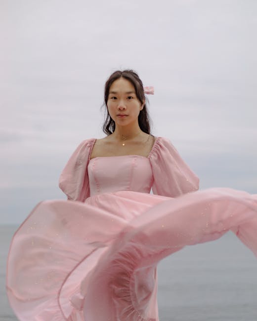
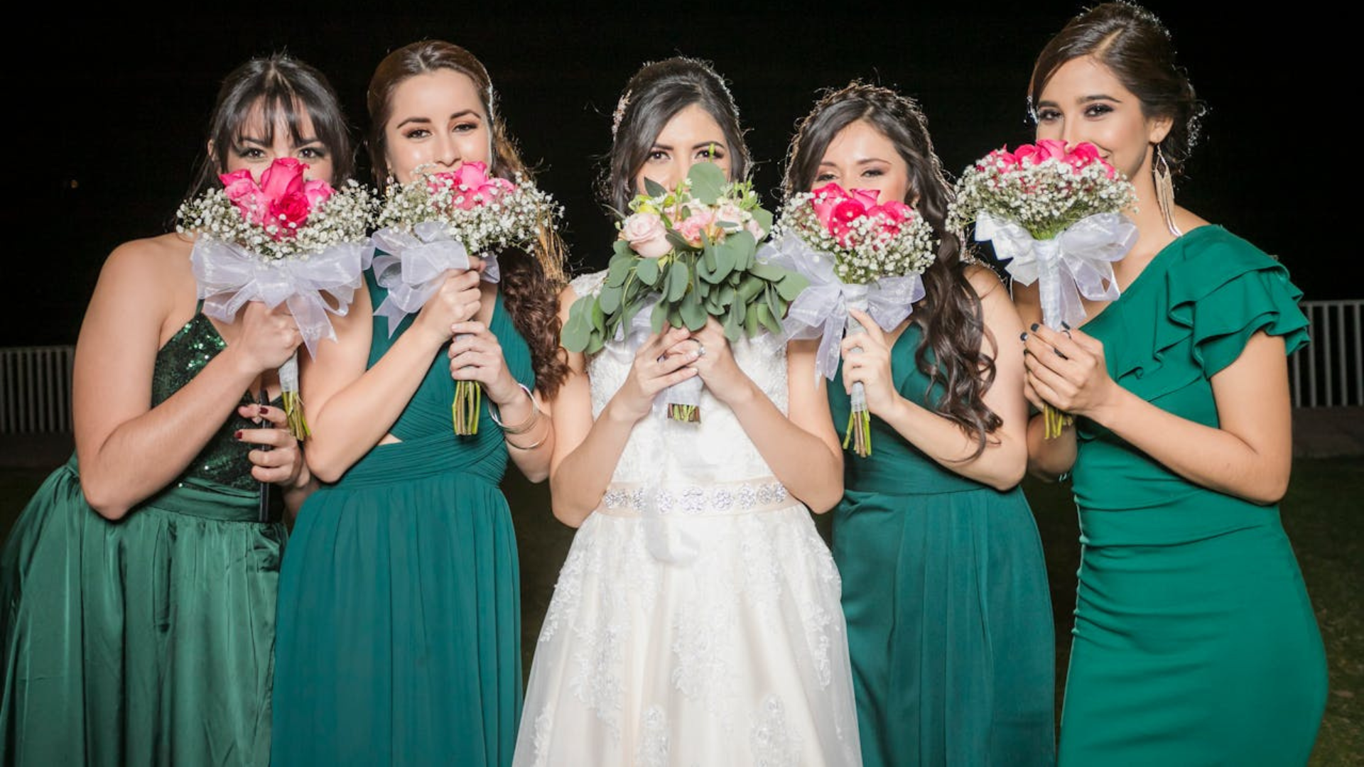 Photo by Becerra Govea Photo on Pexels
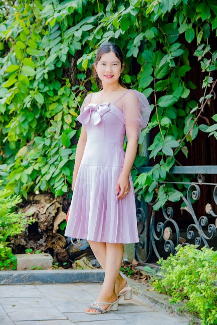
1. Pastel Purple
Pastels are what you want to aim for if you’re going for a feminine and light-themed wedding. Ideal for spring and summer, purple in particular suits numerous skin tones. If you go for a lighter shade of purple, it perfectly complements the floral motifs throughout.
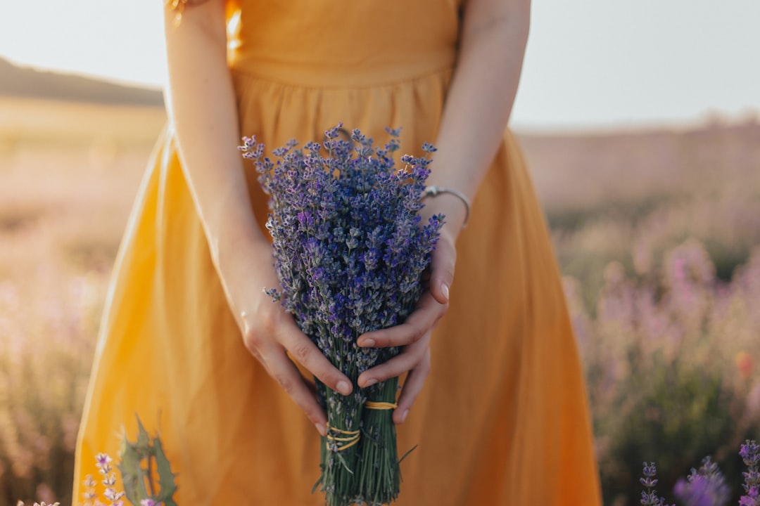
2. Sunset Yellow
Another summer shade to choose is sunset yellow. Unlike the garish brightness of other yellows, sunset is both warm and ideal for outdoor settings. It has a boho look that works with similarly themed venues.
3. Sage Green
Green is a beautiful and natural color, but identifying the right shade can be tricky. However, it’s hard to go wrong with sage green, which is perfect for outdoor garden weddings or rustic barn settings. It is both neutral and alluring, ensuring both the bride and the bridesmaids are happy.
4. Sunset Pink
Another sunset shade to consider is pink, which can be warm and subtle when mixed with orange undertones. For a cozy fall or summer wedding, this color works perfectly with bronze and gold accents throughout the venue.
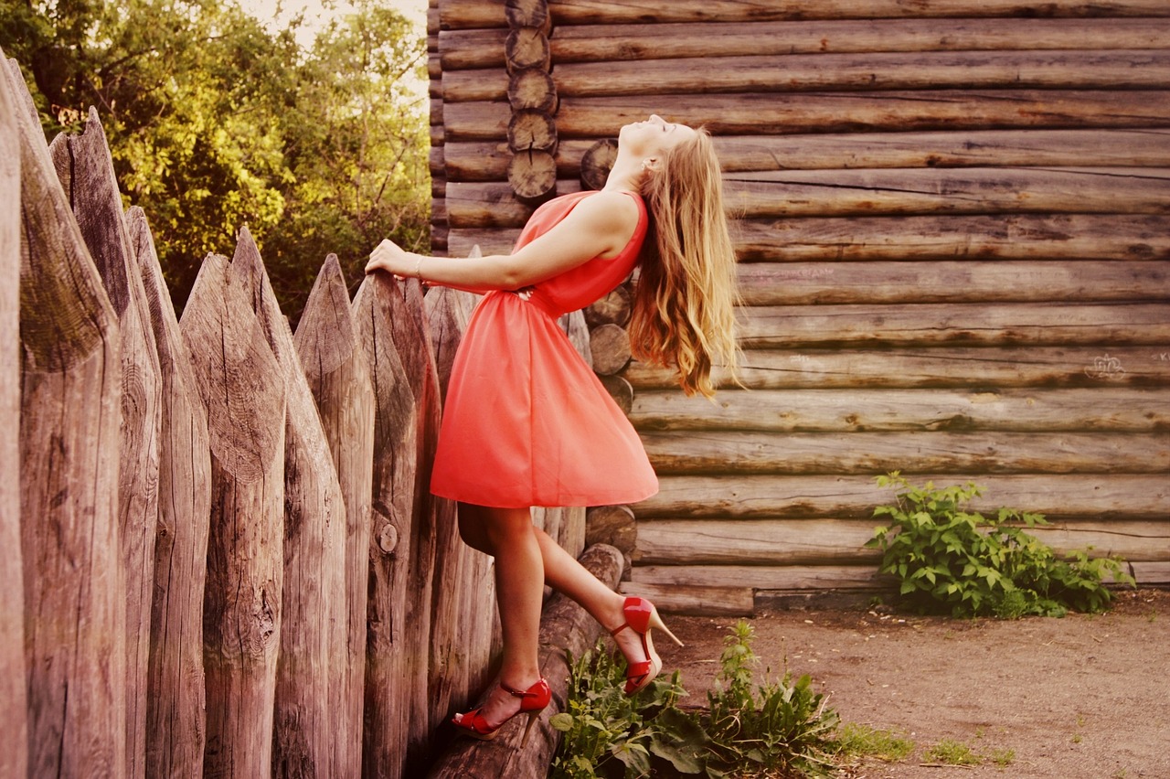
5. Rosy Red
For a classier and nostalgic look, consider rosy red. Unlike deep red, which can be too bold, or bright red, which can seem childish, rosy red is a perfect blend of warmth and vibrancy. It’s also a fun choice for winter weddings.
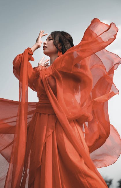
6. Pastel Orange
Returning to pastels, orange is another suitable choice. Many people hate orange clothing in general, but when used as a light shade, it works perfectly with beige and brown accents. The versatility of the color also makes it a good choice for a diverse cast of skin tones.
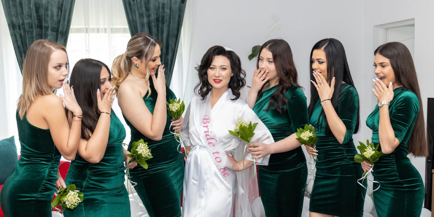
 filmotionproduction202 on Pixabay
7. Champagne
Light champagne colors are the closest bridesmaids can get to white without stepping on toes. This color is both sophisticated and elegant and was a staple in black-tie wedding events of the past. Choosing the right shade ensures they stand out from regular guests while never outshining the bride.
8. Butter Yellow
Yellow can be a difficult color to work with in wedding contexts. It isn’t the most flattering and tends to draw attention, but a warm, soft, and buttery shade pairs perfectly with floral bouquets and has a warm and delicate vibe that’s just so inviting.
9. Pastel Pink
Pink is a classic choice for bridesmaid dresses, and while it’s a bit overdone, sticking to pastel pink ensures the best results. This is because the softness of the shade makes it flattering for most skin tones and body types. Additionally, there’s something so romantic about pink that other colors don’t achieve.
10. Baby Blue
Playing on the “something blue” superstition, having your bridesmaids dressed in a light and soft shade of blue can be a fun way to tick this off your list. Perfect for beach weddings in particular, baby blue will contrast with both the sky and the sea, tying everything together.
Now that we have discussed the colors you definitely want to go for, here are 10 you might want to avoid at all costs.
1. Bright Gold
While you might be aiming for a classy and high-end look, gold is just a garish and overtly flashy color that draws the wrong kind of attention. Plus, it shows up badly in photographs and can be hard to accessorize.

2. Silver
Silver suffers from the same lighting issues that cause photography troubles. Additionally, it’s a bit too formal and doesn’t work with light or cool skin tones. You don’t want people mistaking your wedding for a New Year’s Eve party.
3. Bright Purple
While purple is perfect in its pastel shade, bright purple has the wrong effect. It can all too easily clash with flower choices and décor and doesn’t suit every skin tone. It’s also a bit dramatic, so make sure that’s what you want if your wedding theme is understated.
4. Salmon
Salmon is considered one of the most unflattering hues out there, and it tends to wash out all sorts of skin tones. While it’s a retro choice, it might not make sense in an elegant and modern wedding.
5. Pea Green
\While sage green is a beautiful shade to select, pea green is the opposite. It comes across as “yucky” and has a dated and unflattering tone that your bridesmaids will dread. There are few settings where the color would work too, making it a bit of a burden.
6. Bubblegum Pink
While rosy pink, blush, and pastel pink can be romantic, bubblegum pink certainly isn’t. Warm skin tones look terrible in this shade, and it comes across as childish and immature. It’ll probably distract from the classy vibe you’re trying to achieve.
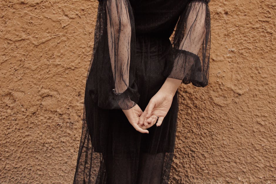
7. Black
Unless you’re having a themed wedding or have gothic proclivities, you probably want to keep black far away from your wedding. Most people consider it a morbid color associated with darker and tragic times. That’s not the feeling you want to emulate in your wedding.
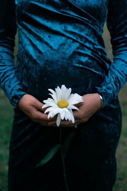
8. Velvet Blue
Getting the shade of blue right can be tricky, but the texture is important too. Velvety blue, which has a furred feel to it, is a bold choice that has limited versatility. While it could work in winter settings, it’s going to come across as heavy.
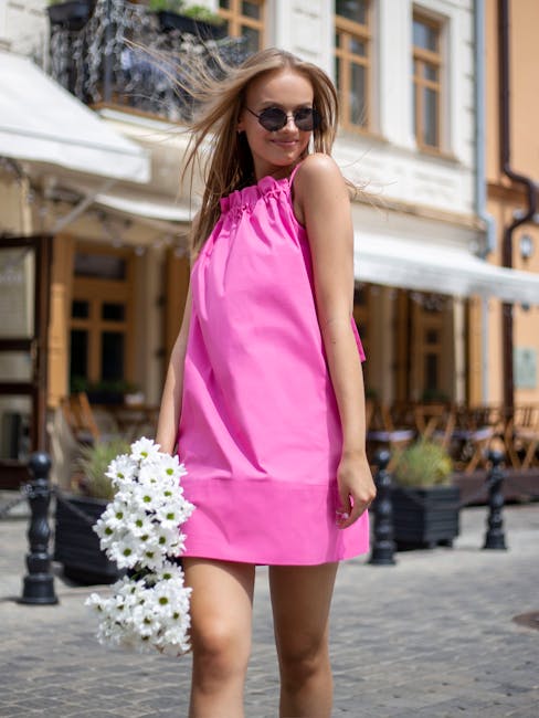
9. Neon Pink
Neon colors in general are a big no. They come across as clownish and childish. Your bridesmaids will be feeling self-conscious and will likely be distracting everyone. Not to mention, the pictures will come out a bit too saturated.

10. Anything Shiny
Shiny dresses are another thing to avoid. Not only do these fabrics create photo glare, but they stand out for all the wrong reasons. They’ll probably take attention away from the bride and come across as cheap and tacky.